
Analyzing the global icon & illustration language of Barclay's Bank required to collect a number of digital and analog example. By defining a clear design system, I based the new design on a grid and geometric shapes. Result was a visually connected illustration and icon system, brand guideline & easy to use set of tools.
Color Variation

Icon Grid
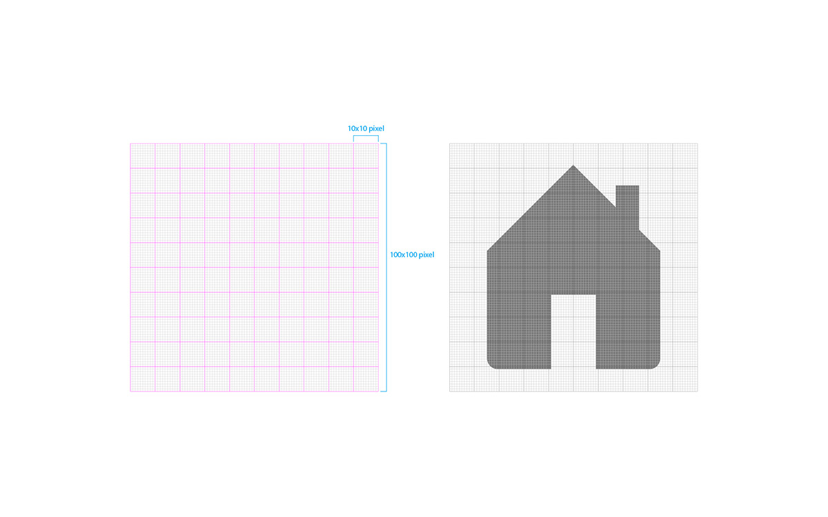
Simplifying Reality to the Core

Use of Geometric Shapes


Close up of the Icons


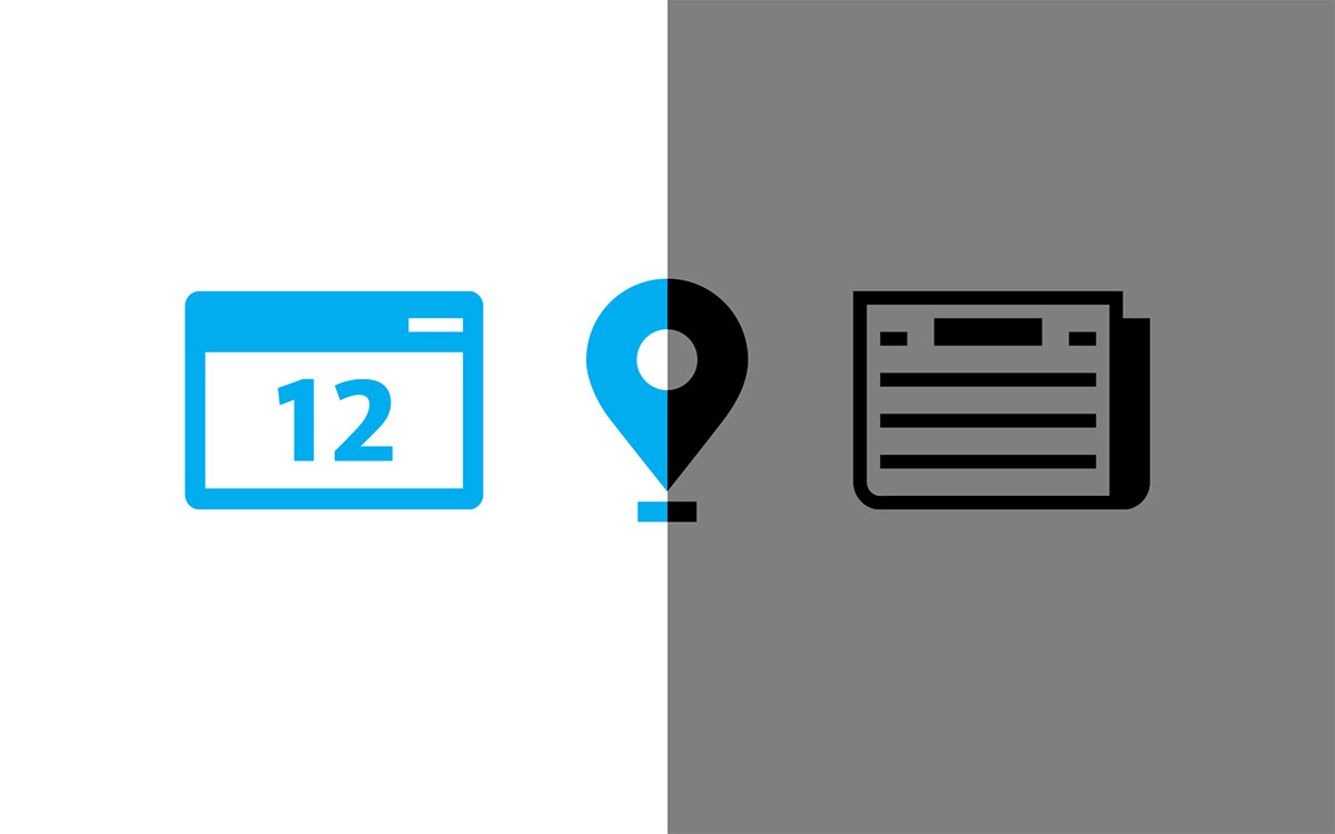

Icons on Button System

Illustration Construction & Style


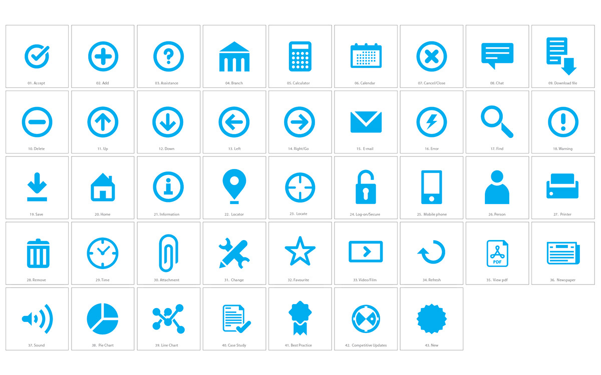
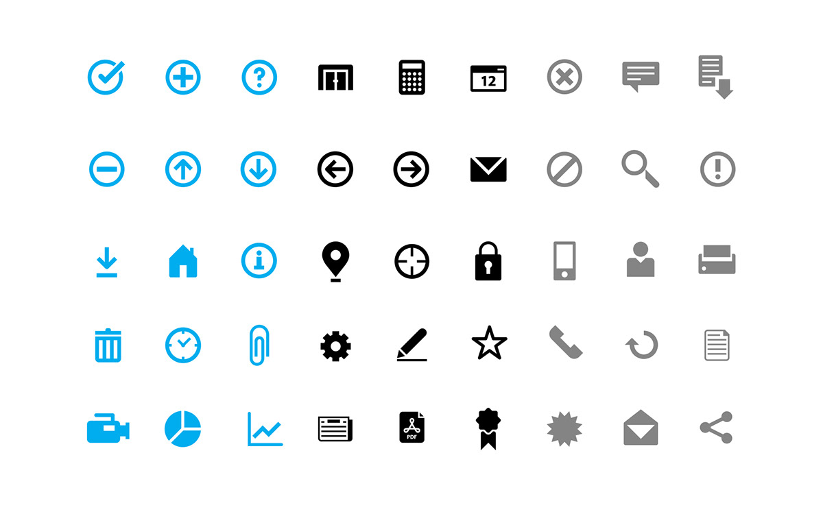
Color Variation


People Illustration Style using Geometric Shapes


Landscape Illustration


Infographic Style using Grid System


Client: Barclay's Bank
Agency: Landor
Creative Director: Craig Dobie
Senior Designer: Philippe Intraligi
Agency: Landor
Creative Director: Craig Dobie
Senior Designer: Philippe Intraligi


