
How We Get to Next
A Noxious Problem – Data Art
Data art pieces for How We Get to Next's project on air pollution.
I designed three data art pieces for A Noxious Problem – a project by Duncan Geere – a set of three articles on air pollution published by the magazine How We Get to Next.
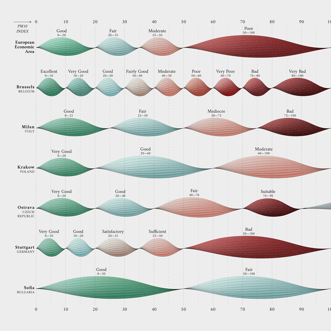
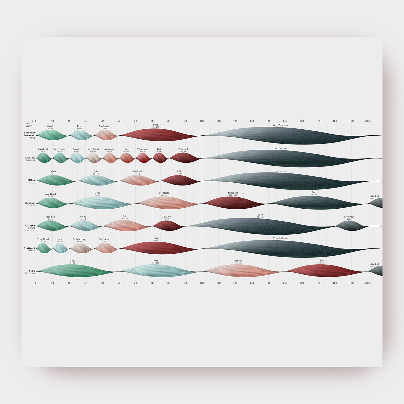
The Battle Over Europe’s Air
Article by Corin Faife
The visualization shows how different EU cities have wildly different classification systems for air pollution. PM10 refers to the density of tiny particles suspended in a sample of air.
Data: European Court of Auditors
Data art: Federica Fragapane
🎐 Instagram: federicafragapane
🔖 Twitter: fedfragapane


How Outdated Cars Live On in a Smoggy Afterlife
Article by Martha Pskowski
The piece shows how the number of used cars imported to Guatemala has increased substantially in the last decade.
Data: portal.sat.gob.gt
Data art: Federica Fragapane
🎐 Instagram: federicafragapane
🔖 Twitter: fedfragapane

The Failed Quest for a Cleaner Cookstove
Article by Gayathri Vaidyanathan
The visualization shows how in 2016, the Global Alliance for Clean Cookstoves distributed mostly LPG stoves.
Data: Global Alliance for Clean Cookstoves
Data art: Federica Fragapane
🎐 Instagram: federicafragapane
🔖 Twitter: fedfragapane


🎐 Instagram: federicafragapane
🔖 Twitter: fedfragapane


