Sherwin Williams Proposed Redesign
Project was to choose an existing company, and to redesign the logo, and make further considerations in collateral materials such as letterhead, business card, etc.
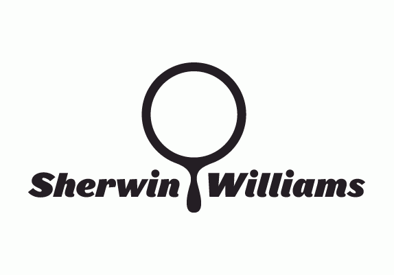
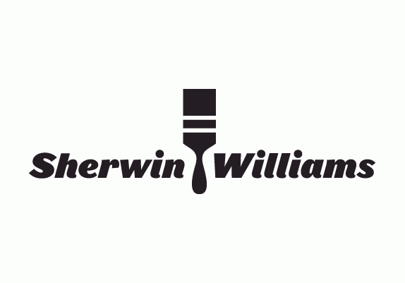
Solution
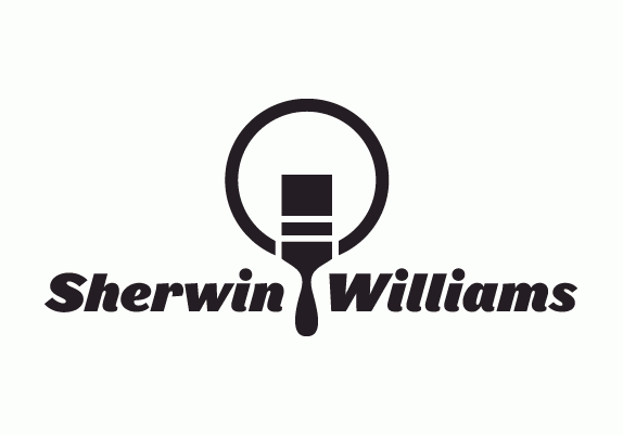
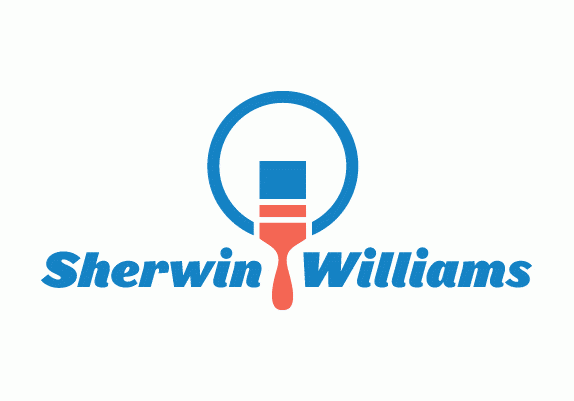
My approach was essentially to consider why Sherwin Williams would need to rebrand. Their current identity, while with history and respect, does not communicate well in the digital age. Their current mark is much too complex and busy to reproduce well across various forms of media, and becomes difficult to distinguish at smaller sizes. Also, the slogan Cover the Earth seems quite outdated, and sends mixed messages in world that is increasingly aware of conservation and sustainability.
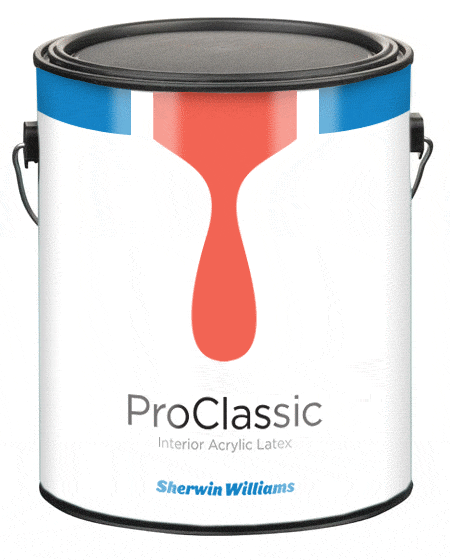
The mark that I have proposed respects certain aspects of the old Sherwin Williams mark, and its history. However, the new look achieves a number of things. It is clearly legible both large and small, and across a number of media platforms. While older audiences may relate to the current mark, the new mark appeals to a younger demographic, potentially increasing the consumer base of Sherwin Williams. The logo can appear in color, or black and white as needed, whereas the old mark would be very difficult to reproduce well in gray scale.
Overall, I feel that the update that I have presented is much needed to a company with many years of history, but that is not quite as relevant in the digital age. The changes I have made are an attempt the refresh the Sherwin William brand, and take these considerations into account.
Solution
My approach was essentially to consider why Sherwin Williams would need to rebrand. Their current identity, while with history and respect, does not communicate well in the digital age. Their current mark is much too complex and busy to reproduce well across various forms of media, and becomes difficult to distinguish at smaller sizes. Also, the slogan Cover the Earth seems quite outdated, and sends mixed messages in world that is increasingly aware of conservation and sustainability.
The mark that I have proposed respects certain aspects of the old Sherwin Williams mark, and its history. However, the new look achieves a number of things. It is clearly legible both large and small, and across a number of media platforms. While older audiences may relate to the current mark, the new mark appeals to a younger demographic, potentially increasing the consumer base of Sherwin Williams. The logo can appear in color, or black and white as needed, whereas the old mark would be very difficult to reproduce well in gray scale.
Overall, I feel that the update that I have presented is much needed to a company with many years of history, but that is not quite as relevant in the digital age. The changes I have made are an attempt the refresh the Sherwin William brand, and take these considerations into account.
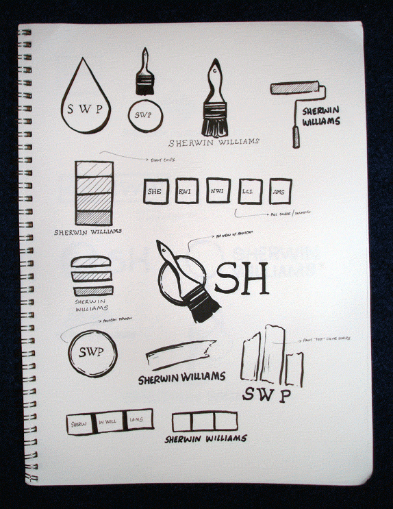
Preliminary Sketches
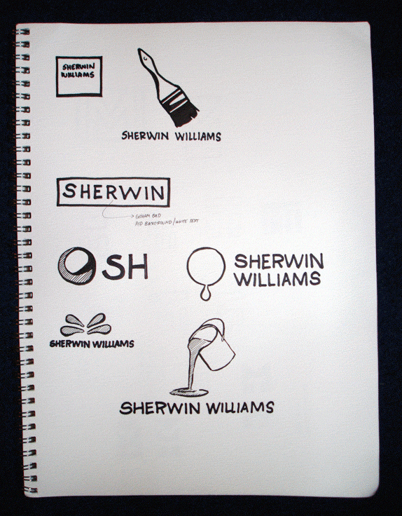
Preliminary Sketches
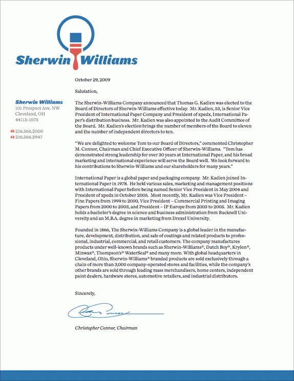
Letterhead Application

