For the past months I started to look into what would make a relevant and challenging new design side-project. Something tough, no great photography, no edgy typography, no fancy shattered grid work... not another designer's cozy place. Something real with multiple touch points, heavy architecture requiring consequently heavy UX solutions, empathy for millions of users and in the end, hopefully, a more appealing and functional version of whatever it would be. Two options were retained I love to hate using: LinkedIn & Apple Music. This case study took me roughly 4 weeks of evening and night work.
Apple Music is relatively new on the music streaming scene. I subscribed from day one because A) it was integrated to the Apple ecosystem I was using everyday and B) I was conscious it was far from ideal but also curious to see how Apple would polish this and infuse their traditional design expertise.
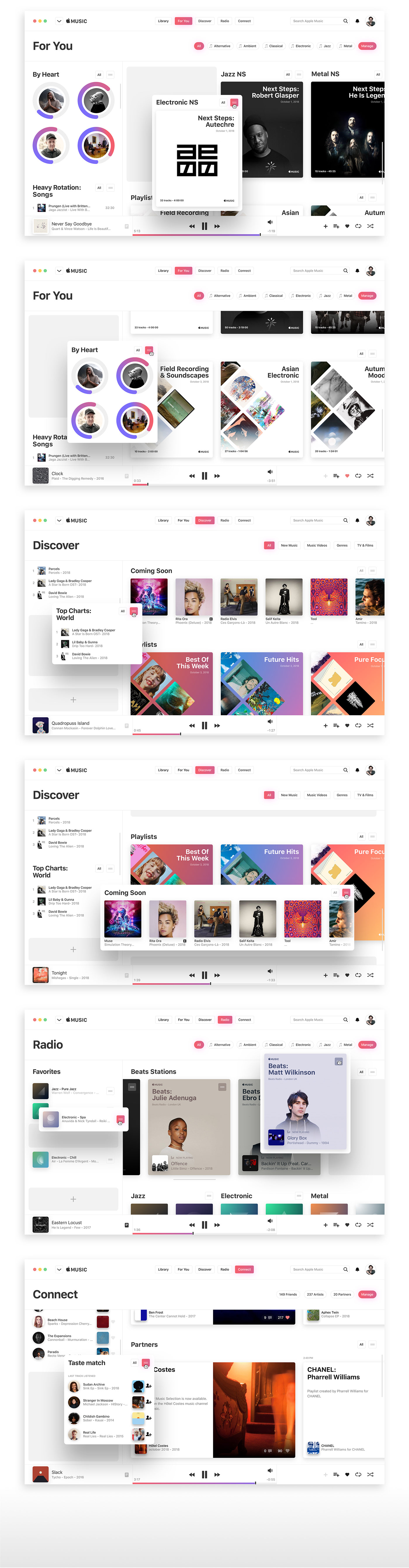
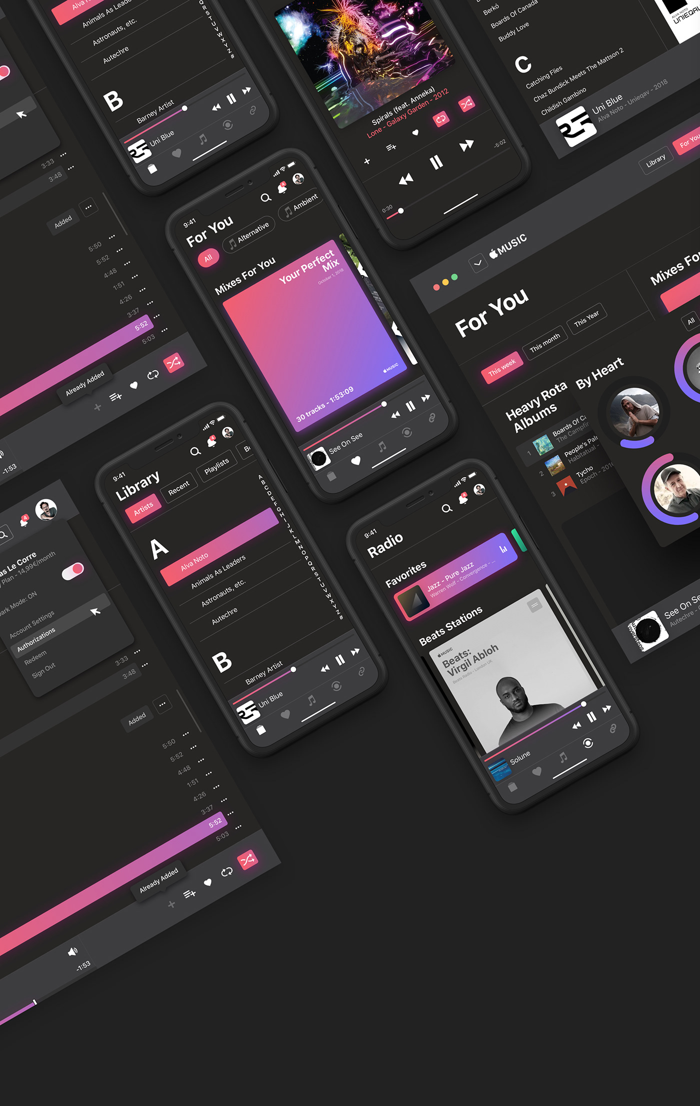
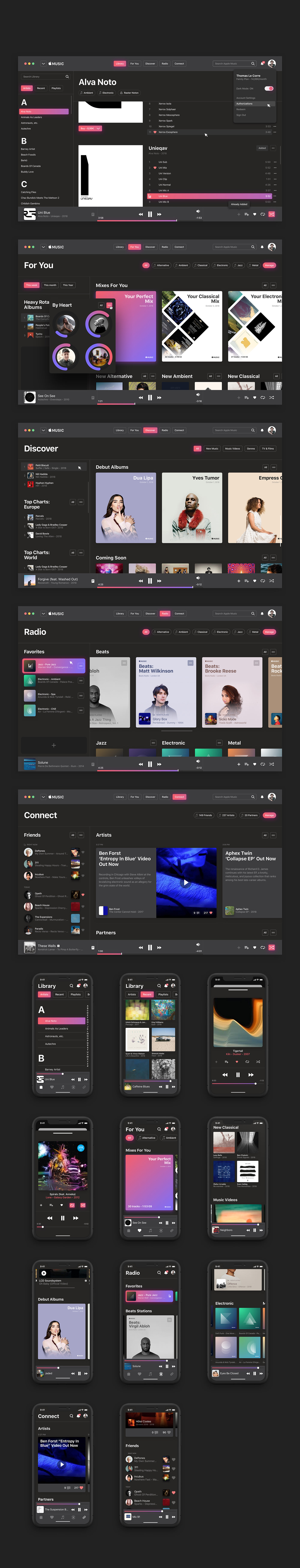
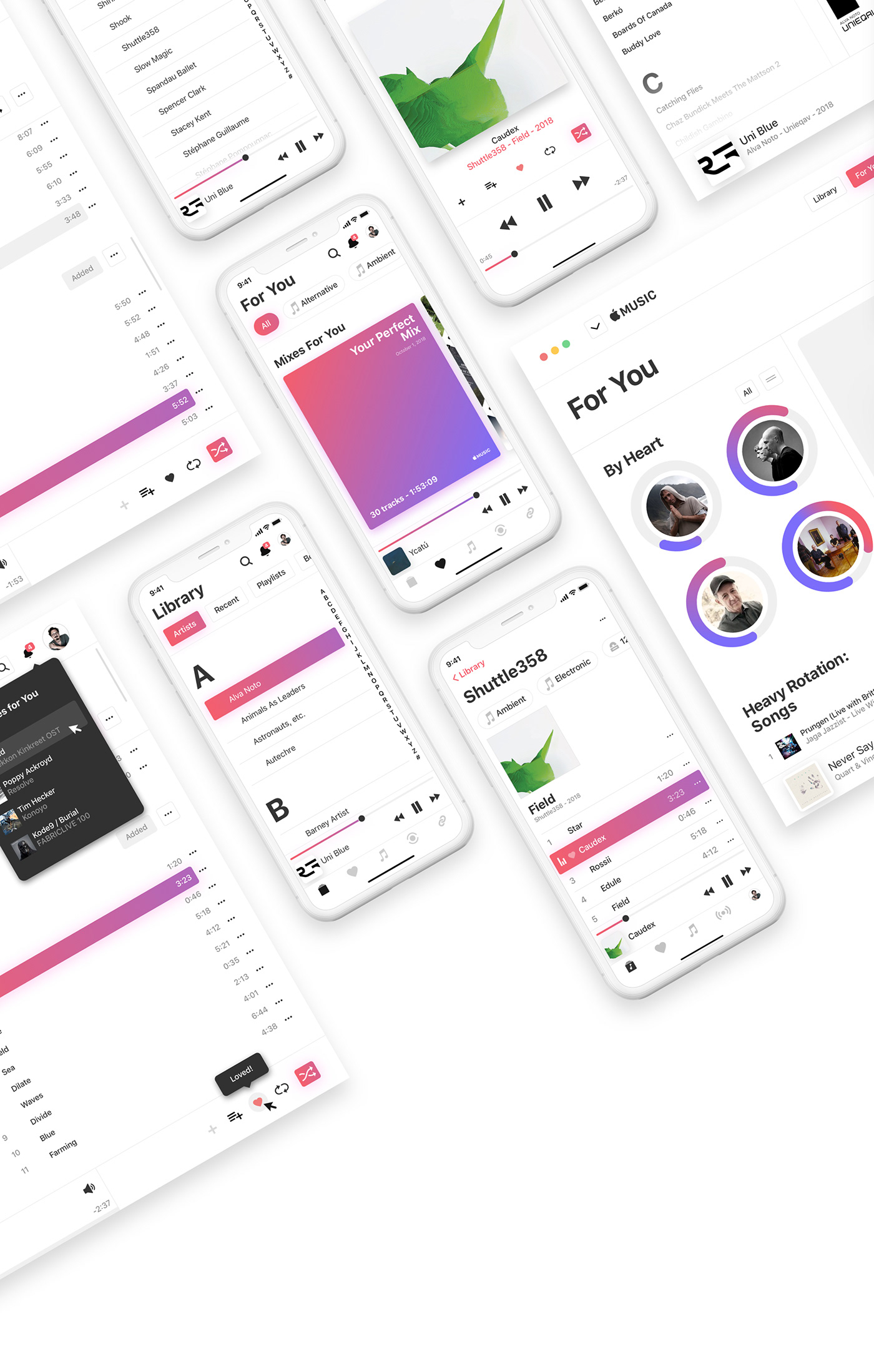
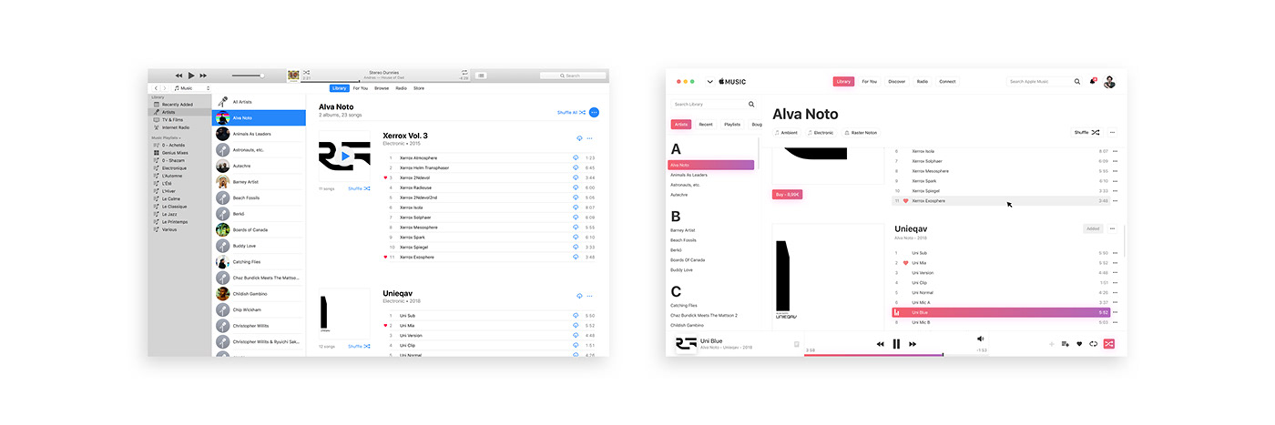
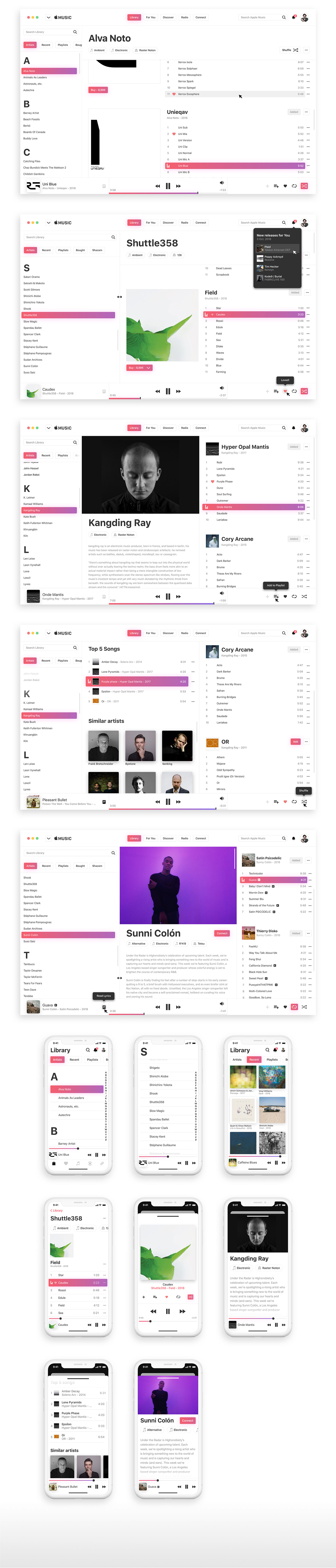
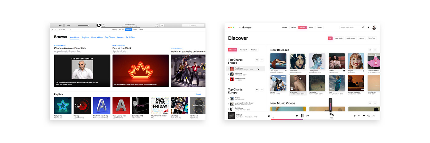
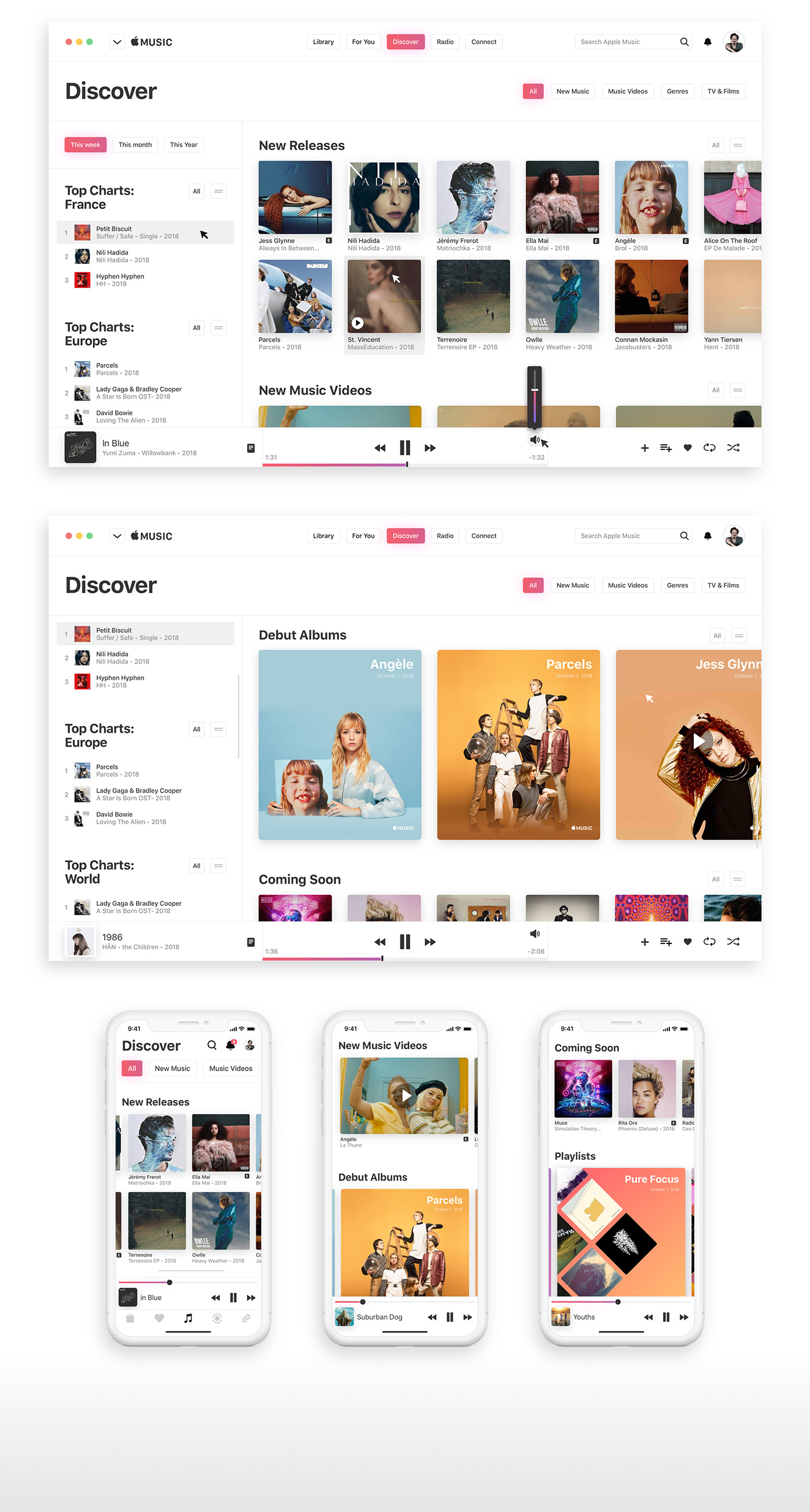
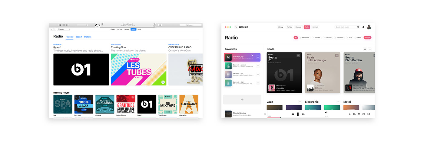
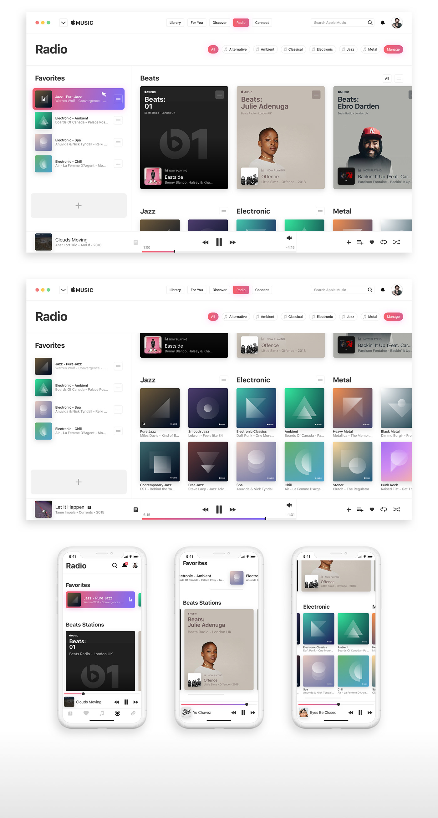
And this is slowly happening, the mobile app is driving every design iteration as new waves of users keep flowing in but it still feels clunky sometimes, and the desktop app especially needs a solid update. So I’ve been mainly focusing my attention on the Desktop app, but further down you will find some mobile screens as well.
I’ve been using the app for a while now so this case study is mainly based on my own assumptions. However, about design and experience, I also talked to people and read many feedbacks.
Here a few common feedbacks:
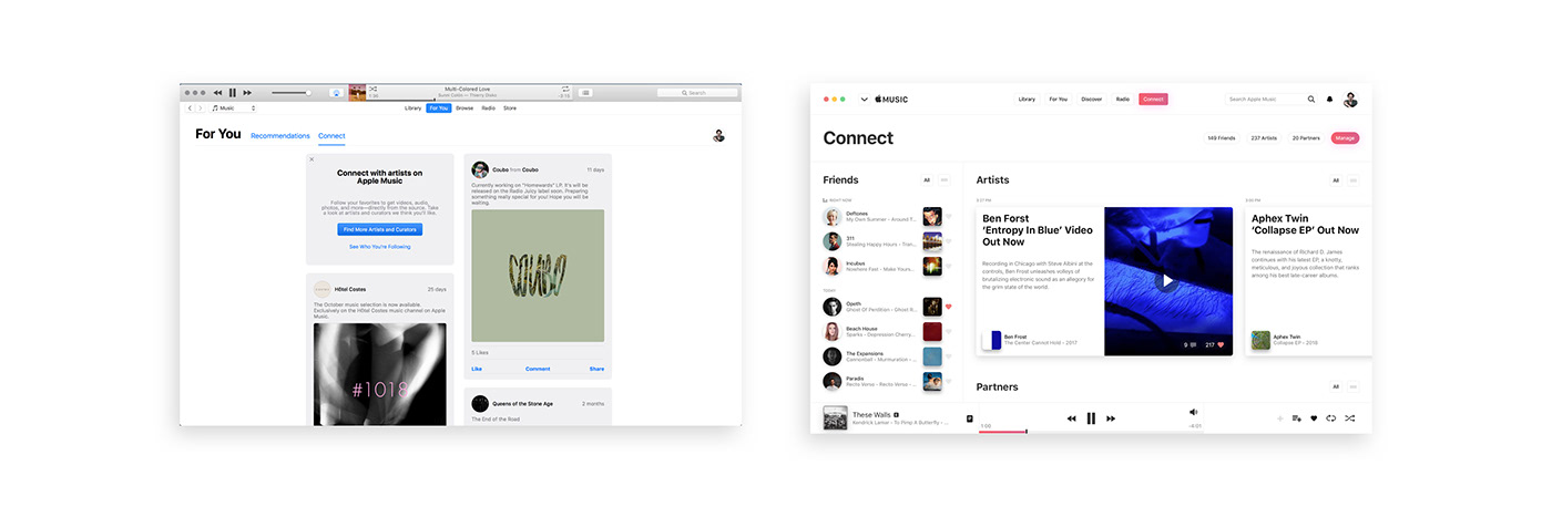
- “Outdated iTunes layout on desktop”
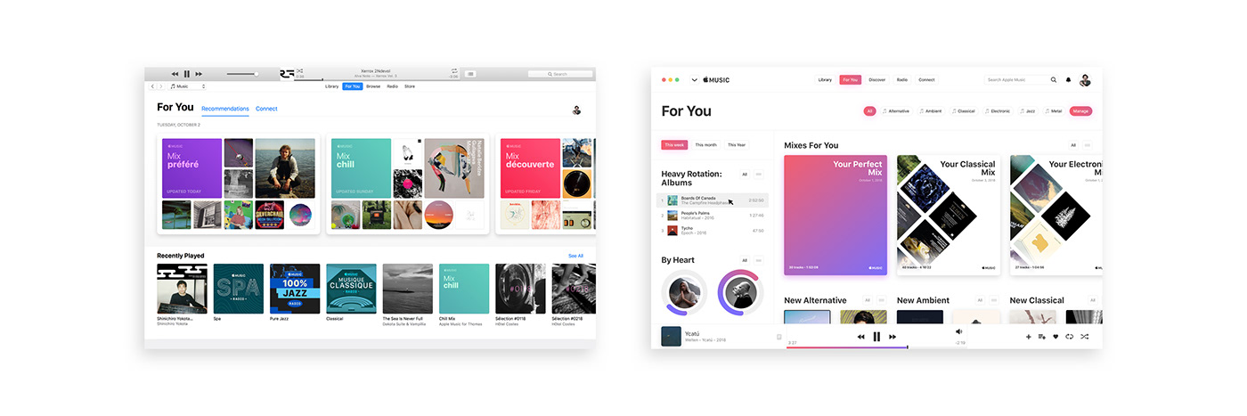
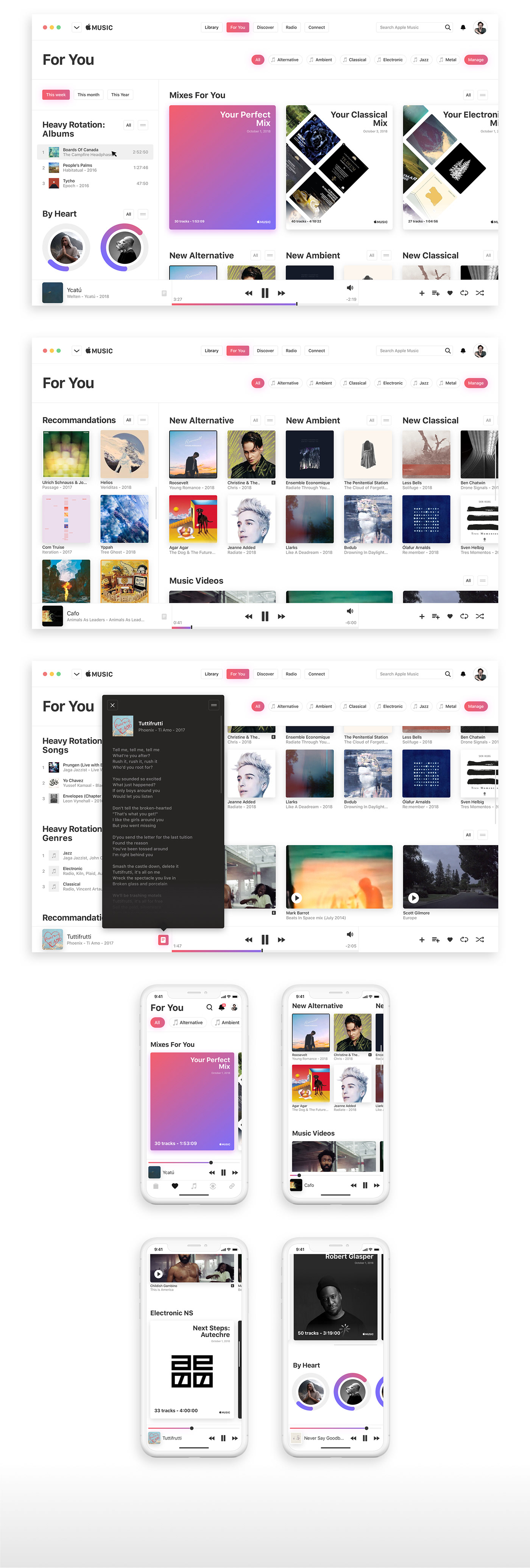
- “Too little emphasis on the user’s own music library and too much emphasis on always recommending something new.”
- “I don’t listen to today’s music and there’s a lot of it, I’d rather not see it.”
- “My recommendations are full of artists I have no interest in. Also very heavily in only one genre of music.”
- “The Music app is full of some slightly confusing behaviours.”
- “Having a little bit of personality doesn’t hurt.”
And here’s what I tried to keep in mind:
- Harmonise, Desktop and Mobile should look like one
- Create something you would like to use yourself
- Keep the big picture in mind, think about all the devices out there
- Keep it simple, remove anytime possible
- Make it feel personal, introduce customisation
- Don’t check what other Music Streaming Services do
- Don’t check what fellow Digital Designers did already
Full case study available on Medium.
Library
For You
Discover
Radio
Connect
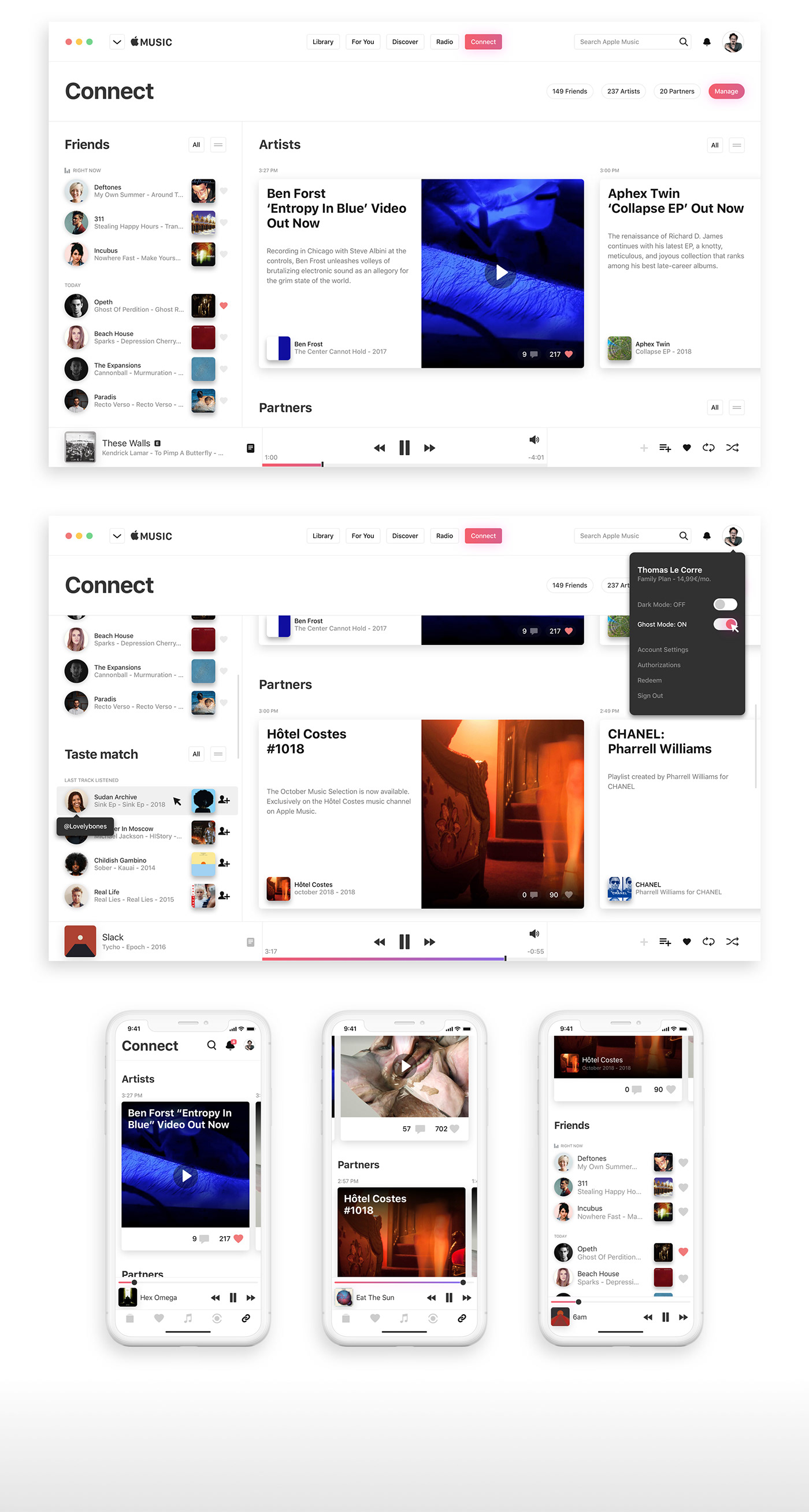
Customise
everything