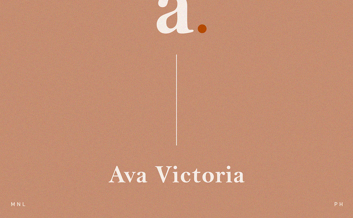
Self Branding
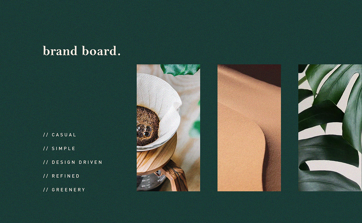
Simplicity and refinement .
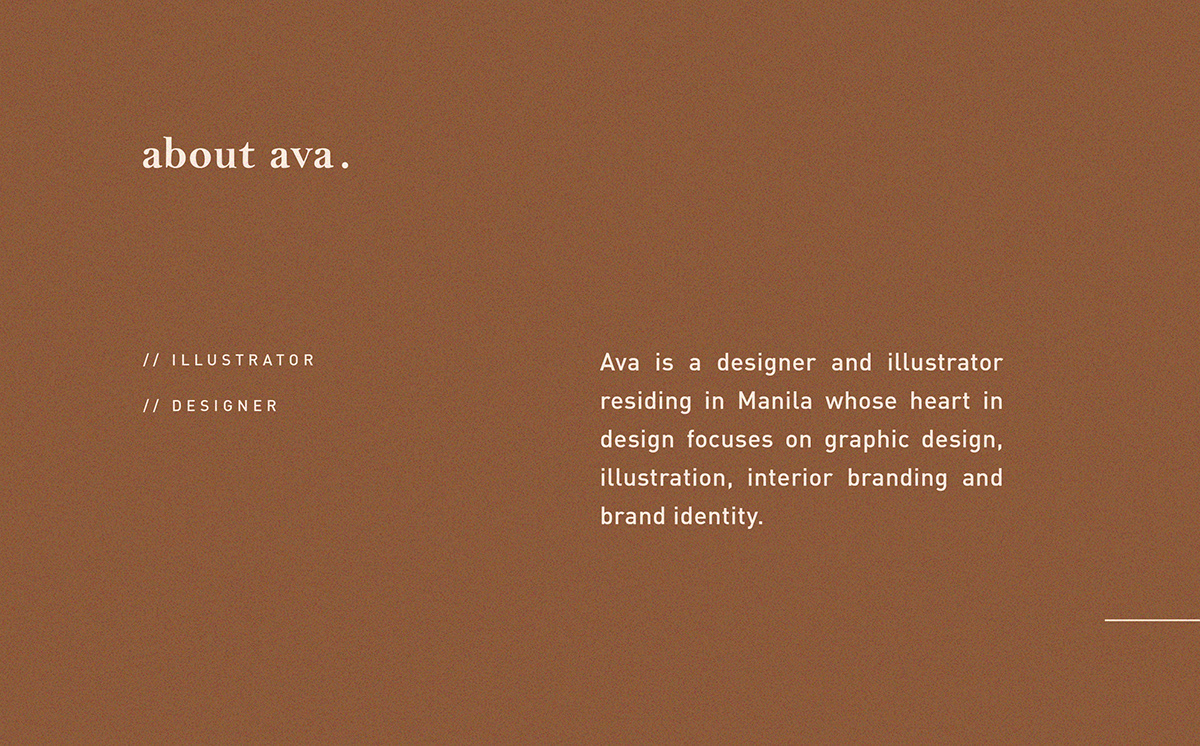
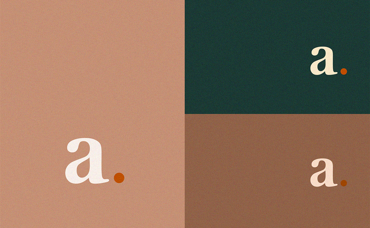
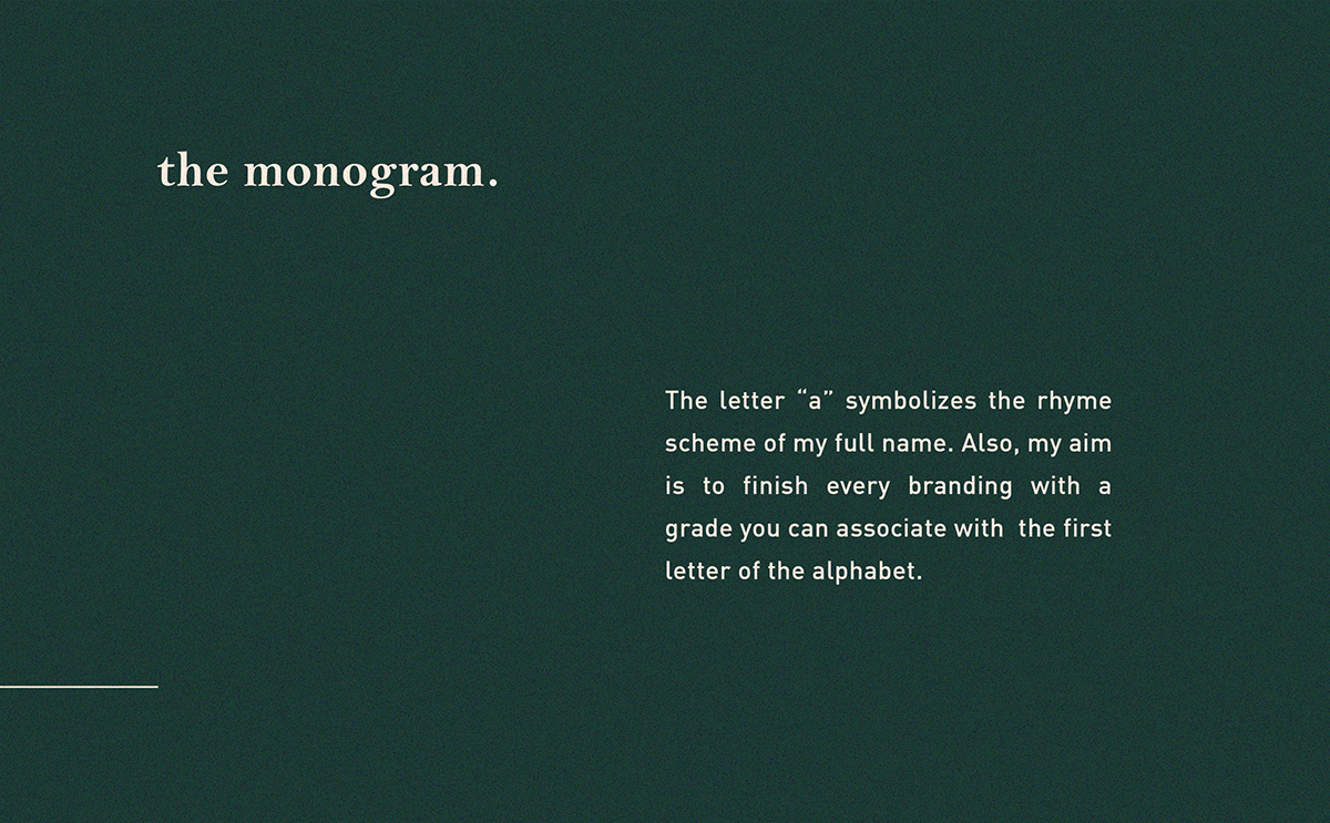
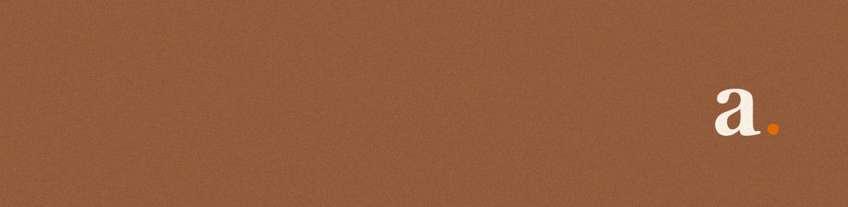
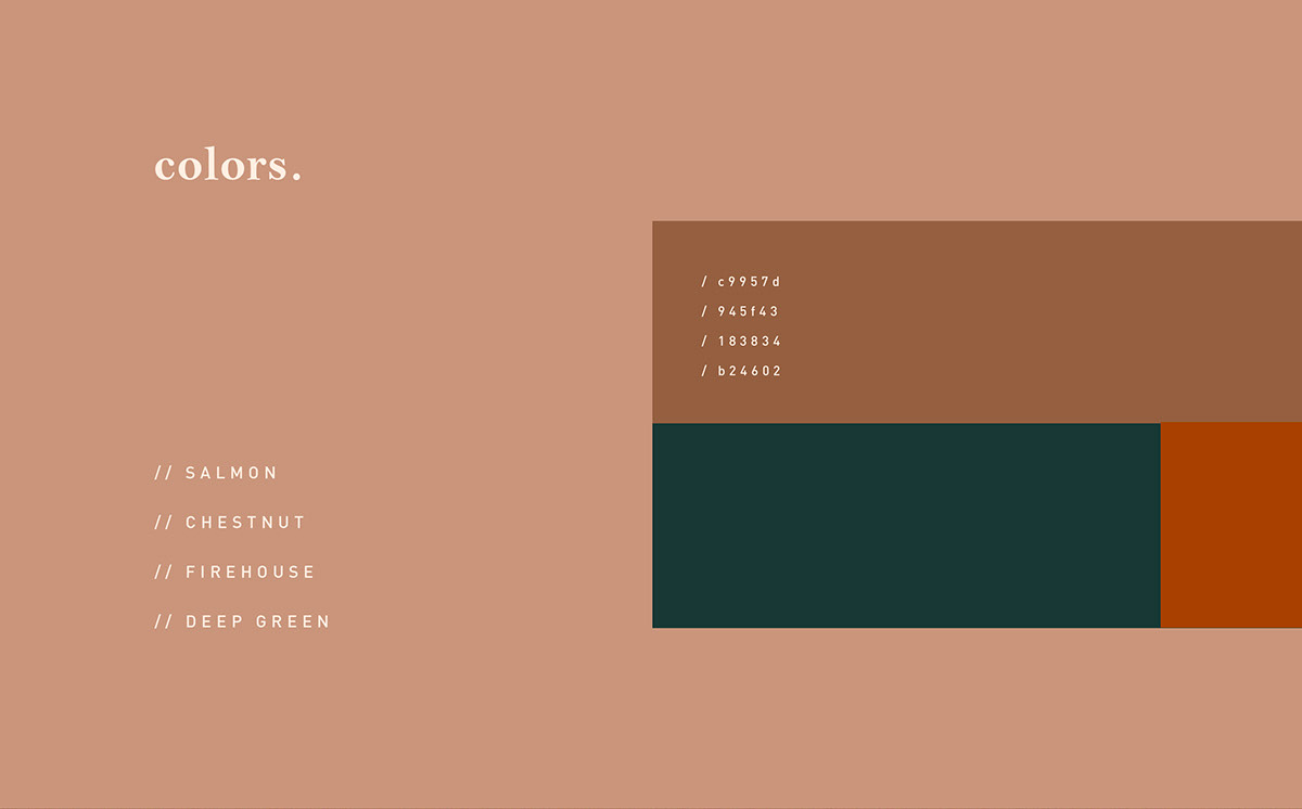
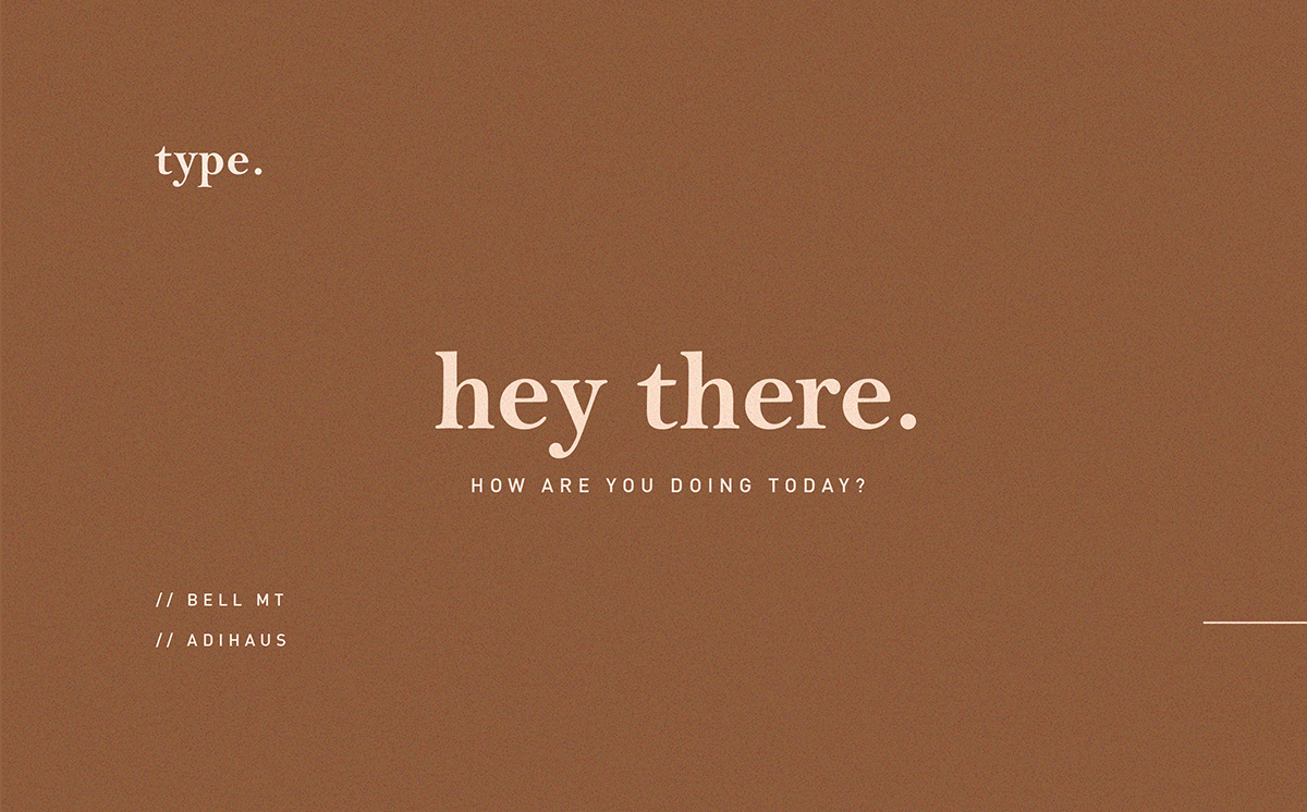
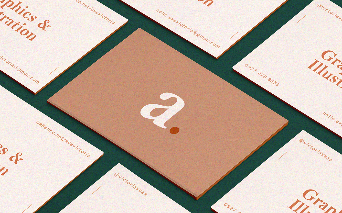
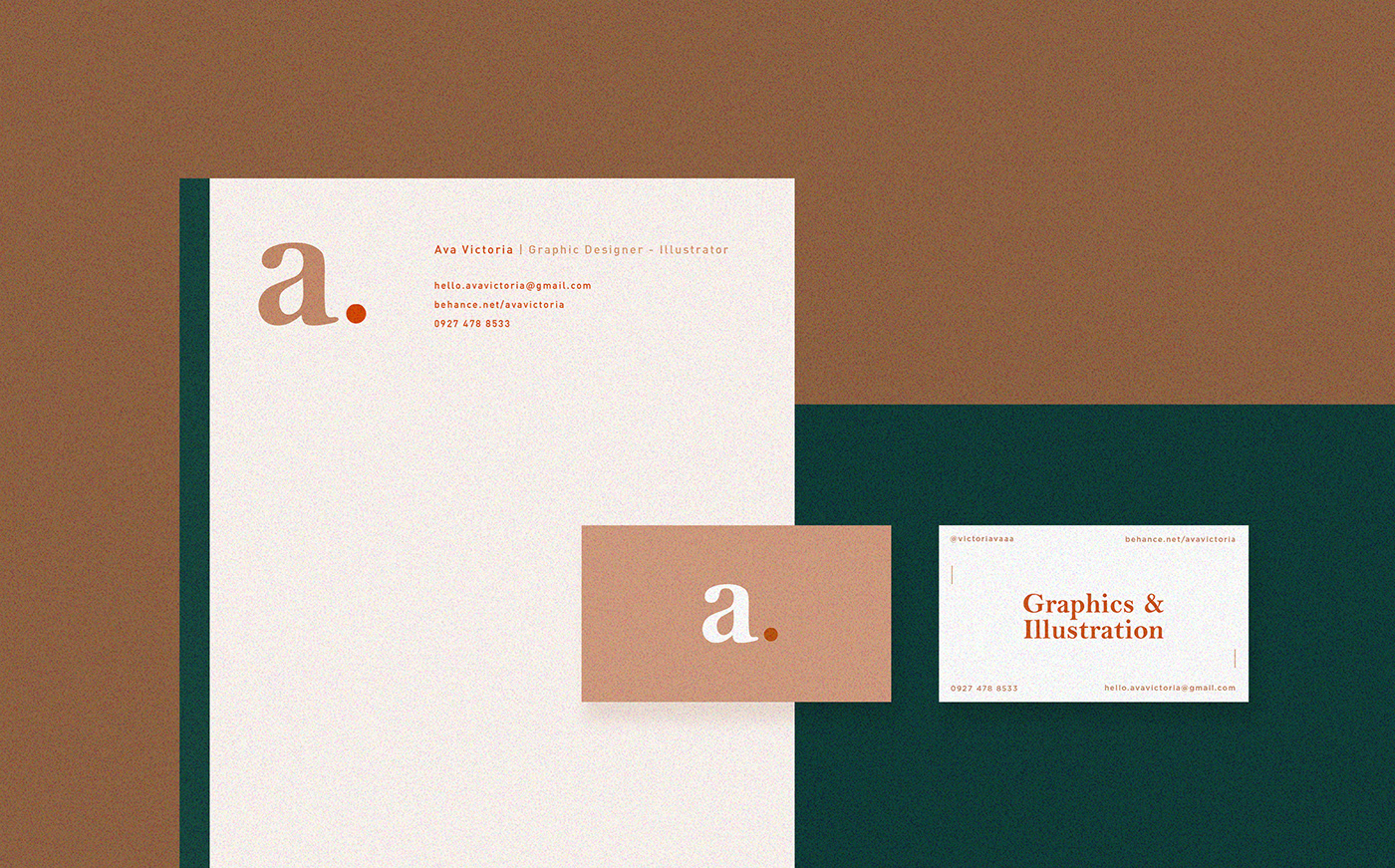
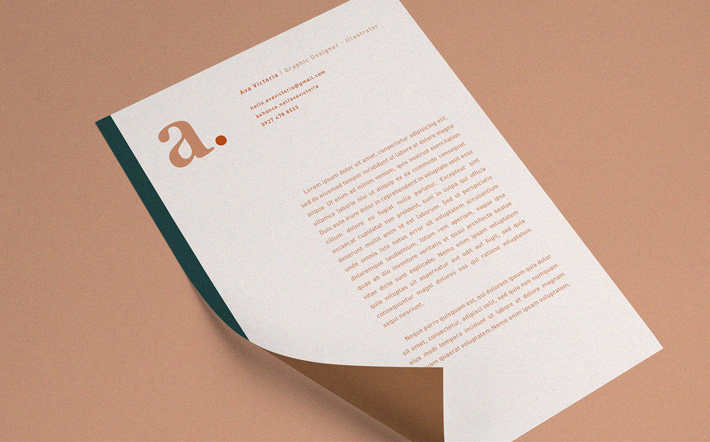
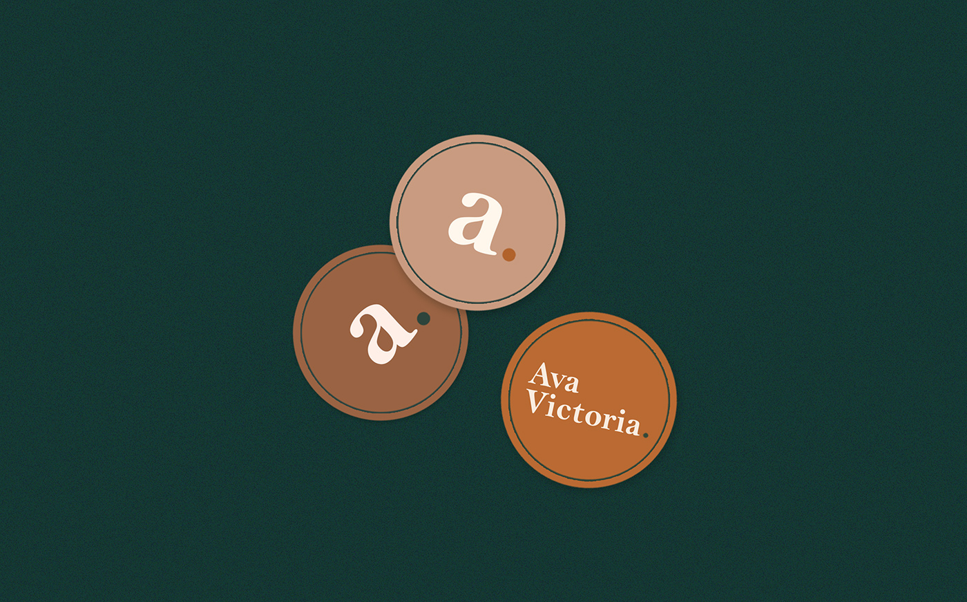
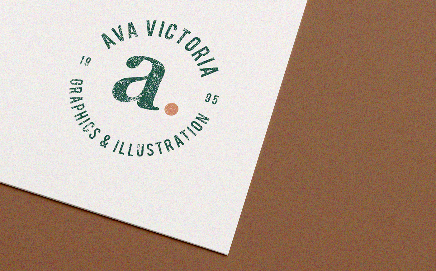
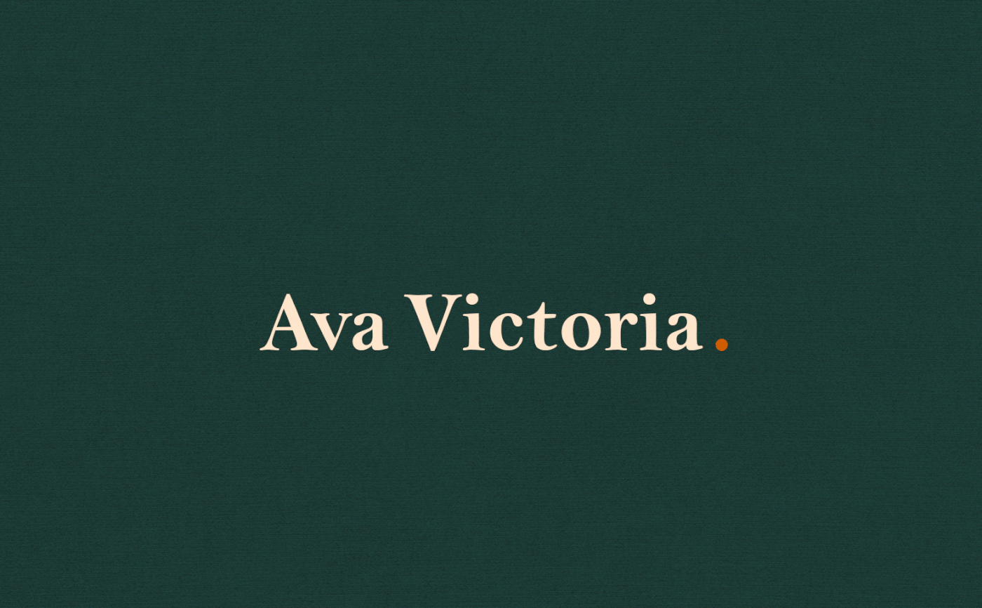
I used “a” as my monogram because this letter is the rhythmic pattern anyone would hear if they were to speak of my full name. Also, my aim is to finish every branding with a grade you can associate with the first letter of the alphabet. Serif font is also used to establish a premium look. The colour scheme I chose can be seen anywhere for it mirrors the colours of nature. Overall, my designs display elegance yet remain harmonious to anything and anyone.
//