Ryan Ruud Identity
Multimedia Specialist
Multimedia Specialist
Ryan Ruud is an entrepeneur from St. Cloud working within the realms of mass communication, broadcast, social media and PR. He came to me seeking for a visual way to help simplify his identity and sell himself to his clients. Specifically, he wanted clarity within the design, because he is routinely asked "So what exactly is it that you do?"
With a website on the way, and a visual identity that includes a logo, business cards, a resume, and a Twitter background, I was able to help Ryan focus his talents to communicate to his potential clients or employers exactly what he can do for them.
------
Armed with a color scheme that "incorporates blue", and his personal slogan, "Pulling strings since 1986!", I gave him an identity that is both very modern and very clean, focusing the attention on Ryan. In his field communicating ideas clearly is critical to success, and this design uses simplicity and economy to stress his brand. I focussed on lines, or 'strings,' as the components that made up his idenitty. Through the use of line I emphasized broad ideas such as "lines of communication", that help create "social networks" via the web. The "/" element was used to emphasize its dynamic, forward, and ascending imagery, which is what Ryan does for his clients. He is literally pushing them into modern marketing and PR practices with positive (and proven, check out his resume!) results.
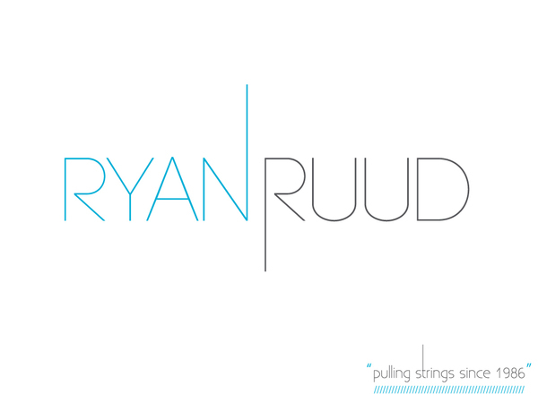
Ryan Ruud Logo Identity w/ slogan. Customized "Code Light" Typeface (which is an absolutely fabulous open source font!)
Modern + Clean
Modern + Clean

Business card, emphasizing the "/" element through repetition and a cut corner.
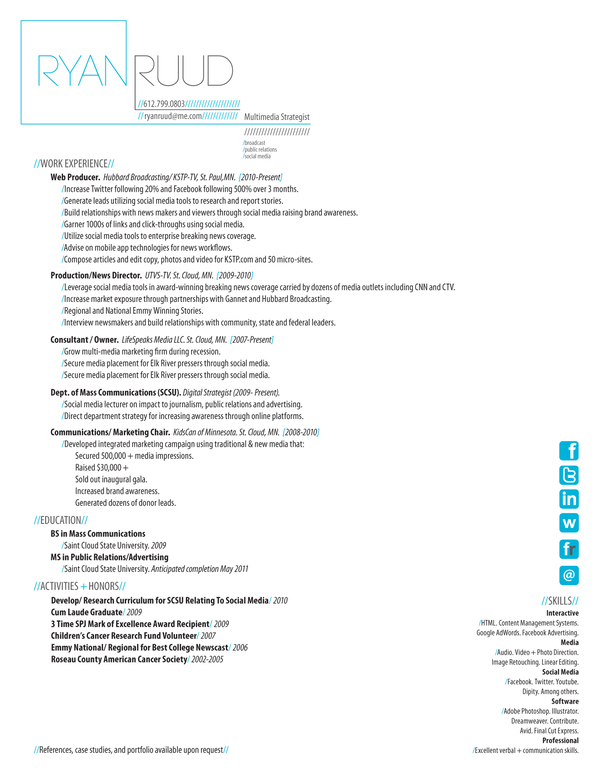
Ryan's resume, which is customizable depending on the position. Icons were added to further emphasize the importance of his social media experience.
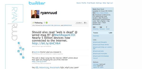
Snapshot of Ryan's Twitter page.

