
Paul Rand Book - How Paul Rand Changed Graphic Design
This short book describes Paul Rand's techniques of using whitespace, different fonts, and abstract designs that changed Graphic Design in Modern Graphic Design.
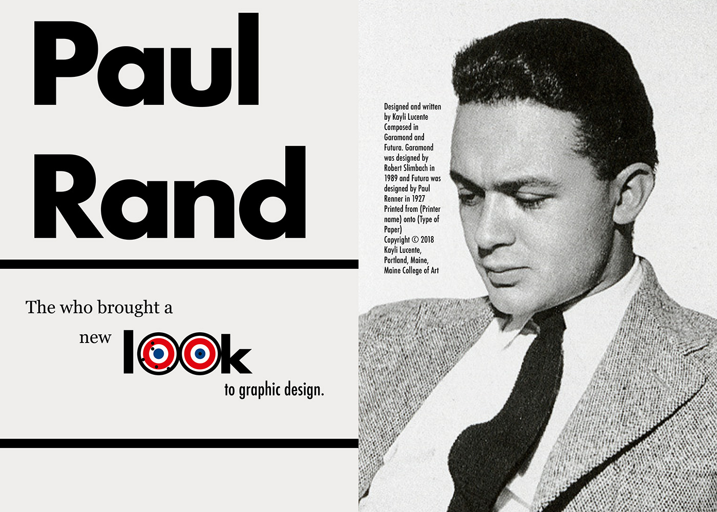
(Final version of the book.)
When I first received this project, I began to research multiple sources that explained Paul Rand's experiences and life-story. I wanted to learn why his style was iconic or why was his advertisements were extremely popular.
What made Paul Rand popular? Why was his designs different? Why was he the Rebel of Design?
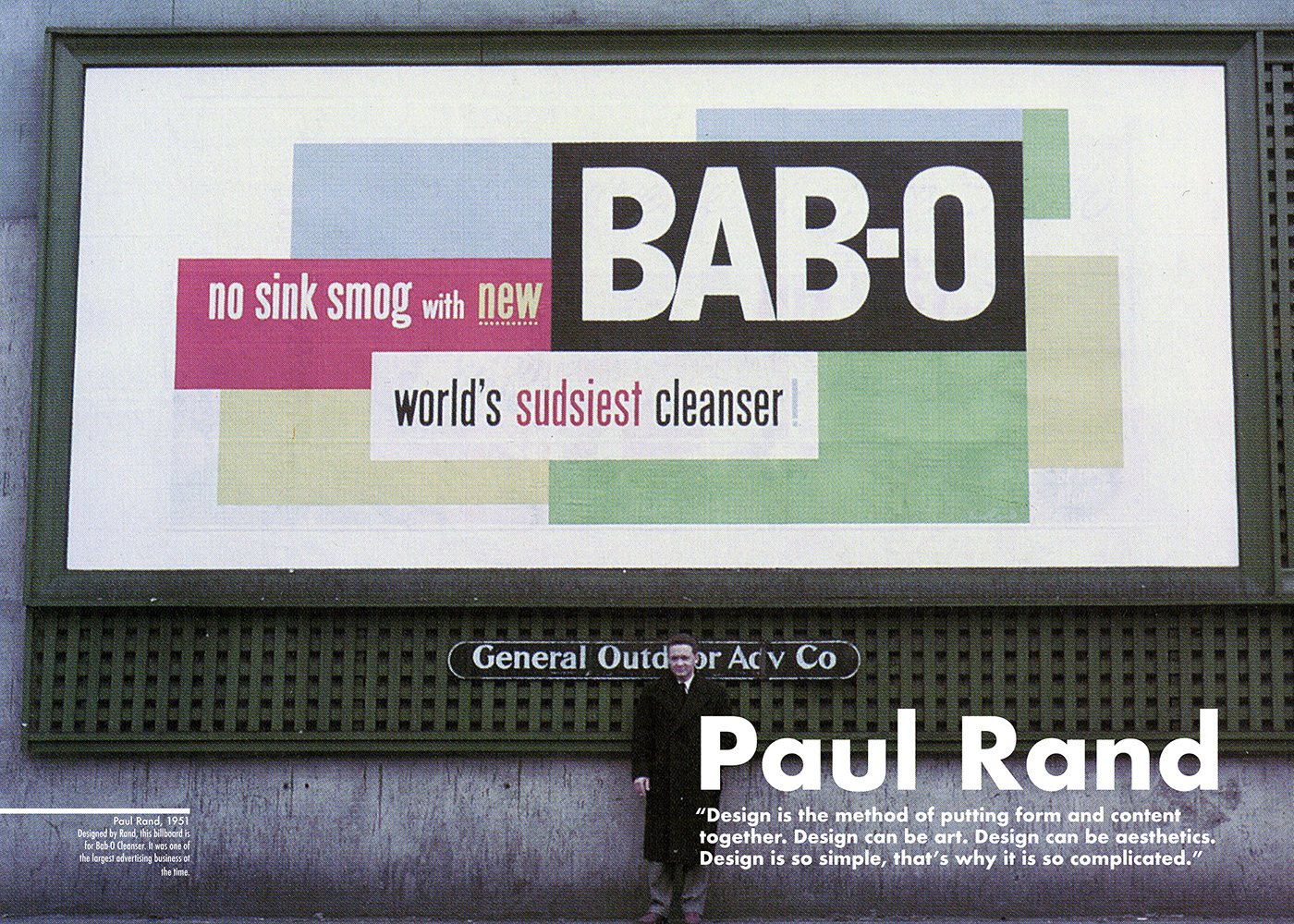
Once I had all my information gathered, I began to piece the book together page by page or spread by spread. I wanted the front cover to have a quote or a picture that would suck the viewer in.


(On the left: My first design for the book. On the right: My second attempt.)
With both designs I tried to communicate the main idea of Paul Rand's advertisement. The first design prorated my message, however the second design did not. The second design was inspired by Rand's style rather than his advertisement.
(Final version of spread one.)
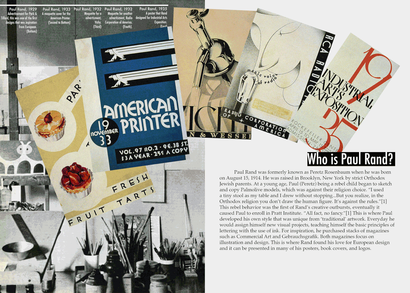
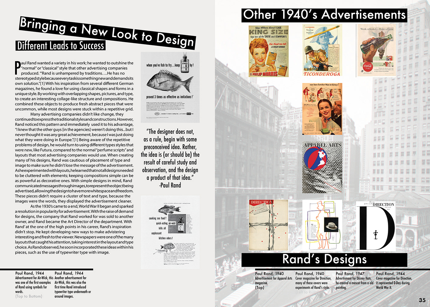
After I completed the first spread, I began to experiment with the second spread. I wanted this spread to explain who Paul Rand was and how he became the "Rebel of Design." I wanted to showcase examples of his designs and how they improved over the years.
(Design process of the second spread. I created two different versions.)
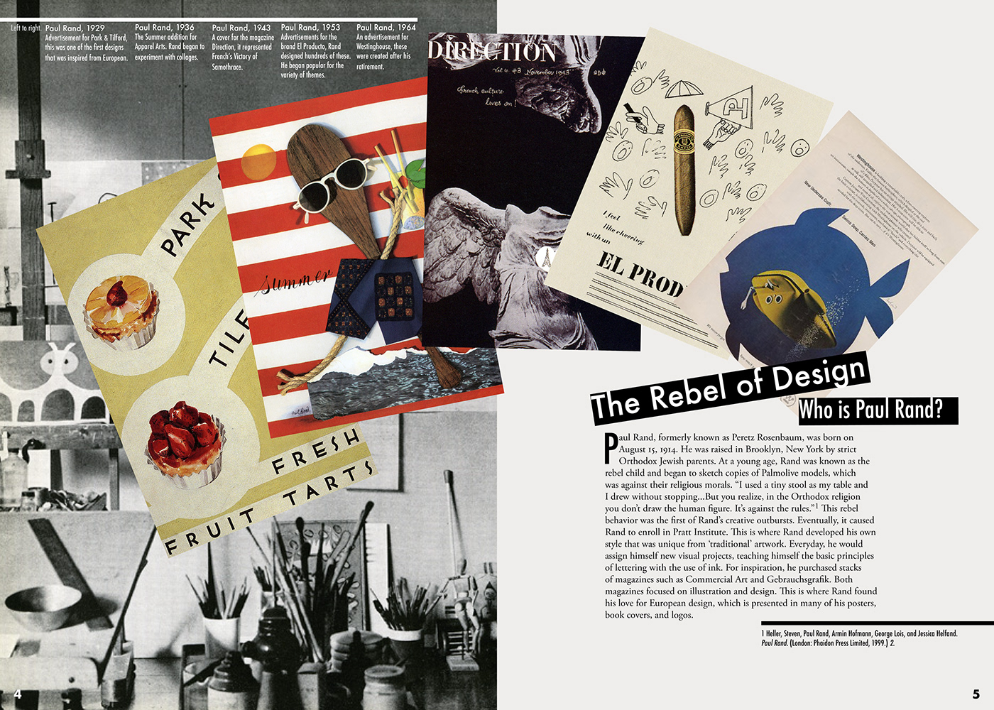
(Final design for spread two.)
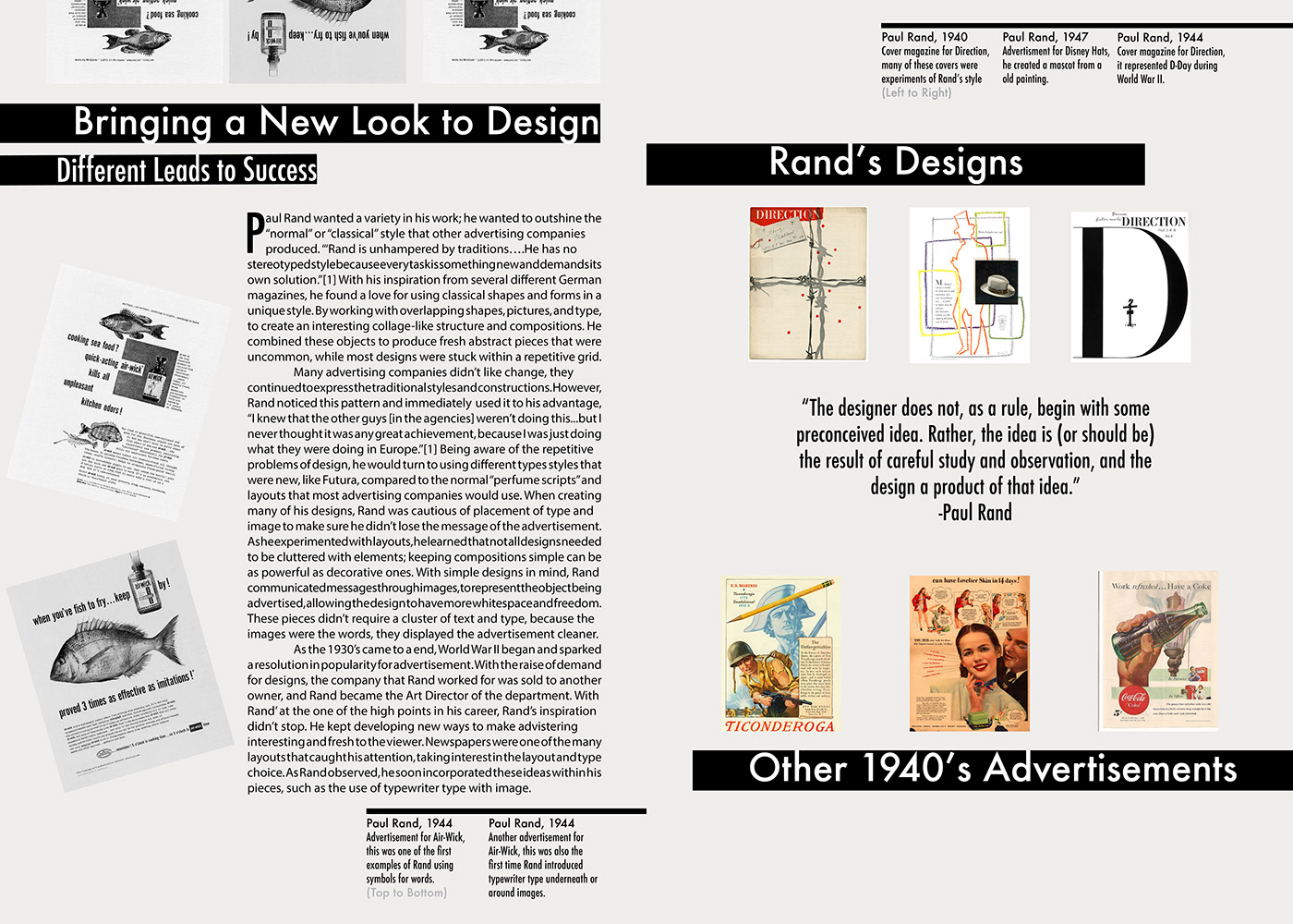
Next, I created some rough designs for the second spread. I needed to display Rand's posters or advertisements and how they were different from the current designs from other advertisement companies.
I described how Rand used his techniques of using whitespace, different fonts, abstract designs and unique compositions to create modern-like designs.
(Two rough designs for the third spread. I wanted to compare Rand's work to other advertisements at the time.)

(Final design for spread three.)
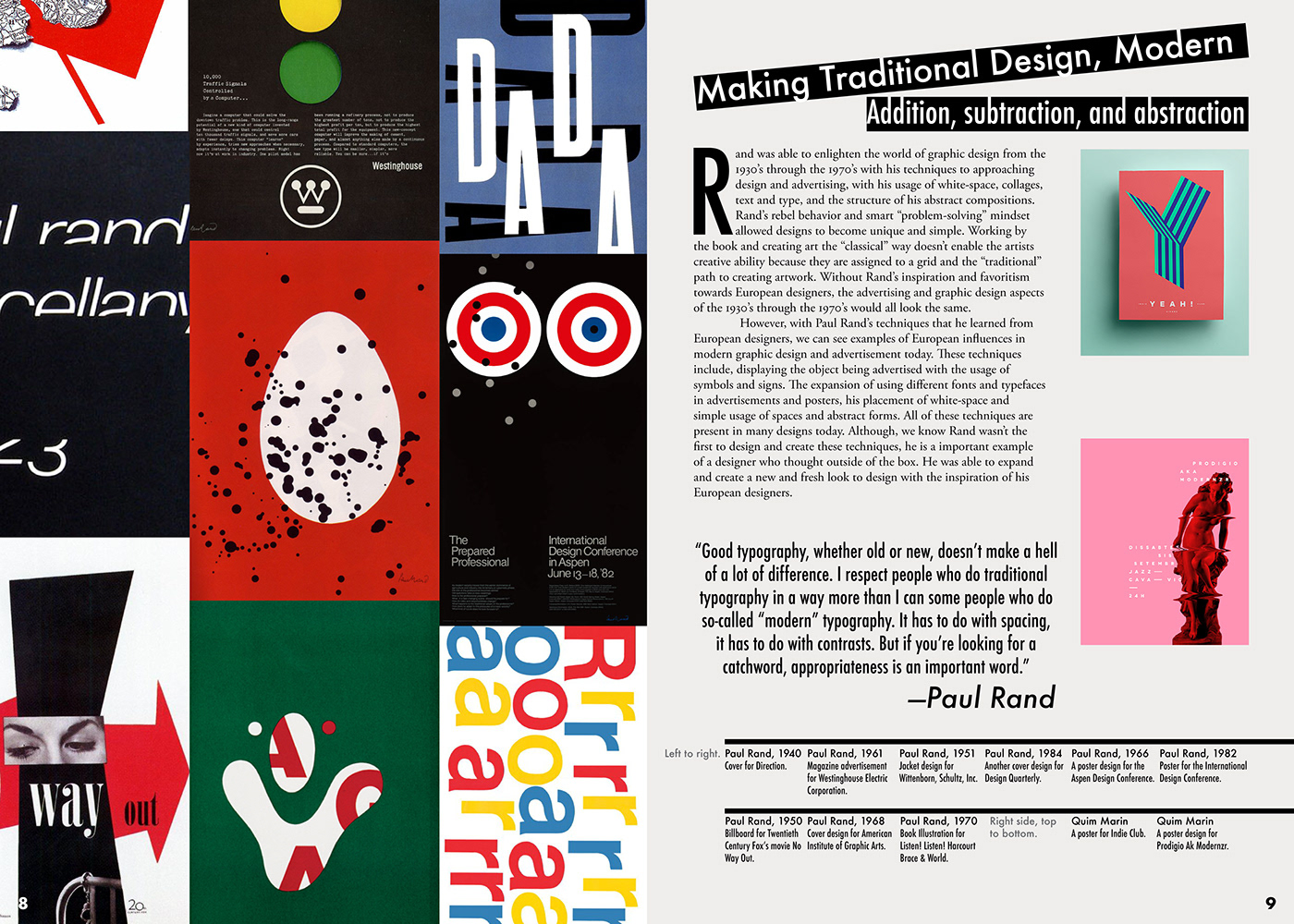
Afterwards, I created the fourth spread. I wanted to explain how Rand's work and inspiration from European designers paved the path for modern graphic design. I included some of his work that seemed more "modern" compared to his older work, which were traditional and boring.
I incorporated a few examples of modern design today to compare Rand's later work. You can see some similarities between the two. The similarities being, the usable of whitespace, and abstract compositions. I compared Paul Rand's style to Quim Marin, who is a modern graphic designer.
(Final design for spread four.)
The fourth design didn't change much from the first design that I created for it. There was small details that I ended up revising, but this ended up being the final.


(Some examples of the last spread.)
(Final design for the last page.)
For the last spread, I wanted to give the reader the idea that this is the end. I tried to portray Rand a working environment. I needed a clean photo of him, one that mainly took up the entire spread. I originally had a quote that explained his thoughts on typography and design, but I noticed that the quote seemed odd by itself.
After a few experiments, I decided to place the quote on the pervious page (spread four) where it ties the page nicely together.
(Some designs for the front and back cover for the book.)

(Final front and back cover for the book.)
Finally, I created several spreads that displayed Paul Rand and his work. I needed the front and back cover to pop and grab at the viewers attention. I tried reusing and revising the spread that I tried in the first pages, but it didn't seem to give the message across. I also attempted to have Rand on the cover in a newspaper style; I even included some of his famous designs.
However, I felt these two designs weren't enough to give my message across or catch the viewers attention. So, I finally experimented with a simple cover. This cover was Paul Rand's famous logos, the IBM logo.This black cover catches the viewers attention, plus it includes a lot fo whitespace, which Rand would approve. The logos represent Rand's work and techniques, just as I wanted.
Overall, the book was a wonderful learning experience. I learned that it's okay to be different and unique. Paul Rand is a great example of using and breaking a grid, along with experimented "outside of the box."


