
Tea Patterns & Lettering
My lettering work naturally gravitates towards a more illustrative approach. I like to surround the text with related imagery or enclose pictures within words. For this project, I wanted to explore ideas where the lettering took a backseat, allowing the illustrations to become the focus.
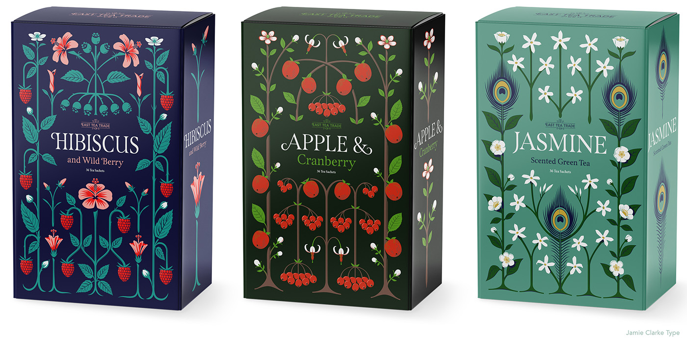
I read an article saying that tea drinking is in decline in England and, as someone fuelled by tea rather than coffee, I thought I would show some solidarity with the beverage. Eventually though, the fruitier blends offered more scope to play with ideas rather than my usual builders' tea.
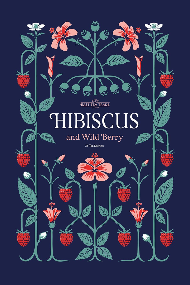
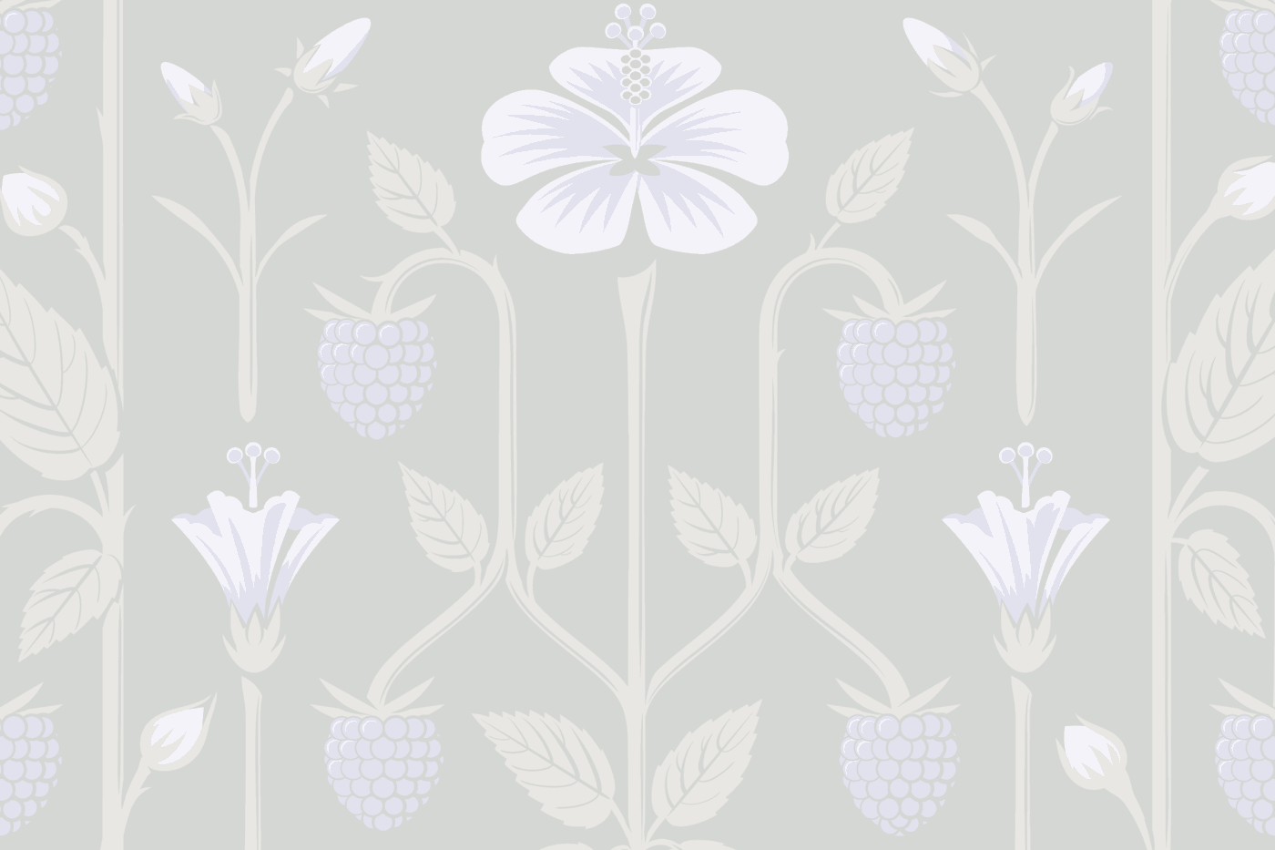
Hibiscus and Wild Berry Tea. I managed to work in four stages of hibiscus flower development into the design, from bud to fully open flower.
When blending illustration and lettering I find it best if the imagery adheres to a simple pattern, usually involving some symmetry. William Morris advised that “structure is a wall against vagueness” and with this in mind, the overall designs follow an underlying grid.
Principles that I normally apply to my type design, such as rhythm, uniformity and clarity and various sizes all play a part. Indeed, most of the imagery was drawn using the same process and tools as I use for designing type.
I’ve aimed to simplify all the shapes and avoid the curls and swirls or 'over-abundant embellishments’ as described in Steven Heller’s article Cult of the squiggly.
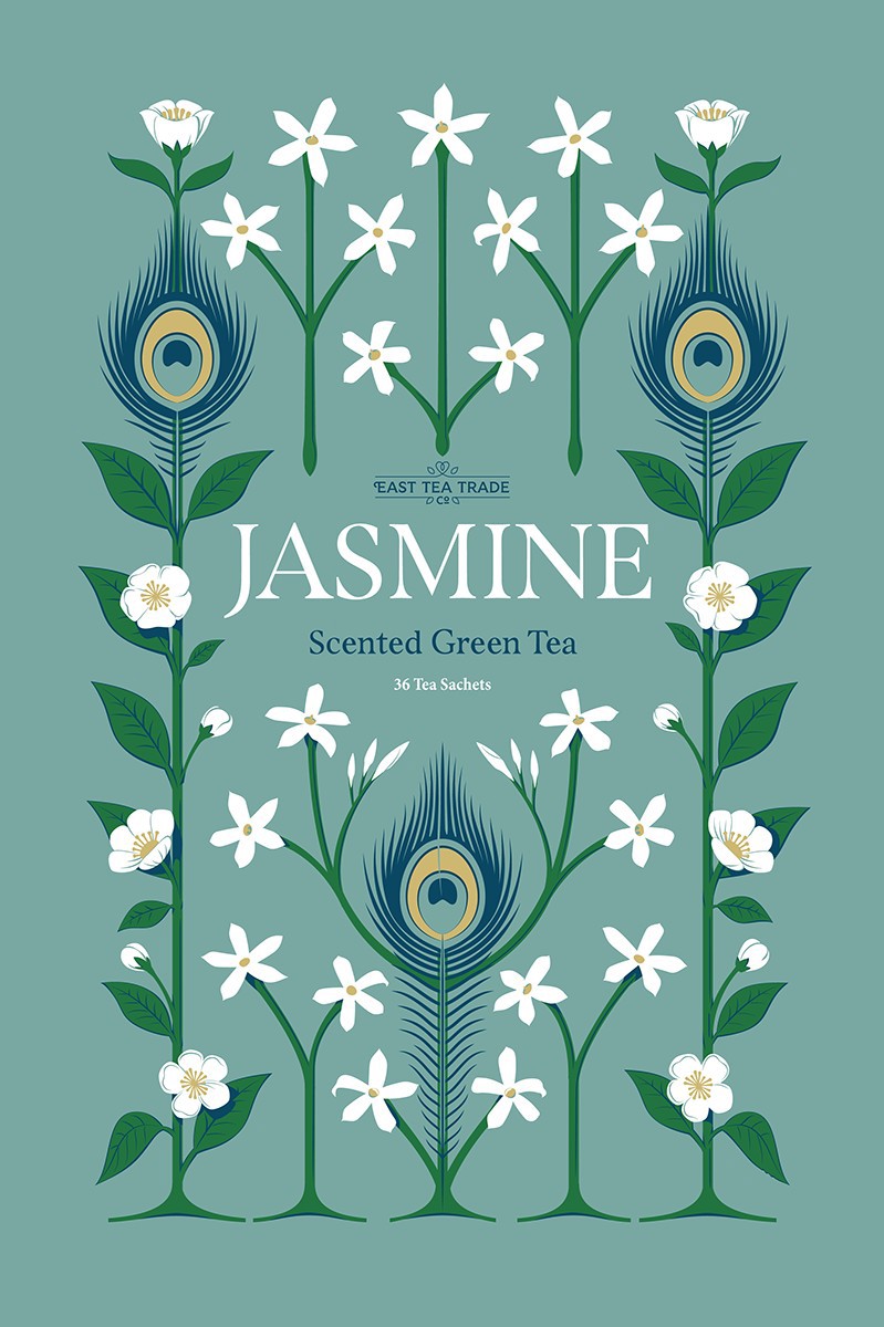
Jasmine Tea. In China, where the majority of Jasmine tea is produced, the peacock feather symbolises dignity and beauty.
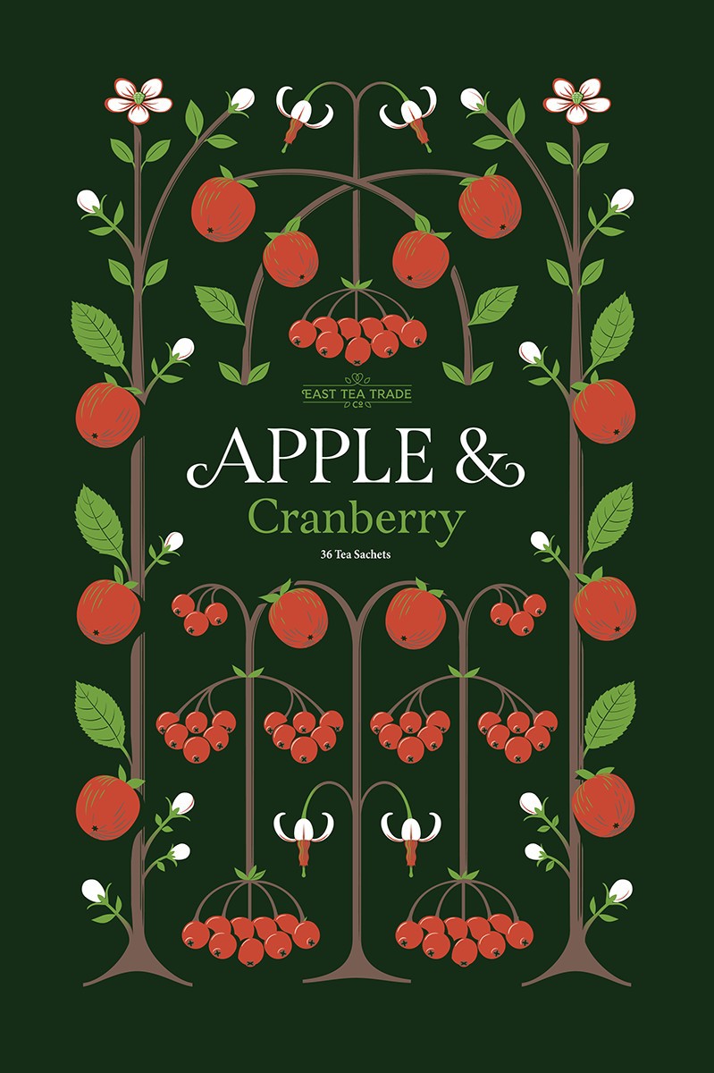
Apple and Cranberry design. Cranberry flowers have a beautiful and distinct shape which worked really well in the limited colour palette
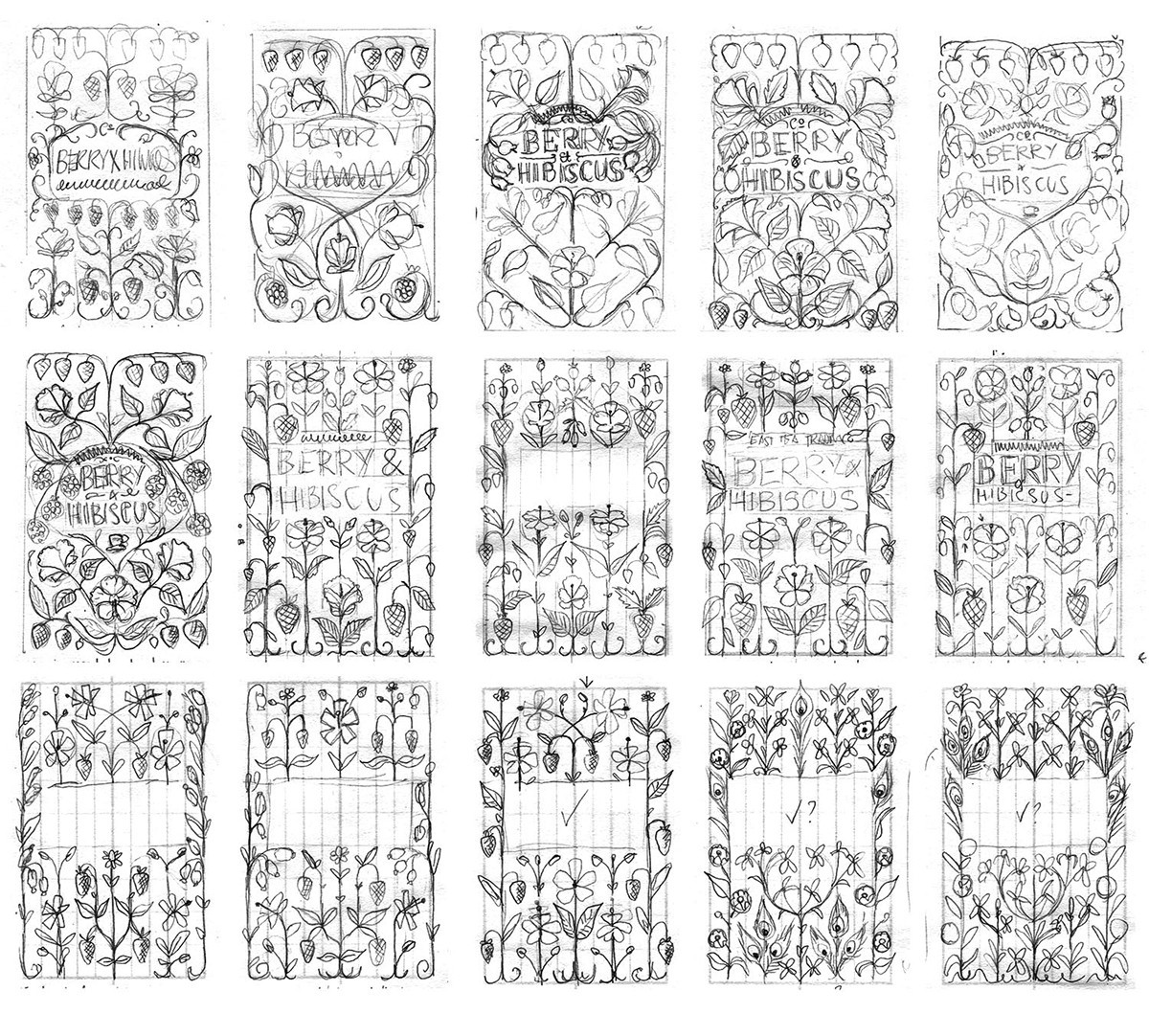
Original sketch progression
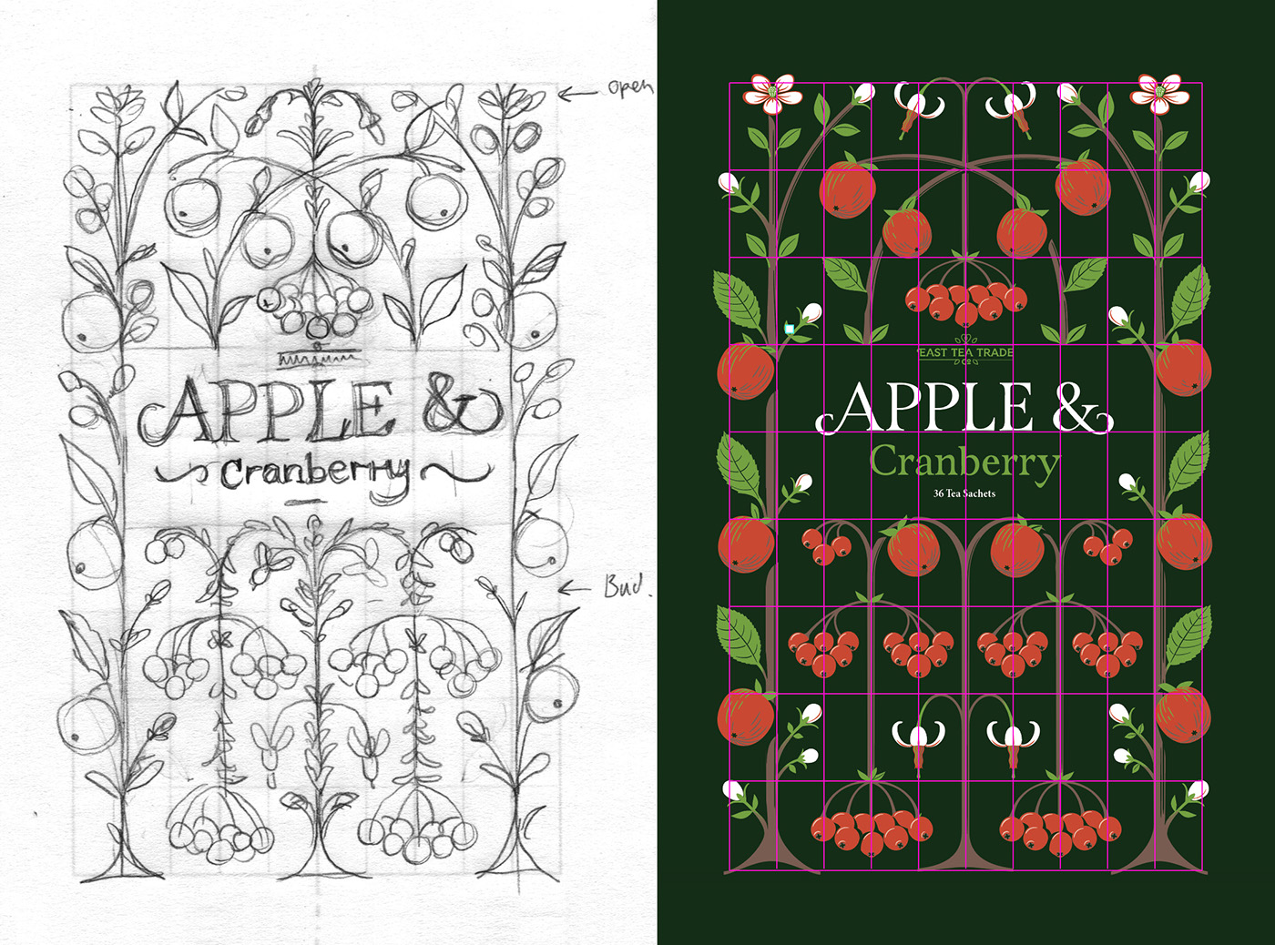
Original sketch Apple & Cranberry sketch and the underlaying grid
The lettering used in this project inspired me to design a completed type family called Span.
The designs were featured on the excellent blog, TypographHer, in an article titled, “Craftsmanship that would make William Morris proud.”


