


Visual edition of the book "The Monk" by Matthew Gregory Lewis (1796)
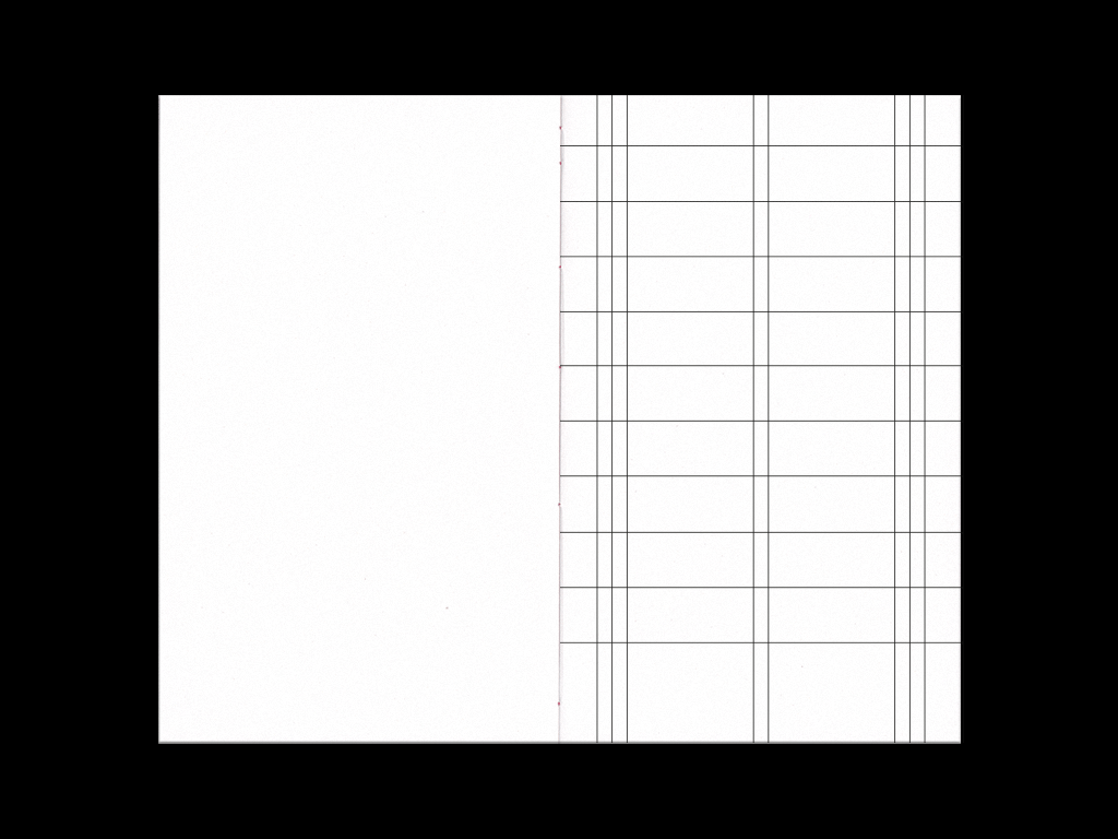
The focus is on the meaning of limits, meant as religious/social bonds, and translated into two simple graphic marks
repeated in every single page.

The width of the different paragraphs changes depending on characters’ behaviour, following three different increasing steps.
The nouns that lead into temptation are marked in order to strengthen the main concept, and the print on the spine forms a path
that represents the main character’s “moral fall”.
that represents the main character’s “moral fall”.


The red shade (obtained through a Risograph printer) is repeated on the cover as well as at the beginning of every chapter,
in order to give the reader the same feeling of obsession and repetition we can find in the book.
in order to give the reader the same feeling of obsession and repetition we can find in the book.


→ click here to see the book about this project
Special thanks goes to Tipografie Reali and to Atto for the Risograph-print.

