


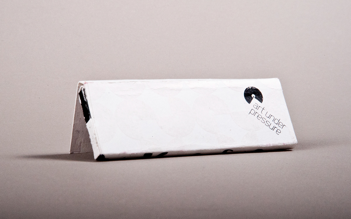
Art Under Pressure
For my Design Studio II class, I was assigned to re-brand the company Art Under Pressure, a street art and skate board company.
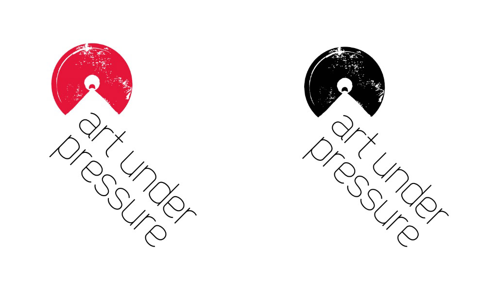
The circuler shape of the logo represents the top of a spraycan, the triangular gap gives the feel of paint being sprayed from the can. This feeling continues with the placement of the text, as if the words are painted or stenciled on. The texture on the can represents a stamp or the idea of moving fast and being “under pressure”

stationery package

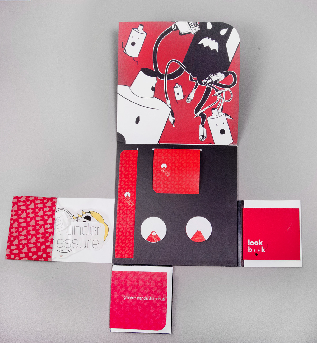
folder
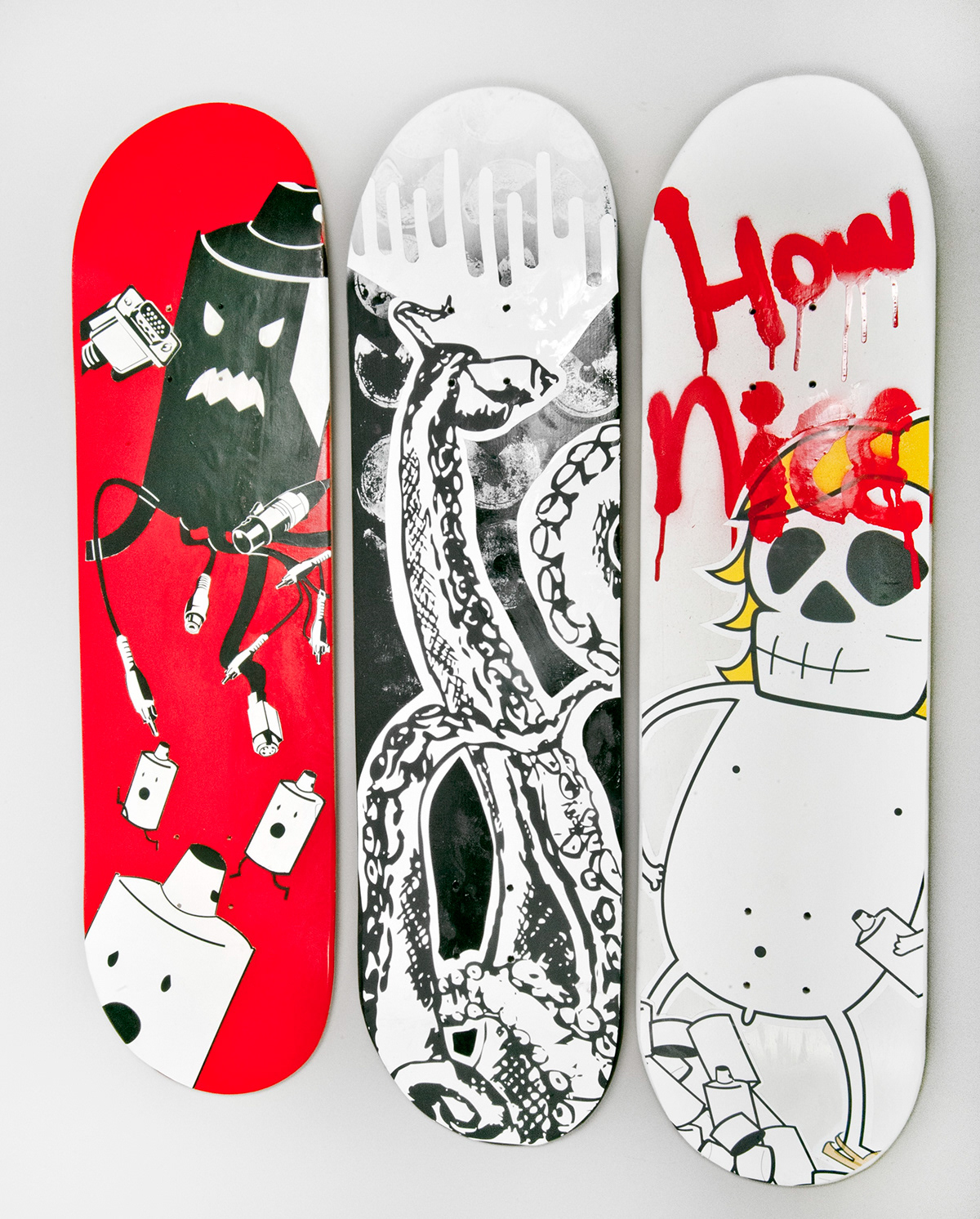
skateboard designs

rolling paper
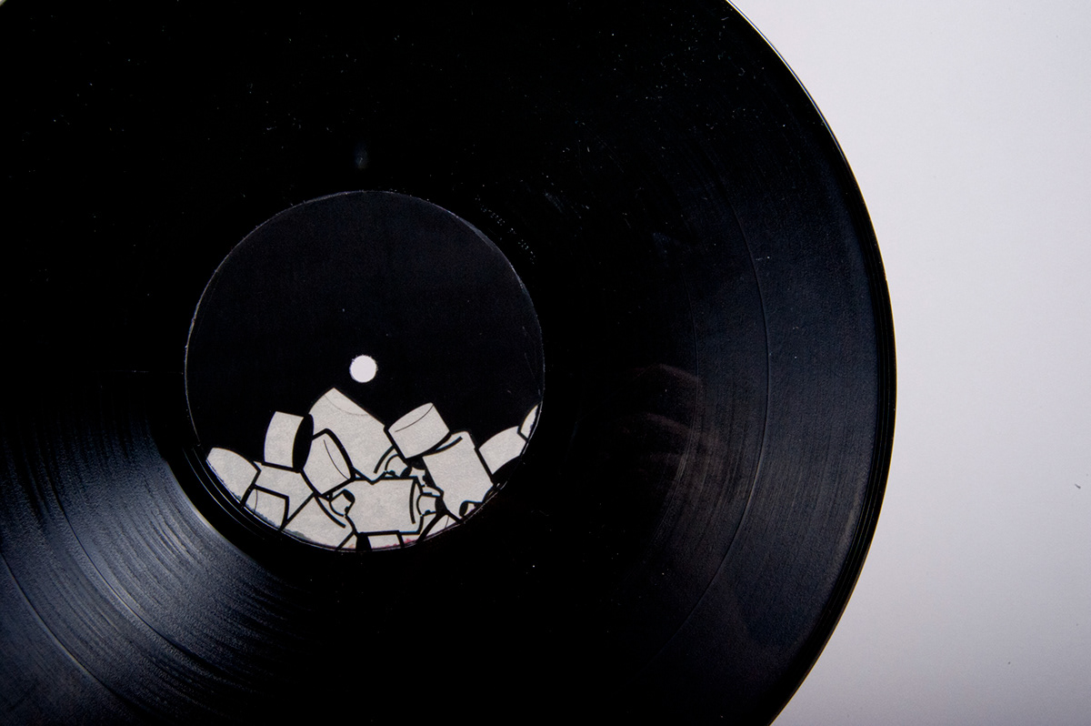
record


