


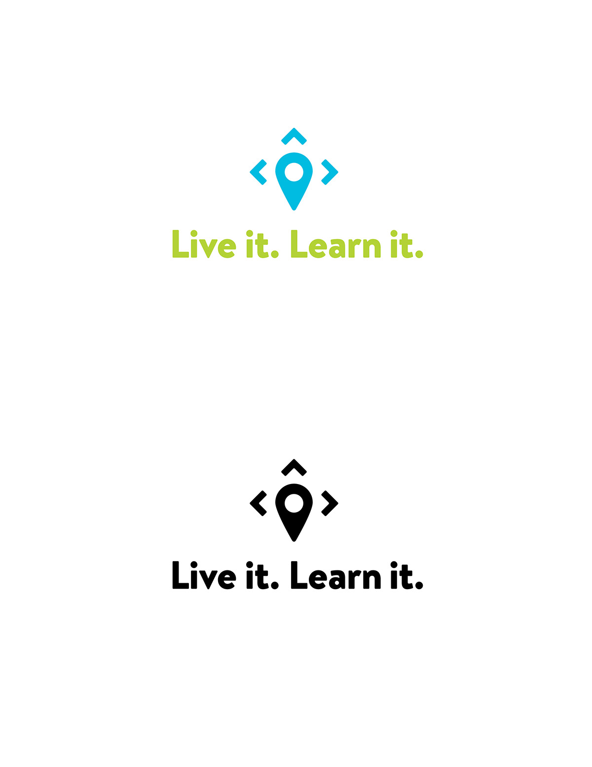
Logo Concept
The logo represents the classroom and the local DC community. The directional arrows form the boundary of the nation’s capital while the geotag represents the varied locations that students visit to gain firsthand learning experiences beyond the classroom. Live It. Learn It. emphasis learning by doing, and what better place to do so than Washington, DC, with its mix of history, government, art and nature. The logo mark colors represent the ground and the sky, giving learning a fresh and exciting feel.


Business Card Redesign
Above are the redesigned business cards for Live it. Learn it.

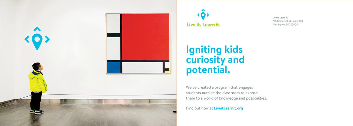

Post Card Campaign
Above are post cards designed to get donor support for the academic programs Live it, Learn it offers.
Program Brochures
Above are the brochures designed to give educators more information about the specific programs that Live it, Learn it offers.
Brand Guidelines

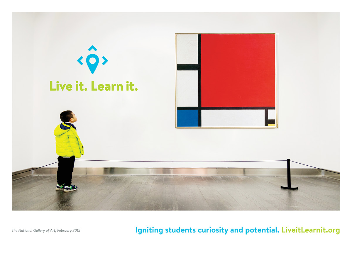

Promotional Posters
Above are three promotional posters for Live it. Learn it.
Designed to be seen at bus stops, metro stations, etc.


