The graphics for this film explore the tension between the cover-up and the discovery.
Despite the intentional difference between the two, the methods are visually quite similar; you just use different colour pens.
Redaction is in black; it covers up and obscures information on mass.
Whereas highlights are in yellow; they suggest careful discovery and draw focus.
Title Sequence
The titles establish an atmosphere of investigation, violence and tension. What is uncovered is significant and highlight the American authorities’ ability to cover up the truth about the death of one of its own agents.

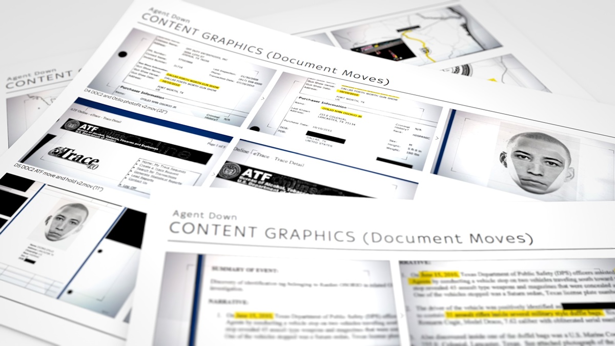
Content Graphics
The content graphics focus more on the investigation aspect; discovering and highlighting whilst looking through the viewfinder of a microfiche/microfilm reader.
Visually it presents the back-lit documents as they were found; black and white and redacted throughout. Further graphics include maps and photofits, mocked up and presented in the same style.
The animation relies heavily on the linear motion experienced when spooling through hundreds of pages at once - followed by the fine-tune ‘twitching’ that re-focuses the content in view.


Design
Senior Designer / Direction: Harry Ward
Designer: Kalli Manolaros
Senior Designer / Direction: Harry Ward
Designer: Kalli Manolaros
Head of Design: Chyaz Buffett
Production
Correspondent: Nick Martin
Producer / Director: Toby Sculthorp
Producer / Director: Toby Sculthorp
Producer: Liz Lane
Editor: Emily Dumas
Executive Producer: John Ryley
Executive Producer: John Ryley
Photofit imagery provided by PhotoFit Me app, developed by Open University.