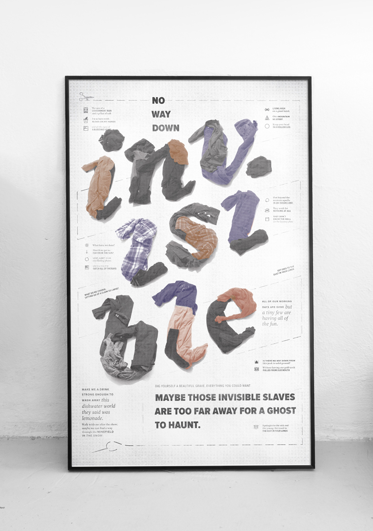
No Way Down
TYPOGRAPHIC INTERPRETATION OF THE SHINS’ LYRICS
For Typography II, our class had the opportunity to choose a song as the basis content of a poster design, after a multi-phase design process.
No Way Down, as many songs by The Shins are, is rich in layers of meaning. Its upbeat, almost care-free sounding melody, is contradicted by the social critique embedded in the song. It addresses the realities of global marketplace—the economic domination by the privileged consumer and the “invisible slaves” in sweatshops subjugated to the demands of production, working for below minimum wage for throw-away goods. So this interpretation of the song informed my design.

ESTABLISHING A GRID
The project began by choosing a grid. I made the unusual decision to implement a non-standard grid comprised of 1x1 square modules. I knew I’d be working with unconventional shapes, so that informed my decision. Looking back I would have chosen something with fewer columns and gutters between the modules. Live and learn.

TYPE EXCERCISES
Development of the project continued by exploring. These compositions were created using using strict limitations: constrained type size, no image elements, no graphic elements, etc.
PHYSICAL TYPE EXPLORATION
The discovery phase of this project led me into physical space, using type that was created parially or entirely outside traditional typographic software.
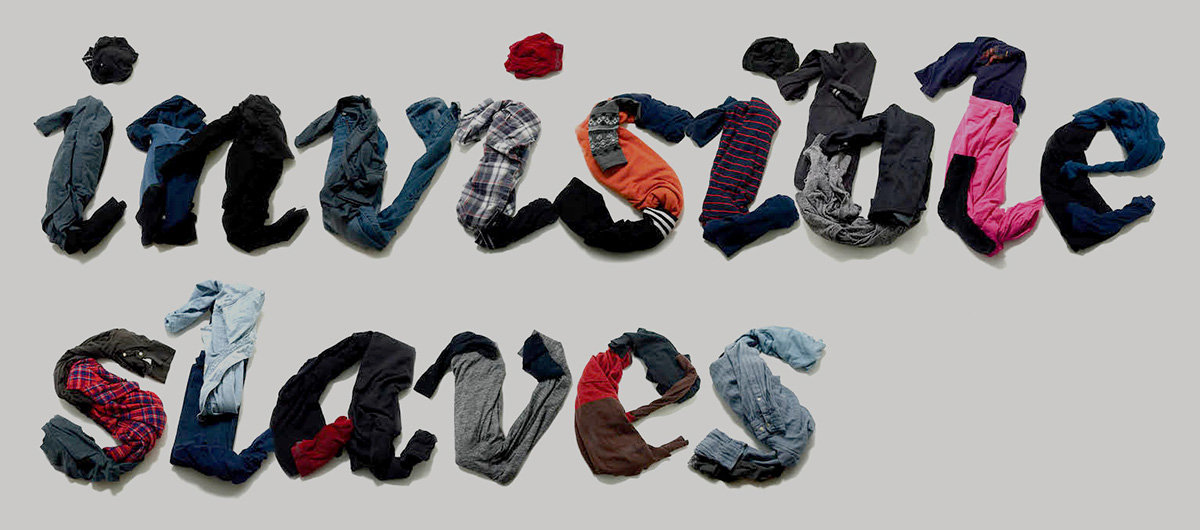
The two key words "invisible slaves" physically lettered using clothes: a metaphor for the garment industry.
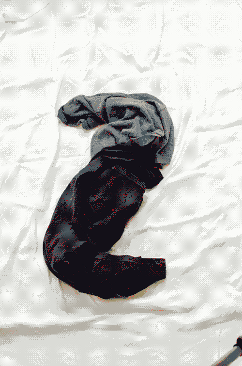
Photographic iterations to interpret the typeface (GT Sectra) using clothing.

Image research and collage exploration using photography of mannequins and child laborers.
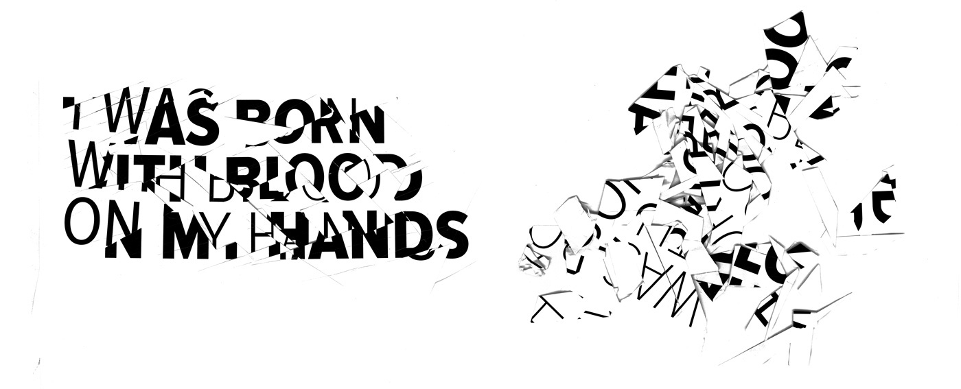
I layered laser prints of digital type at various sizes and X-Acto cut into the stack, pulling portions and creating choppy letterforms suggestive of violence.
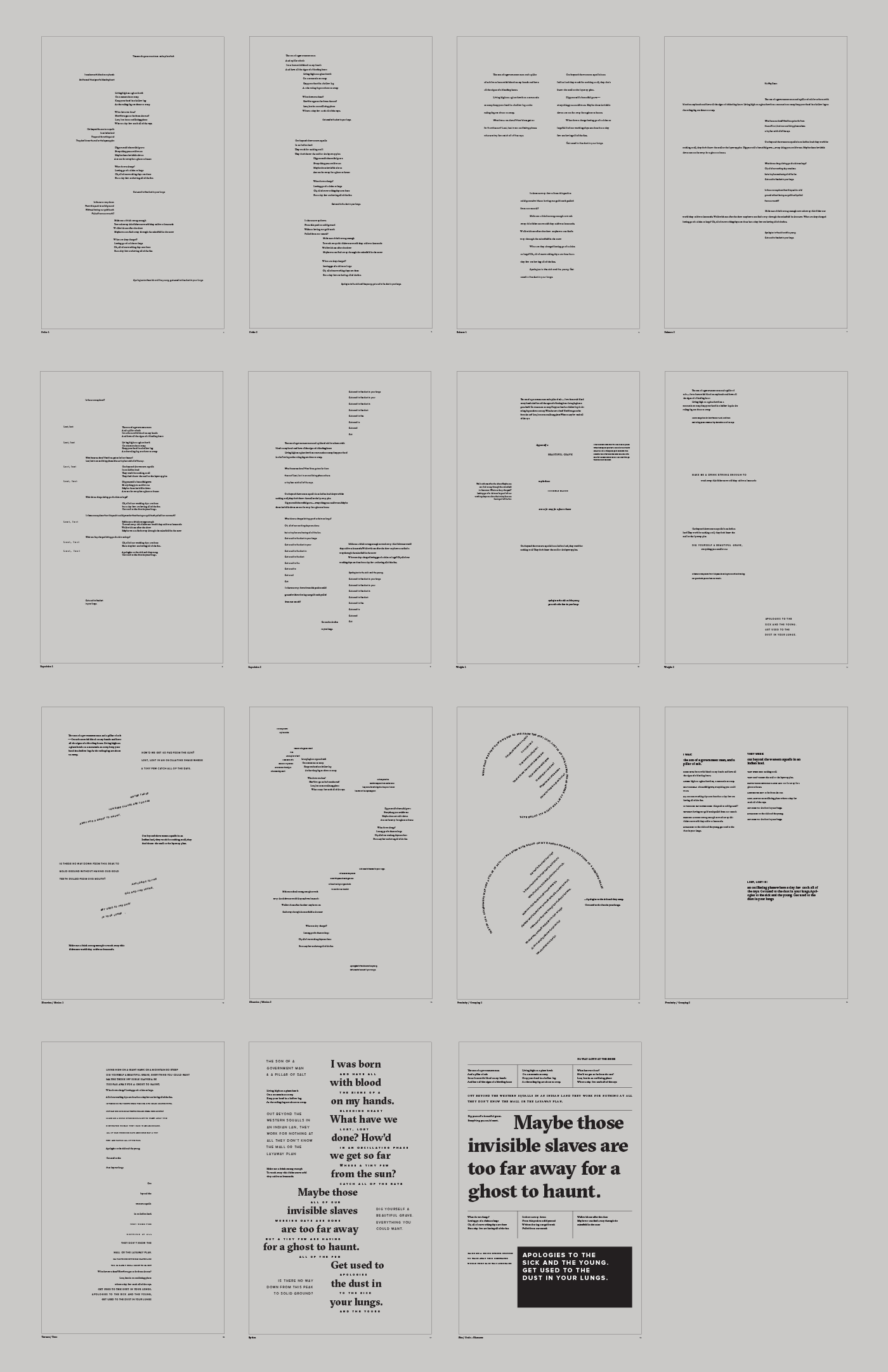
VISUAL STRATEGIES
After the exploration phase, I began to apply them into poster designs using various commmunication techniques.
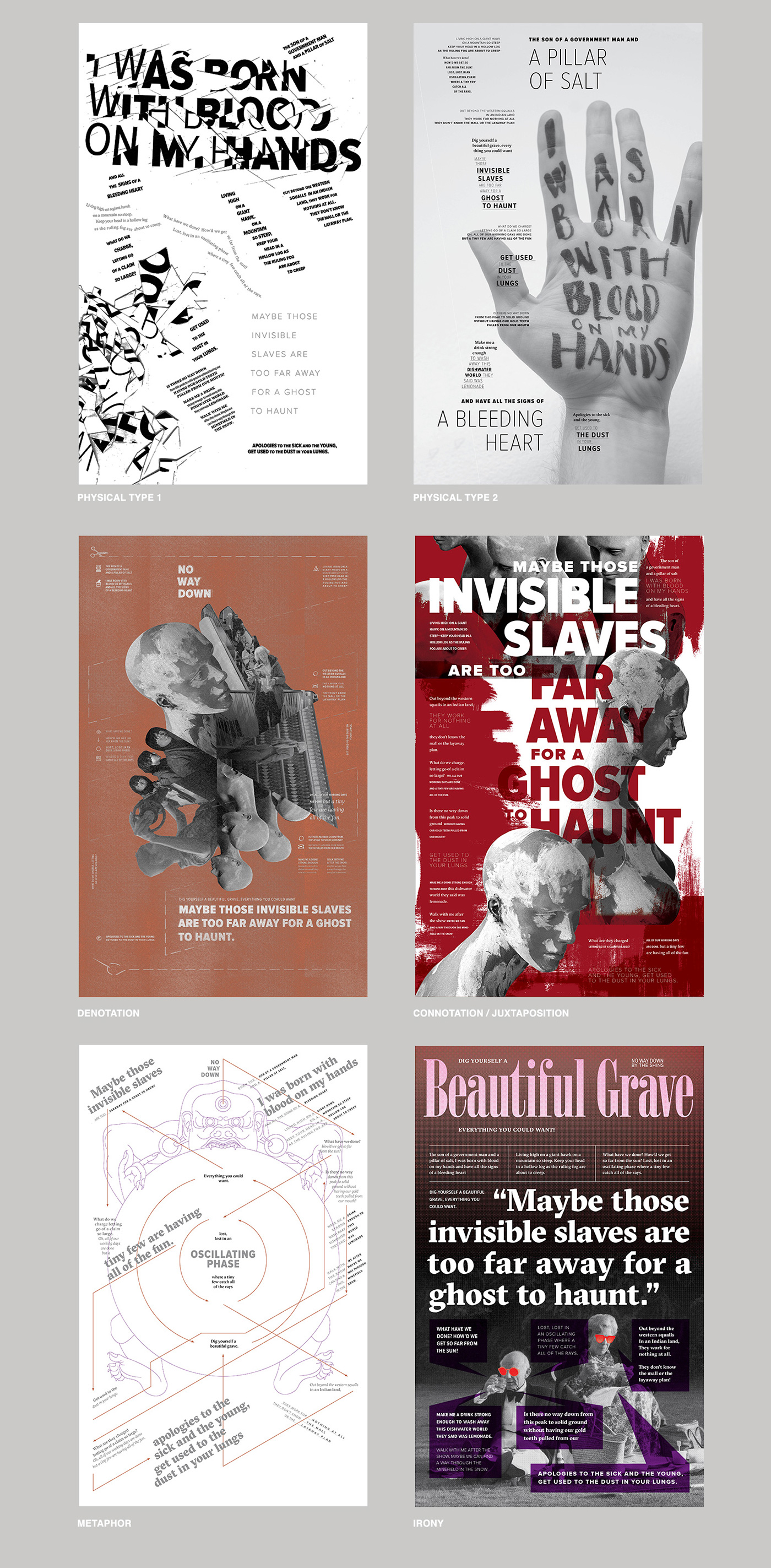
FINAL POSTER