
This project is a breakdown of the big screen data visualisation done at Sky News during the 2015 General Election
Data Driven - Realtime - Non-Linear - Presenter Controlled
Chyaz Buffet, Head of Design Sky News: "The central conceit to all our content design is this: Information + engagement = communication.
Information design is not about the gimmick, it is about improving communication and storytelling in partnership with the editorial tone, presentation style and journalism and Sky News Election Design achieves this marriage perfectly. From the permanent, all encompassing but uncomplicated lower third screen furniture to the dynamic presenter driven screen sequences, all are designed to be engaging, but never at the expense of the communication of information.
All the designs generated adhere to this simple ethos. They are clean, clear and confident in what they are designed to communicate. Crucially, the viewer/user is never left waiting or out of date. All information is clearly legible. All information is consistent in it’s design and visual language across all areas; the lower third screen furniture, the full frame results, the wall sequences (and following through to all digital product, print and promotion collateral), from font, colour and layout, to signature animation style. All designs conform to the Sky News rebrand which launched at the same time; the layers, indicating story depth and the revelation of information.
All design requires technology and an entirely new back end was built in house to push all data faster than ever to all aspects of our coverage; new controls written to allow presenters to access the information in non-linear fashion, minimising the barrier to the viewer and user. The pace and beauty of all sequences is designed to maximise viewer engagement and retain attention without ever falling into the mistake of the latest trick.
On the night Sky News was invariably first and fastest with the information, but also the clearest, most informative and crucially never dull or fussy; always engaging; always correct; always telling the story and beautifully consistent across all platforms."

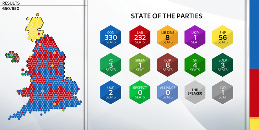
Seat Map
A proportional representation of all 650 constituencies in the UK.
A proportional representation of all 650 constituencies in the UK.
From Michael Thrasher, Professor of Politics Plymouth University:
“The seat map provides the spatial representation (yellow on the top probably, red dominating the north, red/blue in the midlands and finally largely into a southern The indicator bar, shows the proportion of seats captured by each party. blue vista (with the notable exception of London). The regional story is very important in 2015, principally Scotland, south west of England turning from orange to blue perhaps, London an oasis of red surrounded by the Tory heartland with Miliband failing to make an impression as Blair did in 1997.”
Seat counters (left) and indicator bar (right)
The seat counters are hexes along the right-hand side of the wall which give a running total of seats for the main parties, which update in real time.
The seat counters are hexes along the right-hand side of the wall which give a running total of seats for the main parties, which update in real time.
The indicator bar, shows the proportion of seats captured by each party.
State of the parties
Number of seats all parties have won.
Updates in real time.
The Grid
All 650 seats listed alphabetically.
As seats are declared, they colour in automatically.
2010 Results

2015 Results

Winning line
How far the main parties are from the 326 target.
Updates in real time.

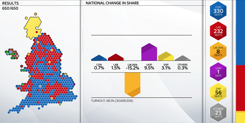
National share and change in share
Shows share and change, updated real time, for major parties.

Gains and losses
Bars to left and right show gains and losses by party. Smaller squares can toggle on and off to show additional info: where gains and losses have come from/gone to.
From Michael Thrasher, Professor of Politics Plymouth University:
“The middle looks a bit fussy at first glance but it is brilliant. Labour is currently showing a total of 230 seats but additionally there is info on its gains (36) and simultaneously its losses (13). This will be a very important part of the overall narrative – Labour (and the Tories) making ground in some areas only to fall back in others. It is easy to overlook another sub-element in the graphic but that would be a mistake. The picture also reveals that all of Labour’s 13 losses have come at the hands of the SNP while its 36 gains have come from 26 gains from the Conservatives and 10 seats from the Liberal Democrats. Same is true for all the other parties. Brilliant!”


Conservative / Labour battleground
This grid lists seats in terms of Con/Lab swing – so on the left you have Labour target seats, which they’d get with a swing of up to 1%, up to 2% etc from the Conservatives; on the right you have seats targeted by the Conservatives.
From Michael Thrasher, Professor of Politics Plymouth University:
“Ah, the old swingometer in linear form. When all is said and done the general election is about which of two parties can become the largest party. In that sense the swing of votes from one to the other remains important. In terms of national swing (the ebb and flow of support between the Conservatives and Labour) there are three important “milestones” in relation to the voting last time.
1. First, a swing of just under 2% from Lab to Con would be sufficient to give the Tories an overall majority. The key seat is Gedling.
2. Second and conversely, a swing of 2% from Con to Lab would ensure that Lab would overtake Con as the largest party. The seat to focus on is Corby.
3. Third, a swing of 5% from Con to Lab is required if Miliband is to win an overall majority (Jacob Rees Mogg’s Somerset North East is the one to point out).
Although this is a Con/Lab battleground the night begins with some seats belonging to other parties; for example Dorset Mid and Poole North is currently Lib Dem but it is expected to fall to the Conservatives.

SNP targets
This orders EVERY Scottish seat (all potential SNP targets) in terms of the amount of swing the SNP would need to gain the seat.
From Michael Thrasher, Professor of Politics Plymouth University:
“Very little happened in Scotland at the last election. Only one of the 59 seats changed hands and that was only because the speaker who had held Glasgow North East retired and the seat reverted back to Labour. Not so 2015. This graphic captures the anticipated SNP surge. The percentages are “target swings” from the party currently defending the seats (41 Labour, 11 Lib Dem and a solitary Conservative. This makes 53 in total because the SNP already have six to begin with. Normally, we would not have expected the SNP to make any further gains because the size of the required swings ruled out that prospect. But since September 2014 (and arguably the 2011 Parliament election) we must assume there will be large swings. These swings are ENORMOUS. They are what we might expect in by-elections but not at a general election. Charlie Kennedy’s seat of Ross, Skye and Lochaber looked impregnable requiring a swing of 18.8% to the SNP; a recent Ashcroft poll suggests he might lose. Gordon Brown’s former seat of Kirkaldy and Cowdenbeath lies at the right hand edge of the graphic.”

UKIP targets
This grid lists 20 potential UKIP targets. These are some of the constituencies that we talked up as potential UKIP gains following its successes in the 2013/2014 elections as well as by-elections like Rotherham (2012), Eastleigh (2013), Clacton and Rochester (2014). Because seats revert back to what they were in 2010 both Clacton and Rochester would be shown as blue in the 2100 hour.
From Michael Thrasher, Professor of Politics Plymouth University:
“The party is no longer expected to make a big advance in seats (it is aiming for a lot of second places to build towards a stronger performance in 2020). The ones to focus on are obviously Clacton and Rochester followed by Thanet South, Thurrock - and because it provides a Labour angle, Great Grimsby.”

Sky 150
Grid showing the Sky 150 and which party held the seats at the last election. Will be wiped clear once results start coming in to show live results as they happen.

Filtered list
This allows a list of seats to be generated depending on a number of search terms: region, votes, winning party, position, country, vote share, result, 2010 party, majority, percentage majority. The lists are generated via a web app before each sequence, and are controlled on air by the presenter
- This allows you to generate all kinds of graphics, for example:
- Seats where UKIP have come second / come second to Conservatives / come second to Conservatives in England etc etc. - Seats where UKIP have got more than 10% of the vote
- Seats which Labour won from the Conservatives (and vice versa)
- Seats which the Lib Dems have lost
- Seats in which Lib Dems have not won and lost their deposit (ie got less than 5% of the votes)
- Seats which the SNP have gained in Scotland / in Scotland from Labour
- Seats which have changed hands
Credits
Design: Aaron Smillie
Development: Pani Chrysostomou
Graphic Editor: Charlotte Bingham
Senior Designer: Harry Ward
Head of Creative Platform Solutions: Przemyslaw Pluta
Senior Design Manager: Dan Roulstone
Senior Design Manager: Dan Roulstone
Head of Design: Chyaz Buffett


