


Final major project. Free assignment.
Conversation of me and my mom a while back:
Me: “I will take my green bag”
Mom: “Green bag? You don’t have a green bag”
Me: “I mean the one with the squares on it”
Mom: “…that bag is grey.”
Me: “I will take my green bag”
Mom: “Green bag? You don’t have a green bag”
Me: “I mean the one with the squares on it”
Mom: “…that bag is grey.”
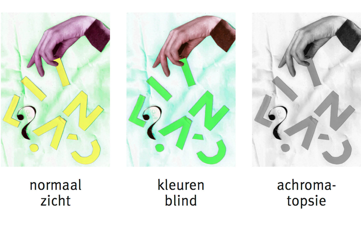
After this conversation I decided that maybe my mom ( and everyone who called my purple pencils blue ) was right, and I was probably wrong. So I took one of those online colour tests with circles and numbers. Turns out I, the graphic designer, am colourblind. Great.
For one of my 2 final major projects, I was assigned to pick a random subject/topic that holds my interest ( and can keep holding my interest for 6 months, our exam time ). I decided to dive deeper into the world of the colourblind and use this for my project. In my research I read a book by Oliver Sacks: ‘The island of the colorblind’. In this book the author travels to Pingelap, a microscopic island in Micronesia. On this island, 1 in 12 people are totally colourblind, they see everything in black and white. This is called achromatopsia. I was really interested in this rare condition, what would it be like to live without colour?
After a lot of research, I found out that there wasn't one evident place where achromats can go to find good reliable information about their condition. These ( online ) places do exist for people who suffer from better known conditions such as rheumatism. I also found out that achromats really like to exchange tips and tricks that make living with achromatopsia easier, like which colour detector works the best, or which special glasses can be purchased. I decided I would like to create a place for people with achromatopsia, a place where reliable usable information can be found, and also a place where interaction between achromats can take place.
Below is my visual journey on this project, with in the end the online platform for achromats: ACHROWEB.


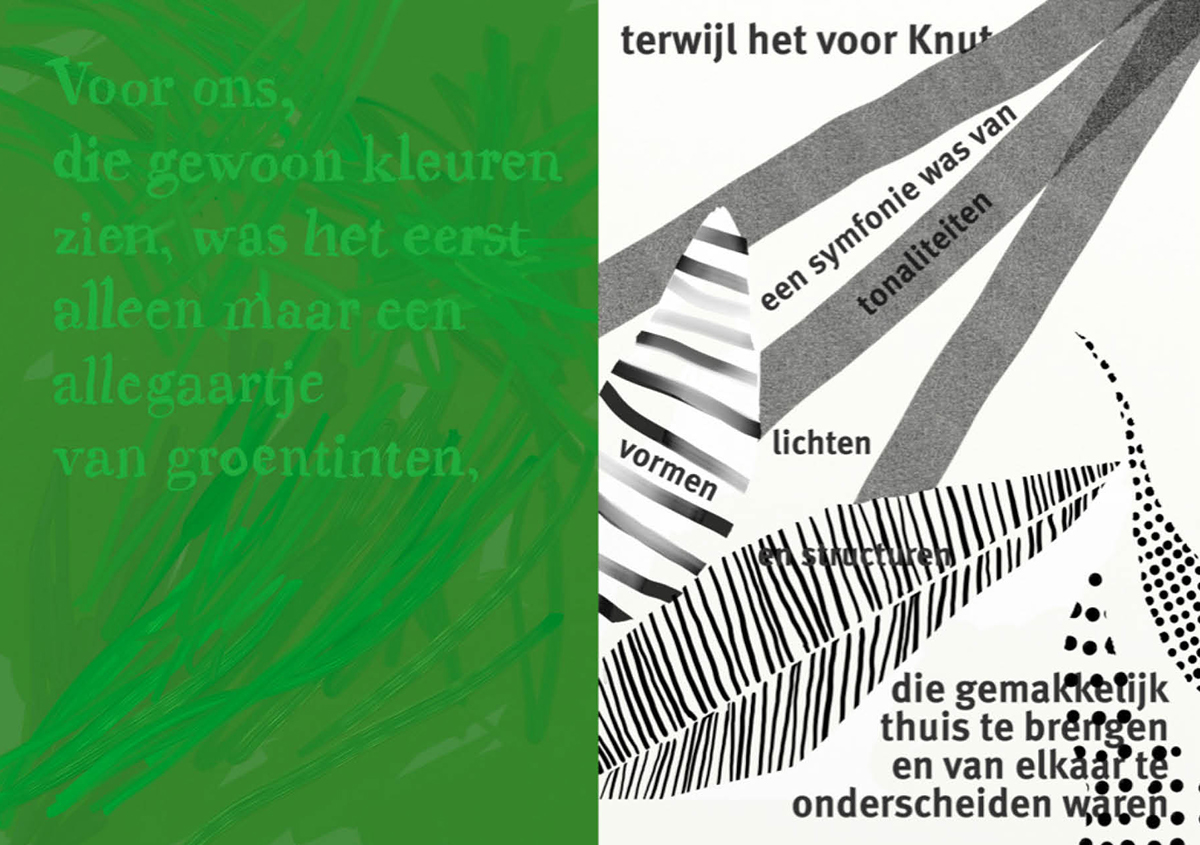
I found out that achromats do in fact see detail where we ( who see colour ) might not. The example below shows a quote from ‘The island of the colorblind’ by Oliver Sacks. The left side is how we, who see colour, would observe a woody forest, all green with little to no distinction between leaves. While the achromat, on the right, would see more pattern, shape and light. Translation left:
“For us, who see colours, it was only an hodgepodge of greens”
Translation right:
“While for Knut [ an achromat ] it was a symphony of tonalities, lights, shapes and structures that could easily be recognized and distinguished from each other.”
From this drawing onward I focused on pattern in stead of colour to reach my target group ( achromats ).


A lot of information is available about this subject, so all that text at one place would become quite boring quite fast. I decided to make it more visual with animated infographics made of patterns. The example below ( not yet animated ) is about the different kinds of lenses achromats can wear, to protect their eyes against direct (sun) light.

Tests with colour when another coloured lens makes it invisible.
For achromats, red is often seen as black.
For achromats, red is often seen as black.

Patterned infographic.


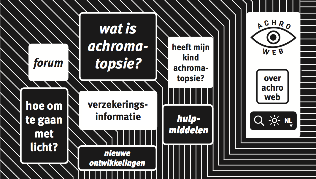
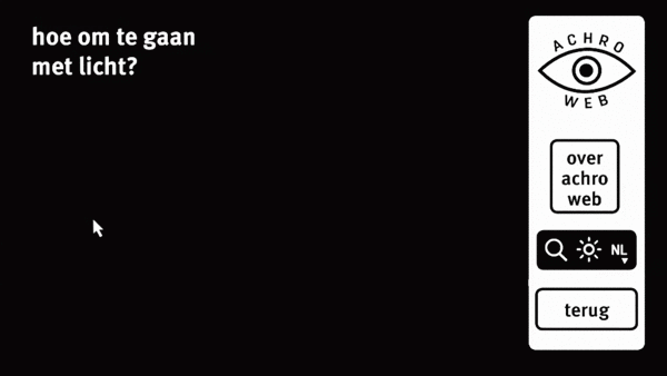
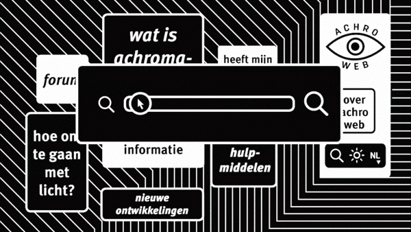
ACHROWEB is an online platform especially designed for people with achromatopsia ( total colourblindness ). Because they see everything in black/white/grey, pattern has taken over from colour on this platform. Achromats often have quite bad eyesight, that is why there is a zoom-in tool available. Also, achromats can’t handle direct bright light very well, hence the brighten reduction tool. To exchange ideas and tips&tricks about everyday life with achromatopsia, like which lenses to use or if a coloursensor can really help, the forum is available.

Animated infographic


Watch the video below to see how it works!


Degree show


