
This Project
A brand developed for a non-profit organization which empowers youth to use photography for advocacy.
The Logo
The Logo
The logo is inspired by a cross-section diagram of optical lens elements and a waveform diagram of a voice. By referencing the mechanics of both speech and photography, the logo integrates Critical Exposure’s core idea of photographic voice. Just as Critical Exposure advocates collaboration across all ages, races, and levels of privilege, the icon aligns vertical forms of varying shape and size to a horizontal axis unifying the elements to a shared direction.

Website
The Critical Exposure brand needs to be strongly expressed through a clear, compelling website which showcases the work of students with maximum impact. The site is primarily navigated by exploring beautifully formatted stories made by youth advocates.


Animation
The character of the Critical Exposure brand is expressed through a 15 second animation of the core organizational purpose.
Brand Guidelines
The Critical Exposure brand is maintained through a manual to guide marketing materials to consistently use the logo, color, type, language, and imagery.


Zine Campaigns
Standalone print publications to be made by students for distribution both to authorities but also to peers.


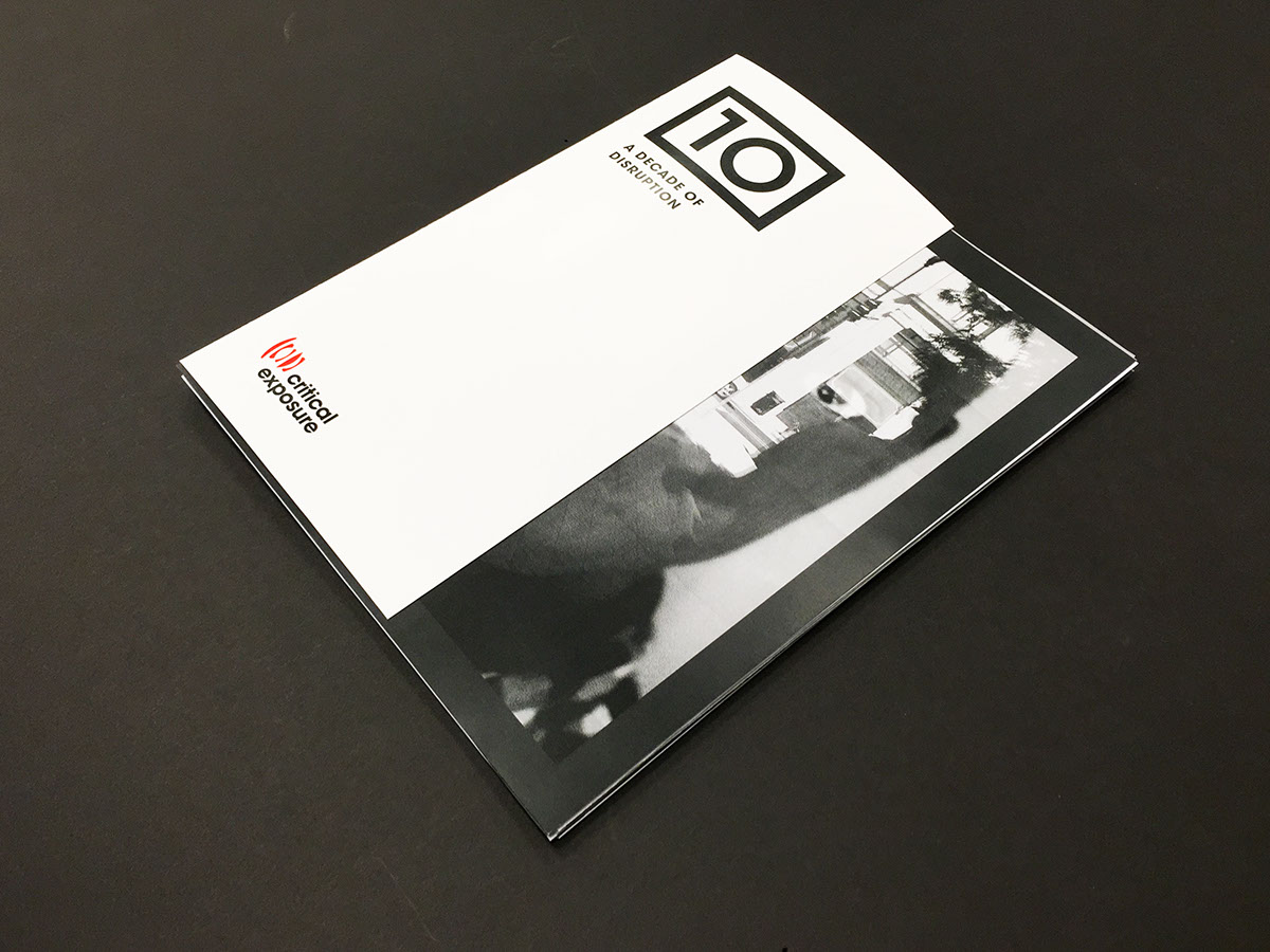
Annual Publication
A yearly publication recognizing the work of Critical Exposure students of that period, this particular one to celebrate a Decade of Disruption—ten years of operating as an organization.


Individual zine campaigns are contained inside the larger annual. The surrounding spread gives background context on the issue addressed by students and the outcomes.
Stationery Package
A folder to contain Critical Exposure Brand Guidelines, letterhead, business card, envelope, and and envelope.


