DESIGNING A TYPEFACE
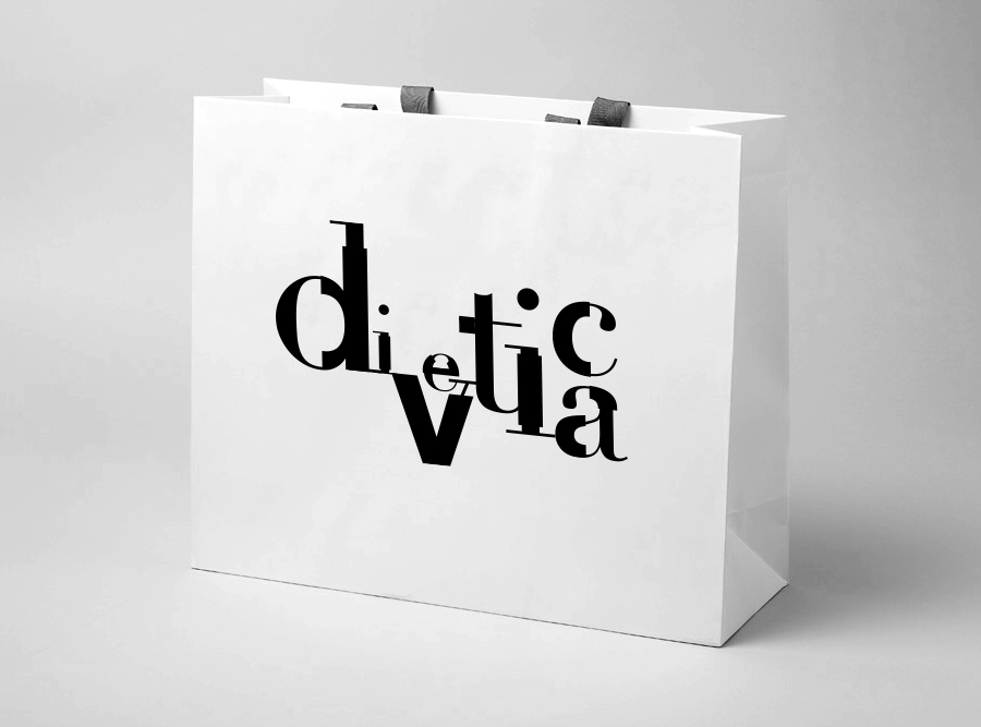
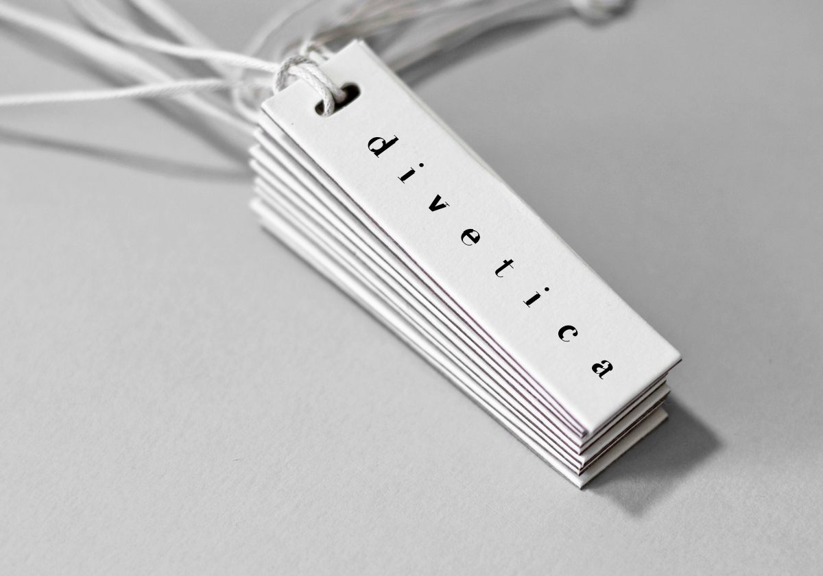
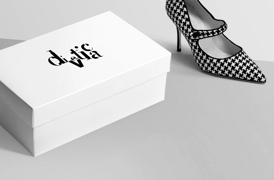
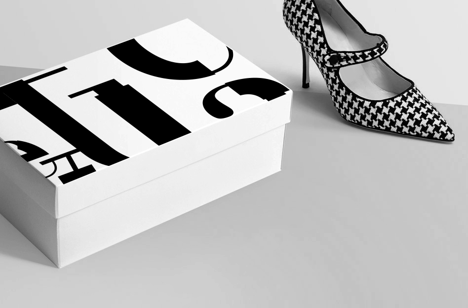
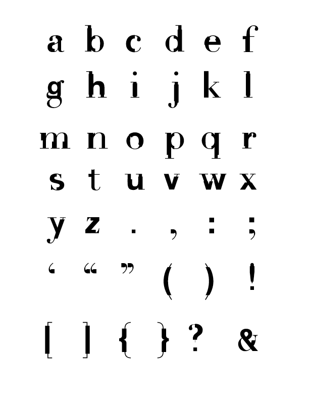
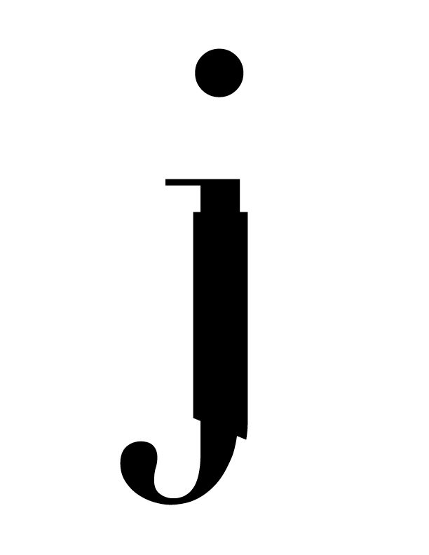
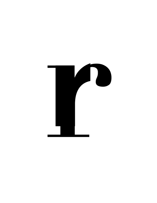
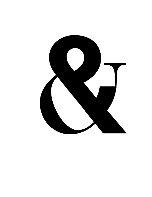
The initial concept of combining serif and san-serif forms was inspired by Frutiger's notion that behind every san-serif is a good, classic serif. The process entailed taking the letterforms of Didot, laying Helvetica on top, and systematically removing parts of each to create a hybrid with both elegant and industrial aesthetics. The result is Divetica.
FULL ALPHABET
INITIAL CONCEPT
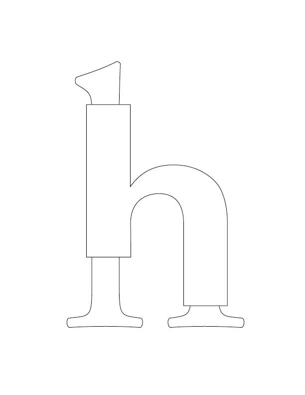
DETAILS


MERCHANDISE APPLICATION