Unlock the power of your wealth
Grenadl is an app designed to assist users in navigating the complexities of modern asset management. Managing assets effectively requires a comprehensive solution that combines advanced technology with user-friendly features.
Grenadl empowers individuals by providing an intuitive platform that simplifies the management of diverse financial assets. Grenadl offers a seamless experience that integrates real-time data, personalized insights, and strategic planning tools.

Task : a visual language rooted in the present
The primary objective was to design a visual language that seamlessly blends a sleek, inspirational aesthetic with a modern and elegant visual identity. This identity needed to instill a sense of trust and empowerment in its users. The branding had to convey the reliability and trustworthiness inherent in the banking sector while also evoking a sense of aspiration and possibility.

An inspirational and meaningful mark
The mark incorporates a hexagon, symbolizing trust and solidity. Complementing the hexagon are dynamic ovals, creating a shape that reveals a sun in the white space. The sun signifies growth and freedom, evoking an outdoor feel. The overall design is dynamic and the logo is versatile and scalable, ensuring it functions effectively across both digital and printed materials.


Typography
Owners was chosen as the main font for its expressive characteristics.Highly legible but full of personality, the grotesk typeface anchors the brand in the finance sector but corresponds to the brand’s mission : empowering users. The general shapes match the logomark.

Modern and serene but vibrant colors
The colors embody the brand’s values by harmoniously balancing a sense of seriousness with a subtle hint of freedom.
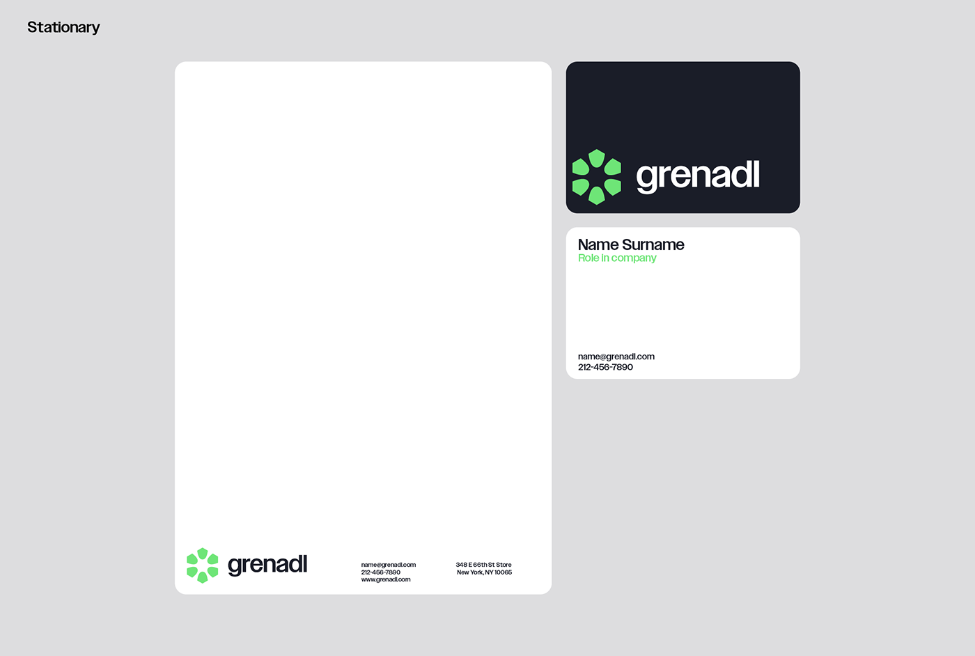
The primary brand color is a vibrant green, reminiscent of nature, yet distinctly modern due to its brightness. Mauve serves as a complement to the green, toning down the palette while adding variety. The primary dark gray, derived from the main purple, is dark and desaturated, providing a muted edge to the visual identity. The light gray unifies the design, creating a cohesive background that allows white modules to stand out. For impact and minimalism, the text is primarily in pure white or black, with green used for emphasis.

Visual Language
The visual language effectively communicates the brand’s mission by creating beautiful layouts for the content to exist in. Corners are rounded, and elements are given ample space to breathe. Headers are set at four times the size of the body text, which is neatly organized into columns. Buttons feature green or mauve backgrounds with black text. Outdoor imagery is used to evoke a sense of freedom, appearing with margins and rounded corners. A pattern derived from the logo can be overlaid on pictures, adding a cohesive and distinctive touch.


