Brief description
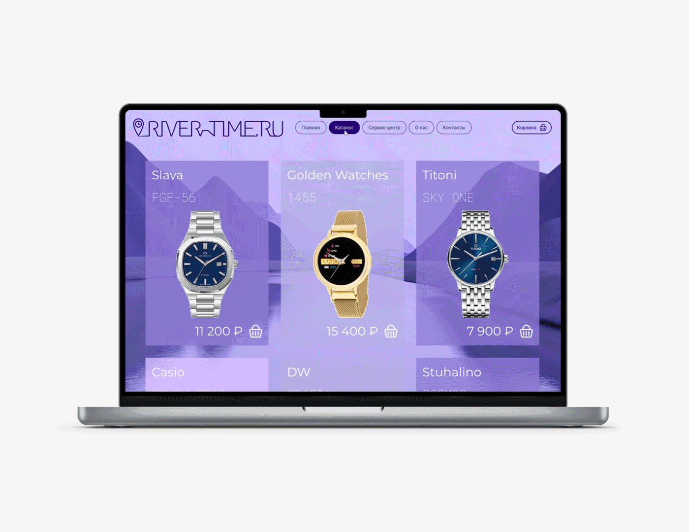
River-time.ru is an online store for selling wristwatches
+ Watch service center
+ Retail stores
Task development of visual identity
Goals increasing sales volume and company recognition
TA women aged 20-55, men aged 20-60
Values accessibility, technological advancement, openness
Character rational, leadership, innovative
The client wants to maintain continuity with the current logo:


Identity concept
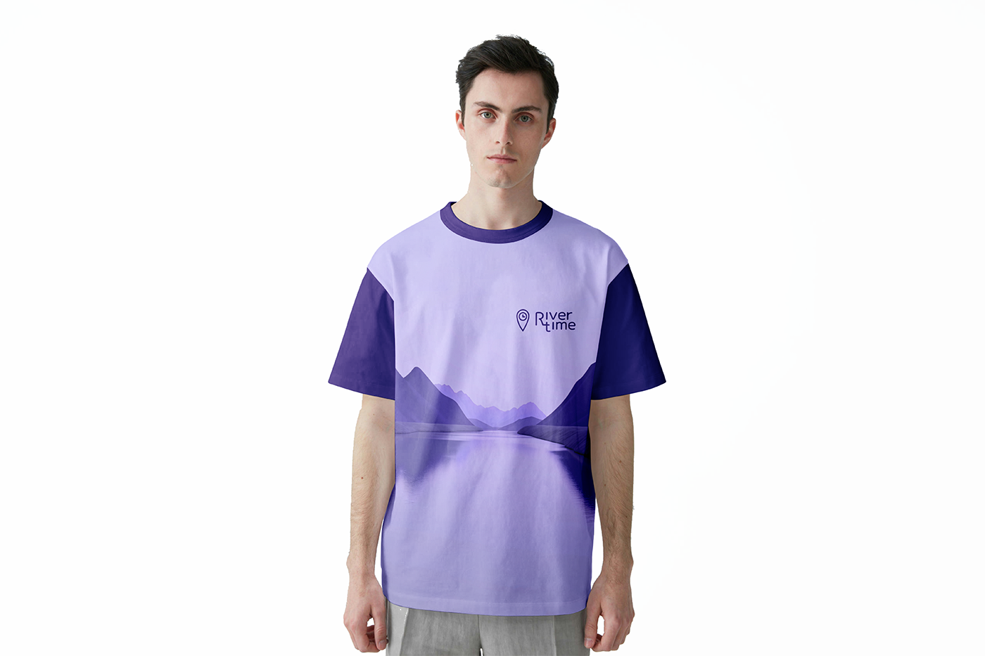
The concept of the proposed identity is based on the word "river" in the company's name.
The visual style is inspired by the image of a full-flowing, powerful, yet calm river. This river imagery reflects the company's values of openness and accessibility. To further embody the company's values of technological advancement and innovation, images of the latest watch models or futuristic prototypes are used.
Logo
The logo is designed as written with merged letters company's name simulating the channel of a river with streams and eddies. Based on the main logo, two smaller-sized logos have been constructed: a two-line logo and a "two-letter" logo. They may be needed for the design of narrow-format branded materials.

Colors
The color palette of the concept is monochrome, maintaining continuity with the company's current logo.
Besides, the use of lilac color in a brand identity is not typical for companies in the wristwatch retail segment. This color choice will help the company stand out against competitors and establish itself as a leader setting its own standards.

Fonts
The rational character of the company is proposed to be conveyed in the new identity through the use of strict Montserrat and utilitarian Roboto fonts for website design, as well as the use of a tile grid as the most convenient structure for displaying the online store showcase.
The Roboto Mono font is convenient for displaying prices and product codes.