


Brand Redesign Proposal
QUIPORT - Corporación Quiport S.A.
-
Corporación Quiport S.A. is the concessionaire of the Quito airport service which included the operation of the former Mariscal Sucre International Airport as well as the development, design, financing, construction, operation, administration, and maintenance of the New Quito International Airport. Quiport is formed by a consortium of companies from Brazil (CCR), Colombia (Odinsa S.A.) and the USA (HAS Development Corporation). Quiport is the concessionaire of the Quito airport service.
With this brand identity redesign proposal, my intention is to give Quiport S.A. a new and fresh look, by creating a modern, clean, and open feel, while maintaining the corporate and strong image this corporation projects. Also, creating a friendly and unique image that can help bring investment from companies from the public and private sectors, generating trust and opportunities through an effective visual message.
• Mood board •
Getting inspiration from previous and related brands helps to see what has been created and helps generate innovative ideas and concepts that might or might not be explored. This is the stage where investigation and creativity start.

• Sketches and Ideas •


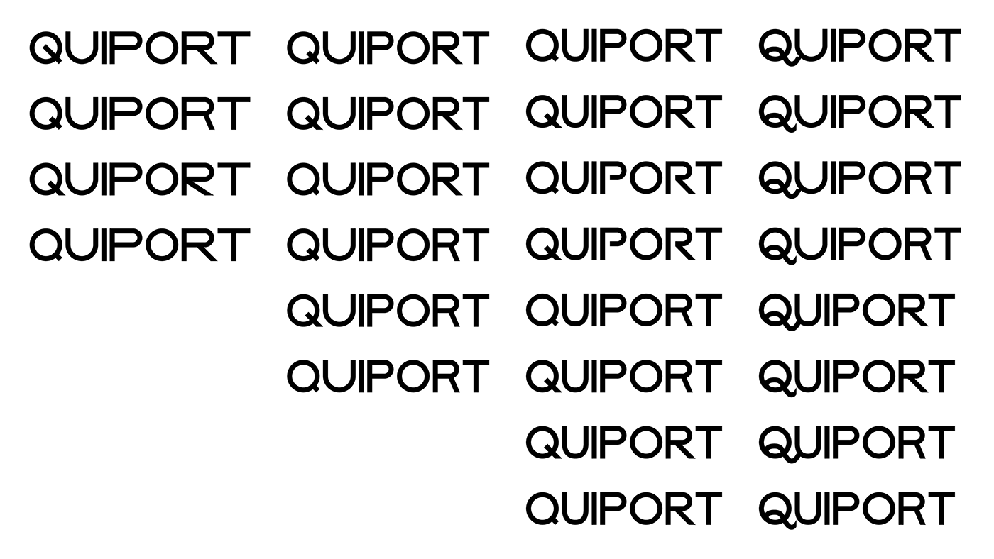
• Vectorizing Type •
It is important to create variations for letters to have multiple options to combine the word "QUIPORT", and select the best option, based on the brand values, psychology, and what we are trying to communicate.

• Isotype Design •
Based on the sketches and ideas from before, I've started to define and clean up those who will work better with the selected type. Considering legibility and the ability to be easily reproduced.

• Composition •
After designing and vectorizing both types and isotypes, it was time to create combinations based on the selected logo sketches and the different options created. Always considering legibility, uniqueness, simplicity, and reproduction. Not only this, but also thinking about how the brand is going to be used on different printed and digital media scenarios.

Variations between letters and isotypes

Lock Up: The final four!
• Final Adjustments •
Proportions
Once I arrived at the final option it was time to make sure all proportions and sizes were correct. The integration of both type and isotype, in an organized and harmonic way, ensures a pleasant appreciation of the image as well as making sure all sizes and variations of the logotype look good no matter the media and application.

Color
After setting up the logotype proportions, I went back to the mood board to pick some inspired colors from the images I picked. Blue was the main color as it not only transmits a formal and serious feeling, a corporate feel if you may, but blue is one of the official colors in Quito city's flag (blue, red, and blue). The selected shade and tone of blue is serious, yet modern. It's a color that will work great on any type of media.

Variations
Once the final color has been selected, it was time to define the logotype variations, based on usability, legibility, and simplicity. In this case the three variations where thought to be used in any size and media, especially paying attention to digital media, where most of Quiport S.A., handles their communications.

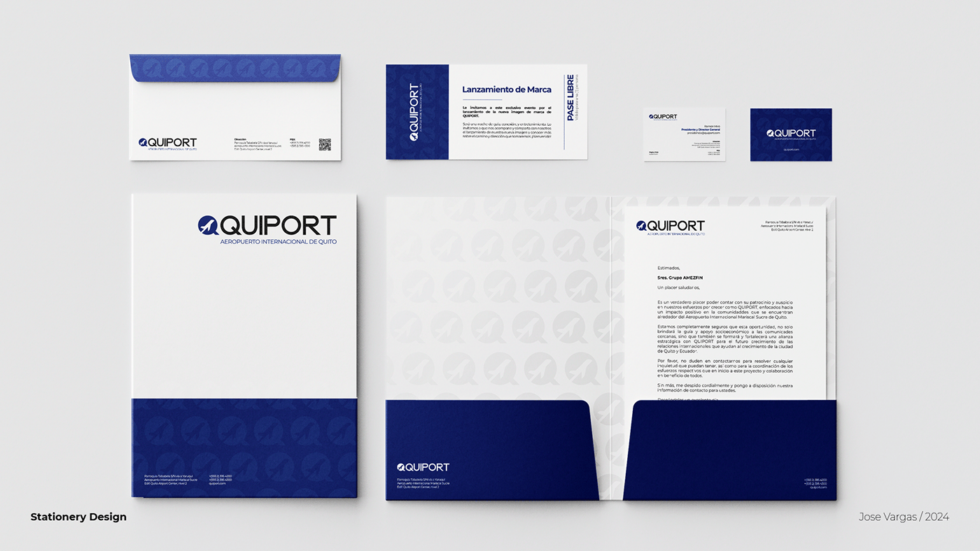
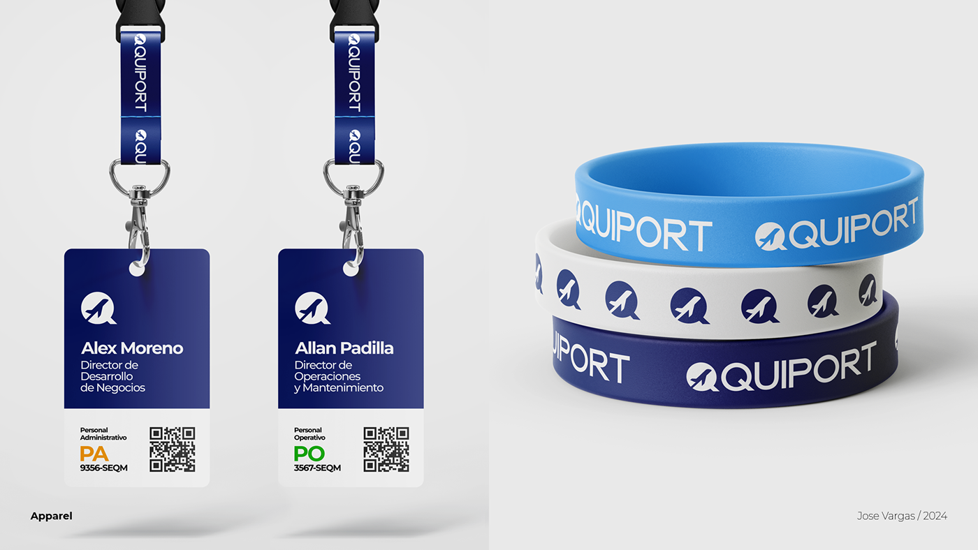
• Applications •
It's always important to see how the logotype and the brand will work in a real scenario. Making sure the brand works in different applications, big and small, helps us to understand how the brand identity can be used and how well it will represent the company.
I really enjoyed creating this personal project!


• Logo Animation •
• Comparison •
How the current logo looks versus my proposed logo.


