

Logo Redesign and Corporate Identity for the
'MAD FORCE CREW' Breakdance School

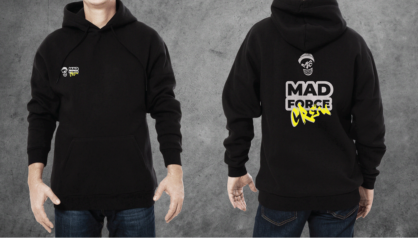
The logo was created for a children's breakdance school founded by a famous teacher, dancer, b-boy, pioneer, and founder of the breakdance movement in Armenia, known as #BBOYFLASH GODFATHER.
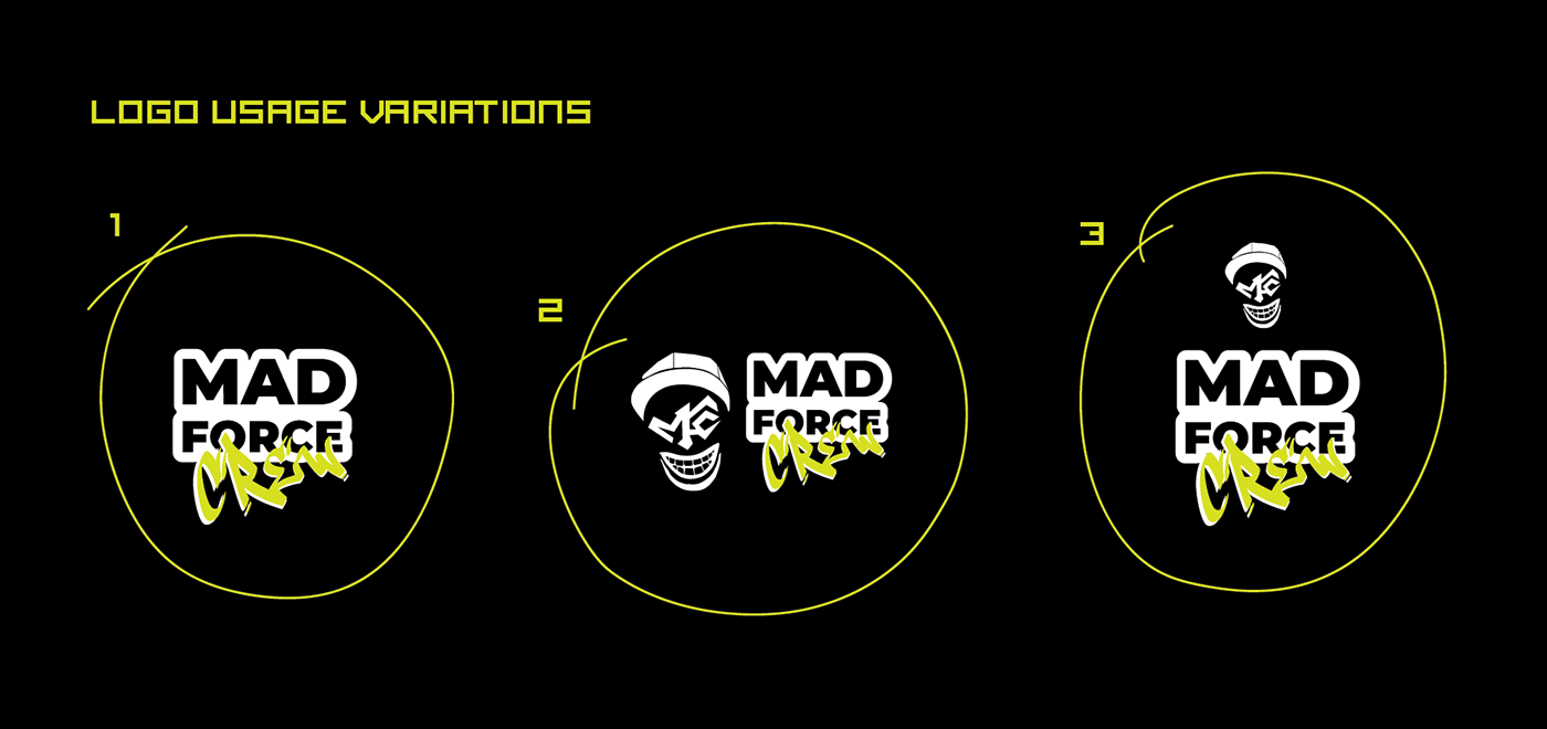
Old emblem symbolism of #bboyflash was used in the development of the logo as an illustration. The typographic part includes the crew's name. The new logo was created based on an updated portrait-illustration of #bboyflash godfather and a new typographic element with the name of the breakdance school.
Old emblem symbolism of #bboyflash was used in the development of the logo as an illustration. The typographic part includes the crew's name. The new logo was created based on an updated portrait-illustration of #bboyflash godfather and a new typographic element with the name of the breakdance school.


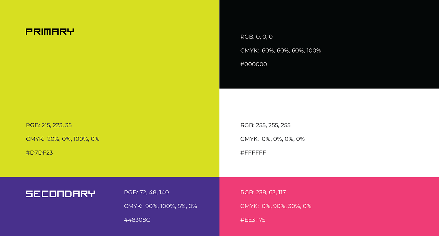

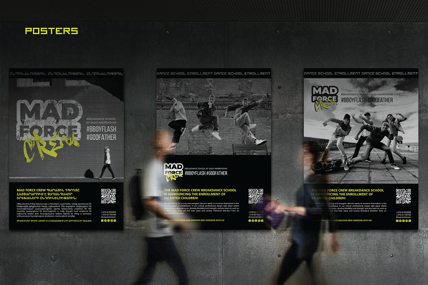
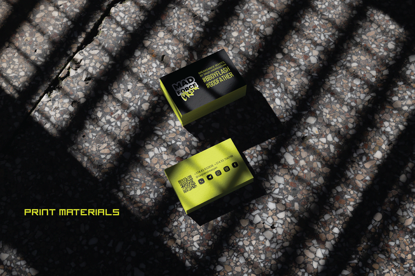


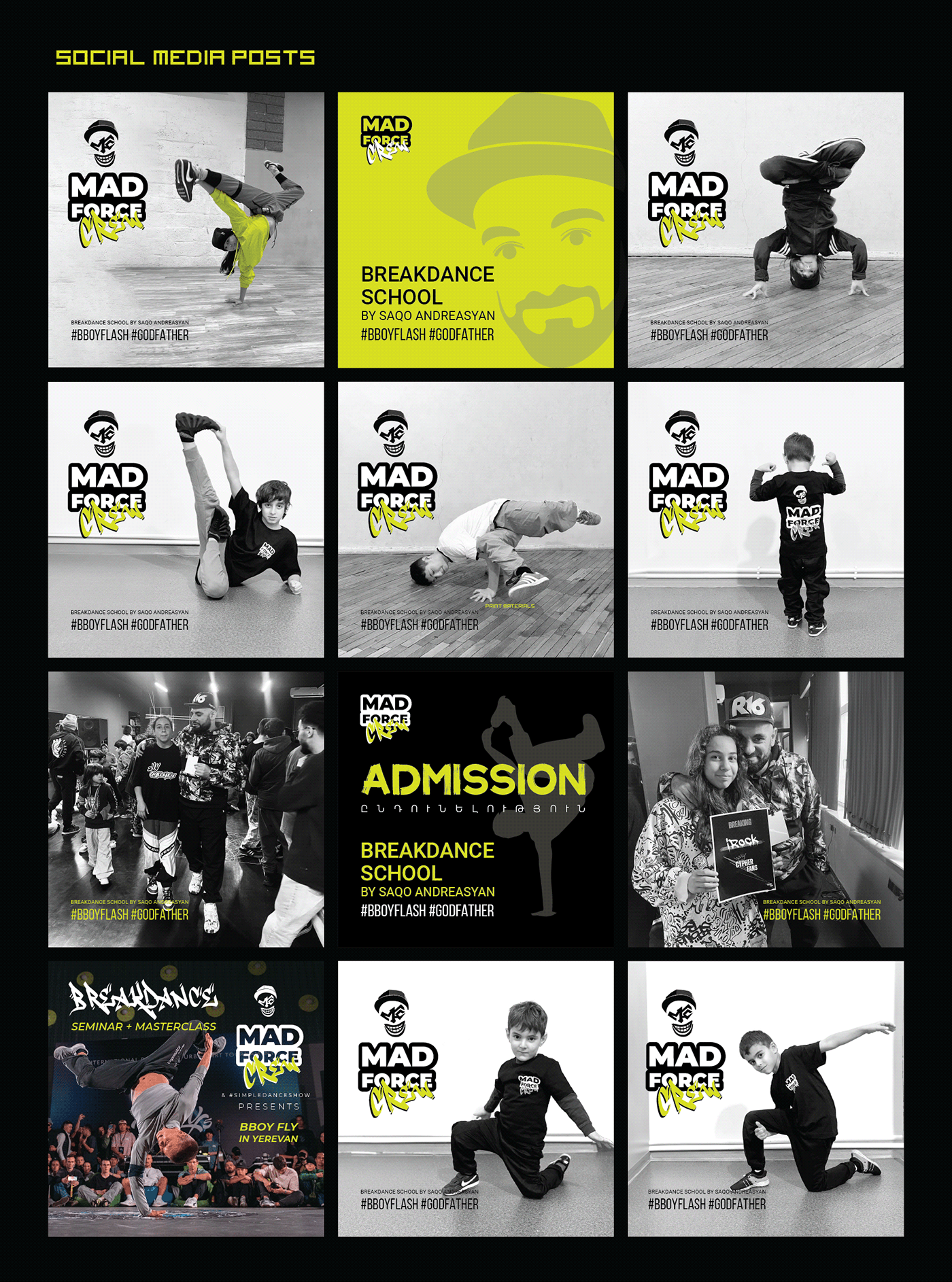
The identity of this breakdance school was developed using a contrast between bright colors and black-and-white atmospheric photographs of dancers, students, and dance halls. This stylish approach allows for the transmission of the atmosphere of movement, energy, and passion inherent in breakdancing. It also increases brand recognition and creates a bright and memorable image of the school for fans of this art.
Thanks for watching :)


