Boo (Takeaway)
An illustration of an owl has been gracing the packaging of Royal Armenia coffees for many years. It's such a famous brand character that people even refer to the product as "boo" (which means "owl" in Armenian). We used this cultural insight and made a strategic decision to create a sub brand, calling it "Boo" (owl).
“Royal Armenia,” a beloved coffee brand, decided to expand its business and start selling its coffees to go. Our task was to create an identity for this new venture and design anything that a "coffee-to-go" stand might need, such as cups, bags, and many more items.
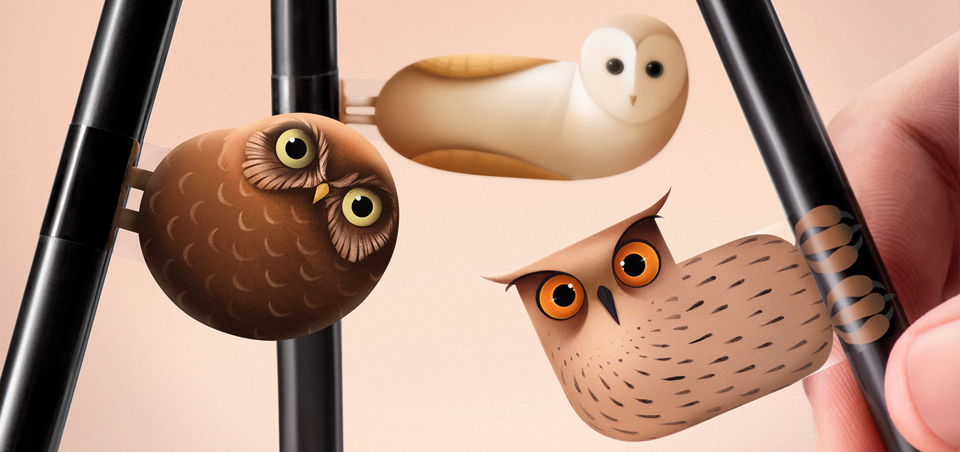
Our idea was to build the entire identity around the physical qualities of an owl. Being a nocturnal bird, an owl symbolizes the coffee effect of keeping people awake. We gave the owl a more modern and emotional look, adding two new owl characters. The word "Boo" (owl) was also turned into a typographic logo where the two letters "O" were placed above each other, reminding us of the wide-open eyes of an owl that has tilted its head. The colors of the cups and the owl's eyes matched the different times of day when the coffee is sold.
Credits:
Creative Director: Stepan Azaryan
Illustrators: Elina Barseghyan, Mariam Stepanyan
Graphic Designer: Ashot Hayrapetyan


