Яро Славно Молодежно
Логотип и и фирменный стиль для молодёжной политики Ярославской области
Yaro Slavno Modolyozhno
Logo and brand identity for the youth policy of the Yaroslavl region
О клиенте
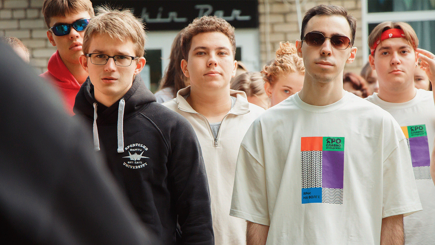
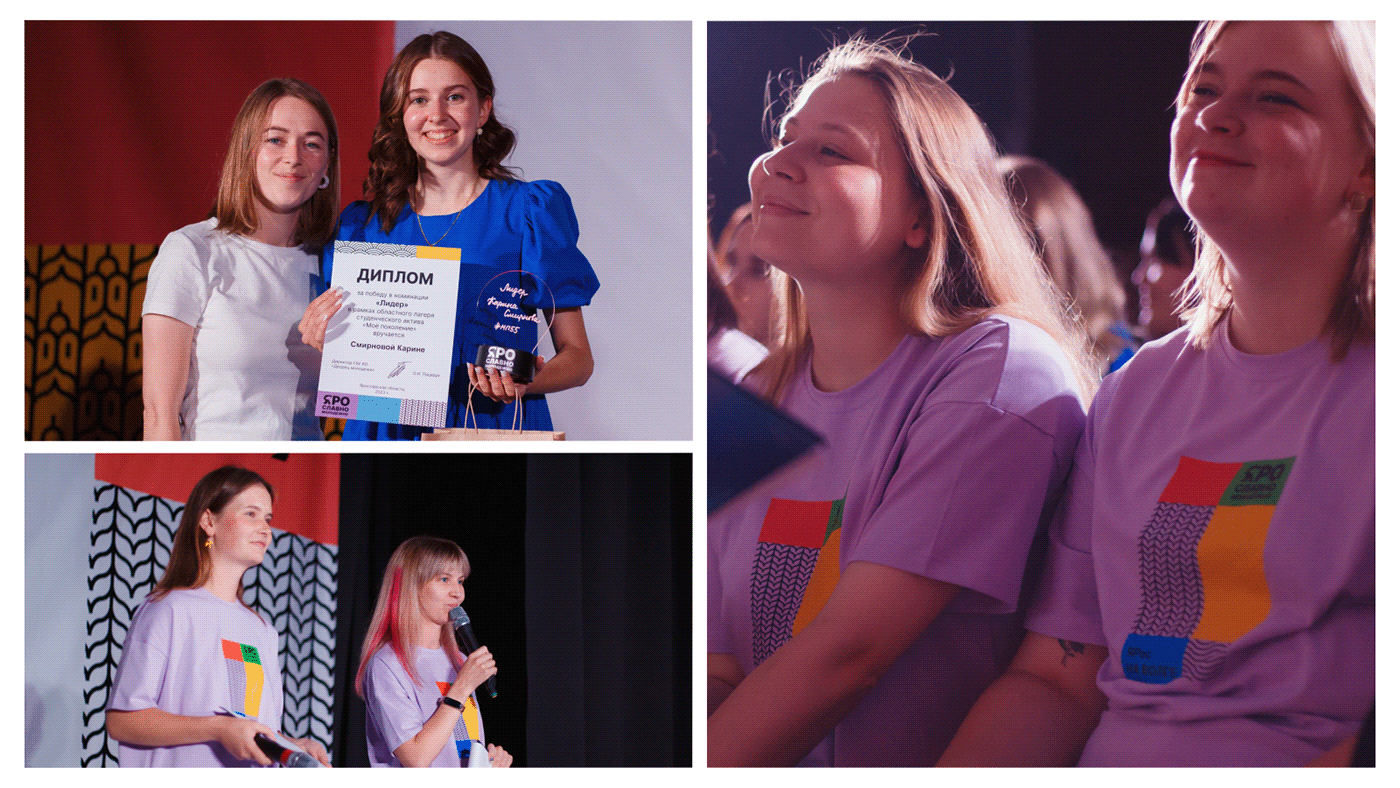
У активных ребят Ярославской области с недавних пор есть свой собственный бренд с запоминающимся названием — «Яро Славно Молодежно». Под этим брендом они не только ездят на конкурсы и фестивали в разные города, но и проводят события в своем регионе: например, форум Ярославской области, фестивали «СТАТУС» и «Мы — лидеры».
About the Client
The active youth of the Yaroslavl region recently have their own brand with a memorable name — 'Yaro Slavno Molodyozhno' which translates as 'Yaroslavl Vibrantly Youthful'. This brand isn't just a name; it's their banner for participating in various contests and festivals across cities. More than that, it's a symbol of their local pride, as they host notable events like the Yaroslavl Region Forum and celebrate festivals such as 'STATUS' and 'We are Leaders' right in their own community.

Задача
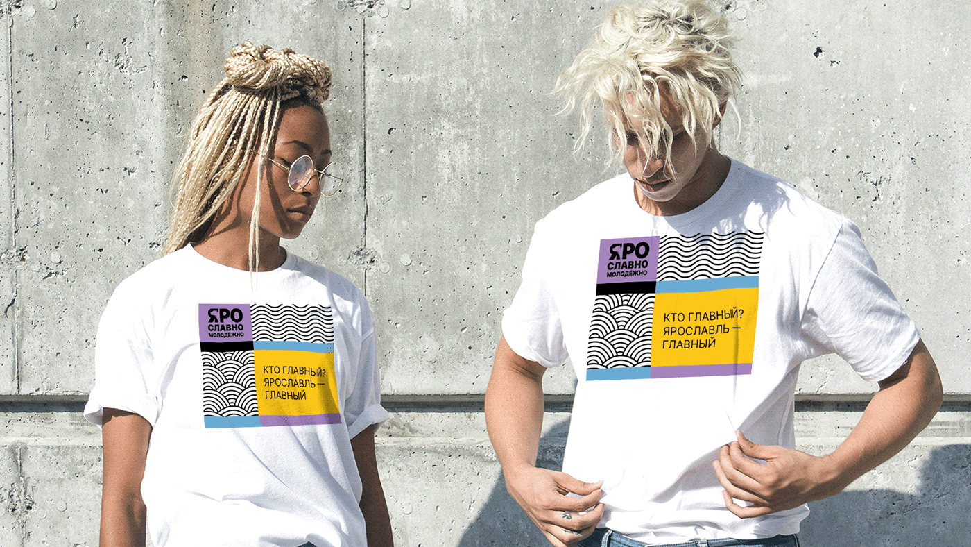
Школьники и студенты из Ярославля давно хотели выделиться среди сверстников из других регионов не только необычным названием, но и фирменным стилем. Именно поэтому в июне 2023-го года специалисты, отвечающие за молодежную политику в регионе, пришли к нам с задачей создать айдентику, которая будет с первого касания передавать бешеную энергию, присущую юному поколению, и в то же время отражать связь проекта с Ярославлем.
Task
School students and college students from Yaroslavl have long wished to stand out among their peers from other regions, not just with a unique name, but also with a distinctive brand style. That's why, in June 2023, specialists responsible for youth policy in the region approached us with the task of creating an identity that would instantly convey the wild energy inherent in the younger generation, while simultaneously reflecting the project's connection to Yaroslavl.
Логотип
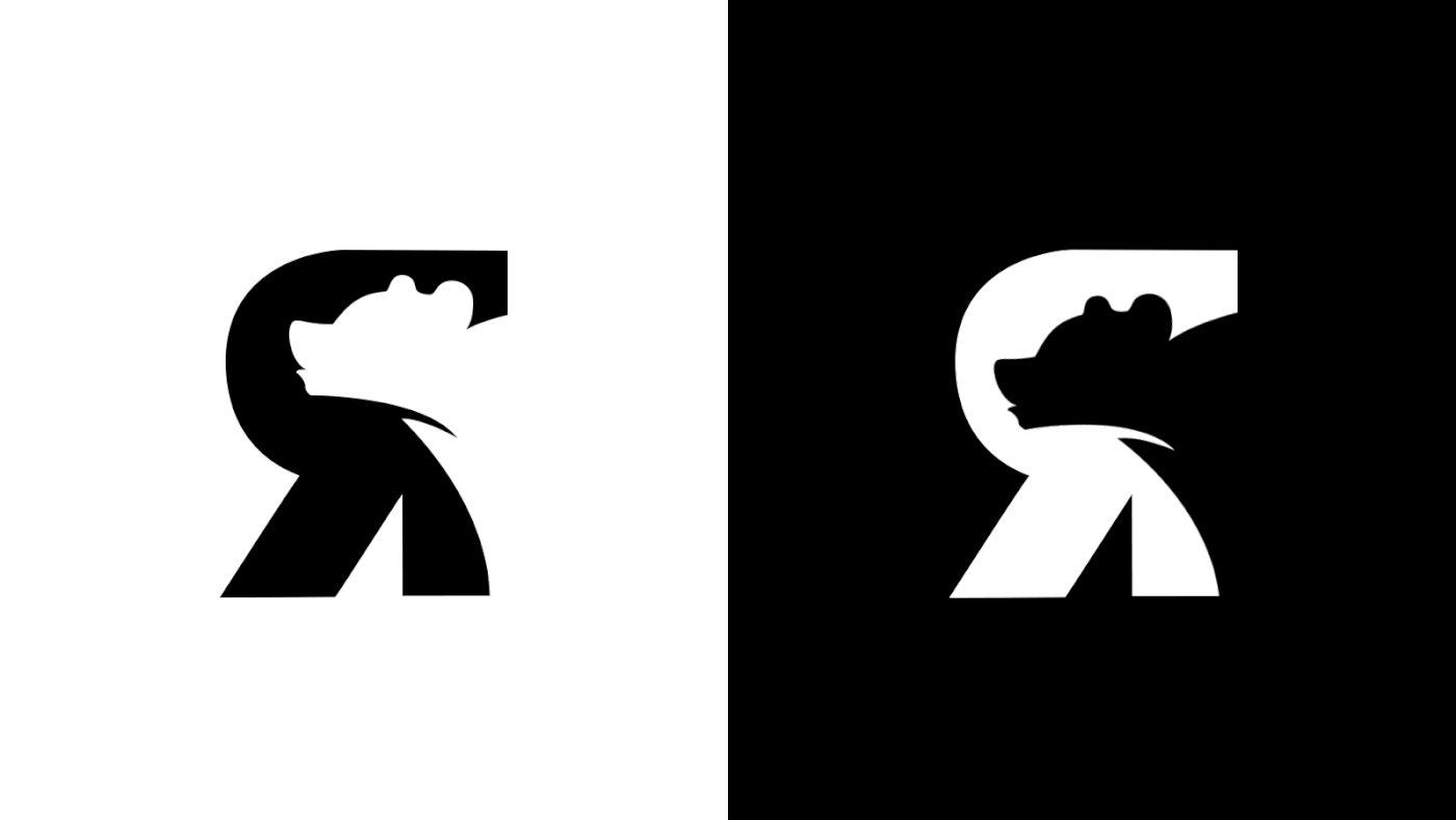
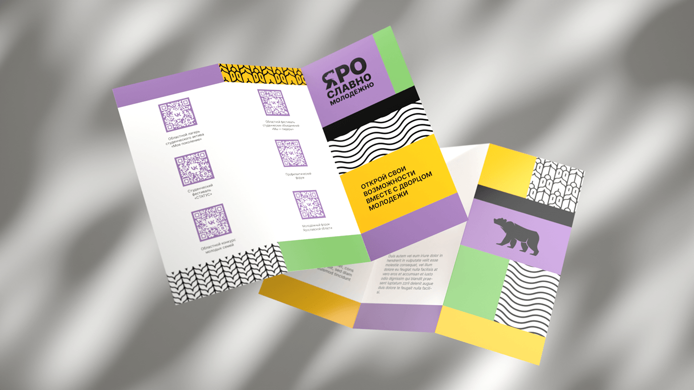
Главный символ области, который изображен в том числе и на ее гербе — медведь. Есть легенда, что Ярослав Мудрый победил этого дикого зверя на территории нынешнего Ярославля, а после и основал город. Именно силуэт медведя мы и взяли за основу будущего логотипа.
В качества шрифта использовали гротескный Inter. Размер шрифта сделали разным: так получился эффект, что слово «Яро» буквально рычит на каждого, кто соприкасается с лого.
Logo
The main symbol of the region, which is also depicted on its coat of arms, is the bear. There's a legend that Yaroslav the Wise defeated this wild beast on the territory of what is now Yaroslavl, and then founded the city. It is the silhouette of the bear that we chose as the basis for the future logo.
For the font, we used the grotesque-style Inter. We varied the font size to create an effect where the word 'Yaro' seems to growl at everyone who encounters the logo.
Фирменные элементы
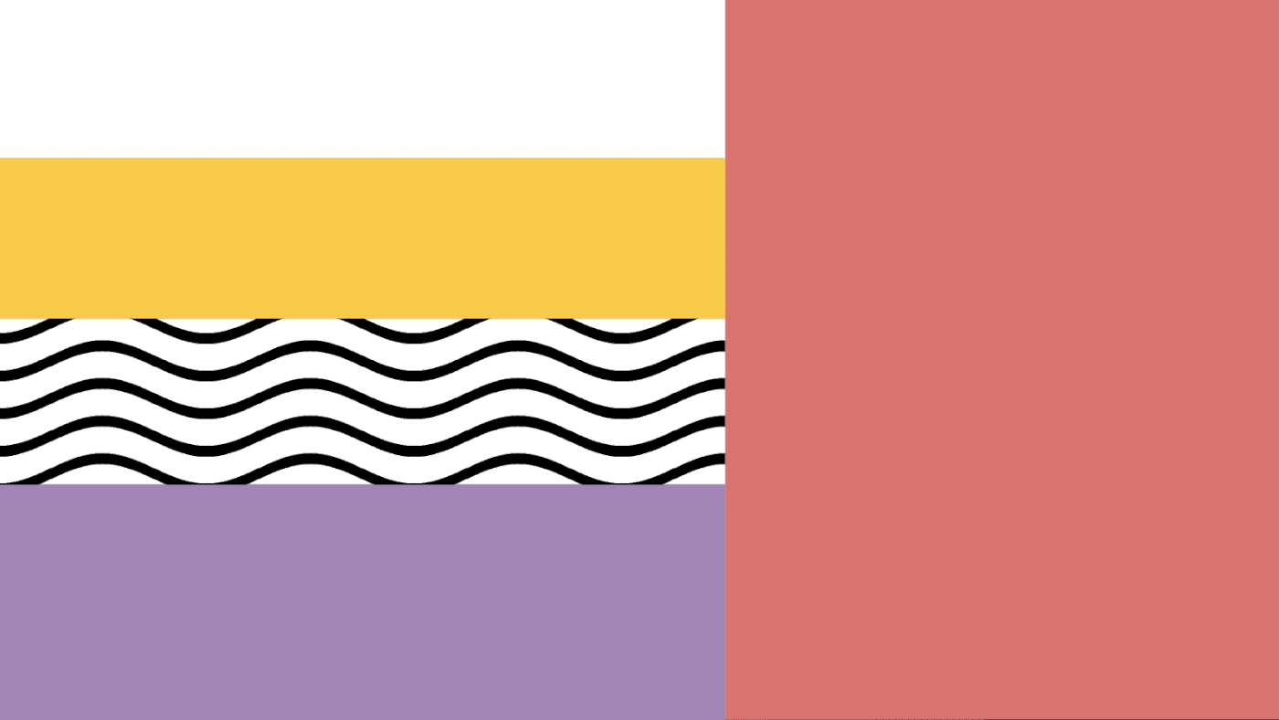
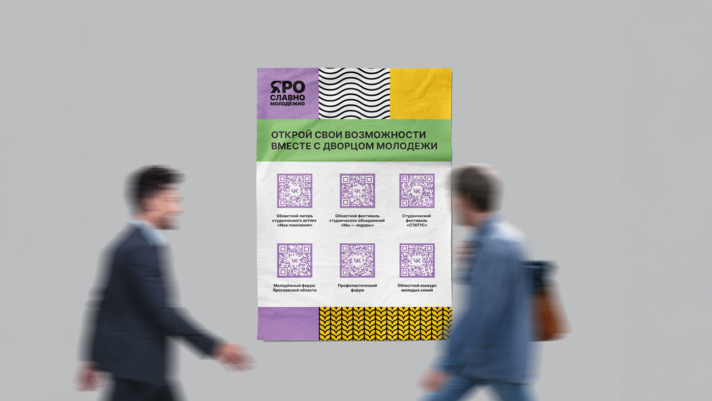
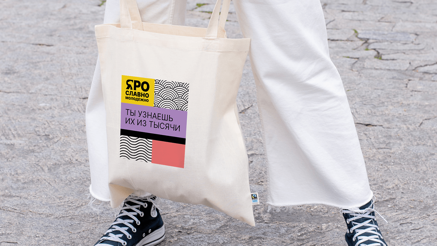
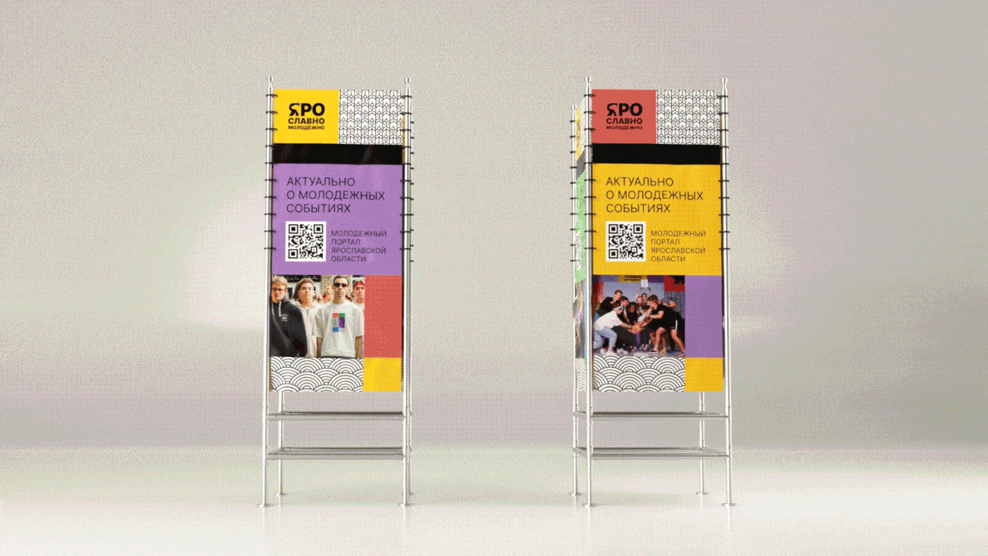
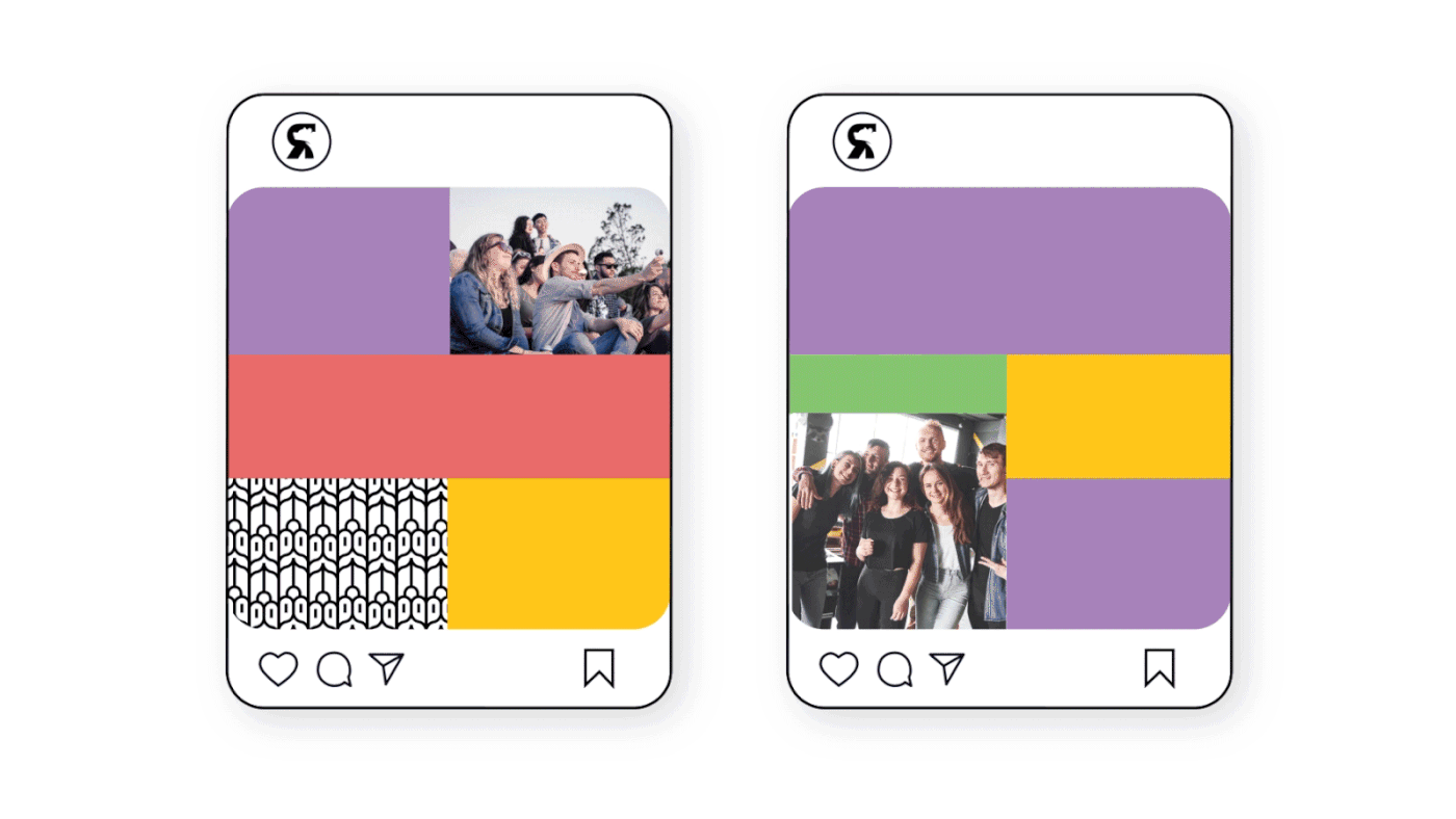
При выборе цветов было важно сохранять преемственность: желтый присутствует на флаге Ярославской области, поэтому он в палитре стал главным. К желтому для контраста добавили фиолетовый, зеленый, розовый и голубой. Мы сразу учитывали тот факт, что «Яро Славно Молодёжно» для своих мероприятий регулярно печатают много раздаточных материалов, поэтому для фирменной гаммы подобрали те оттенки, которые позволяют минимизировать различия между цифровой и печатной продукцией.
При разработке графических элементов дизайнеры студии обратились к списку ассоциаций, который составляли в начале работы над проектов.
Так, в основу паттернов легли купола, колосья, волны Волги, крепостная стена и поля — все то, что возникает прежде всего в голове при упоминании Ярославля. Графическим элементом также стал и сам медведь, профиль которого изображен в логотипе в букве «Я».
Поскольку паттерны выполнены в блочном стиле, то их легко комбинировать на разных макетах.
Brand Elements
Choosing colors, we focused on continuity. Yellow is on the Yaroslavl flag, so it's our main color. We added purple, green, pink, and blue for contrast.
Mindful of the project's frequent need for printed promotional materials, we selected shades for the brand palette that minimize the differences between digital and printed products.
In the development of graphic elements, the design team referred to a list of associations that were compiled at the beginning of the project.
Thus, the basis for the patterns included domes, ears of grain, the waves of the Volga, fortress walls, and fields — all things that come to mind first when thinking of Yaroslavl. The bear itself, whose profile is depicted in the letter 'Ya' of the logo, also became a graphic element.
Since the patterns are designed in a block style, they can be easily combined on different layouts.


Итоги проекта
От заполнения брифа до презентации айдентики в жизни прошло всего два месяца. Прежде всего, так случилось благодаря команде клиента: ребята оперативно давали обратную связь на каждом этапе и сами активно включались в генерацию идей.
Project Outcomes
From filling out the brief to presenting the identity in real life, it took only two months. First and foremost, this was possible thanks to the client's team: they provided prompt feedback at every stage and actively participated in generating ideas.