

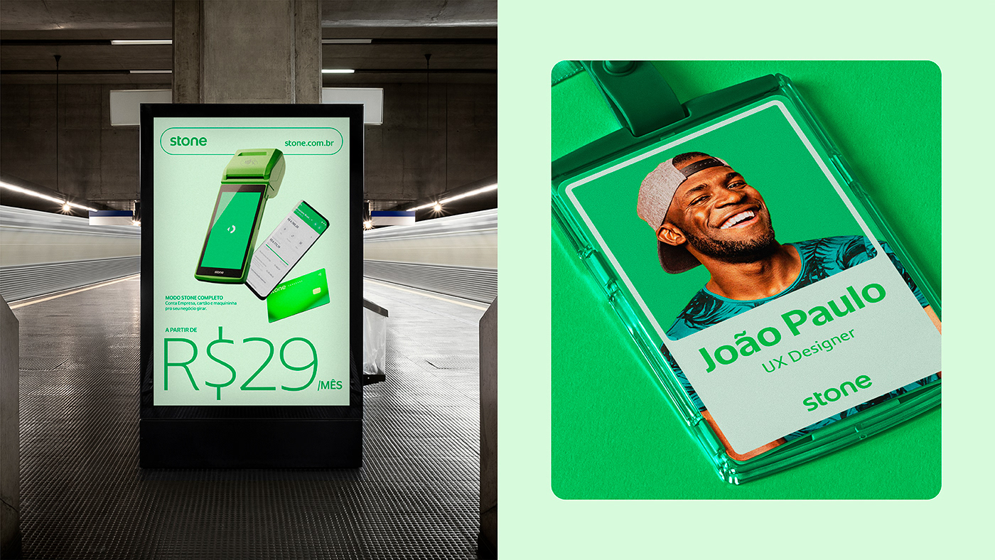
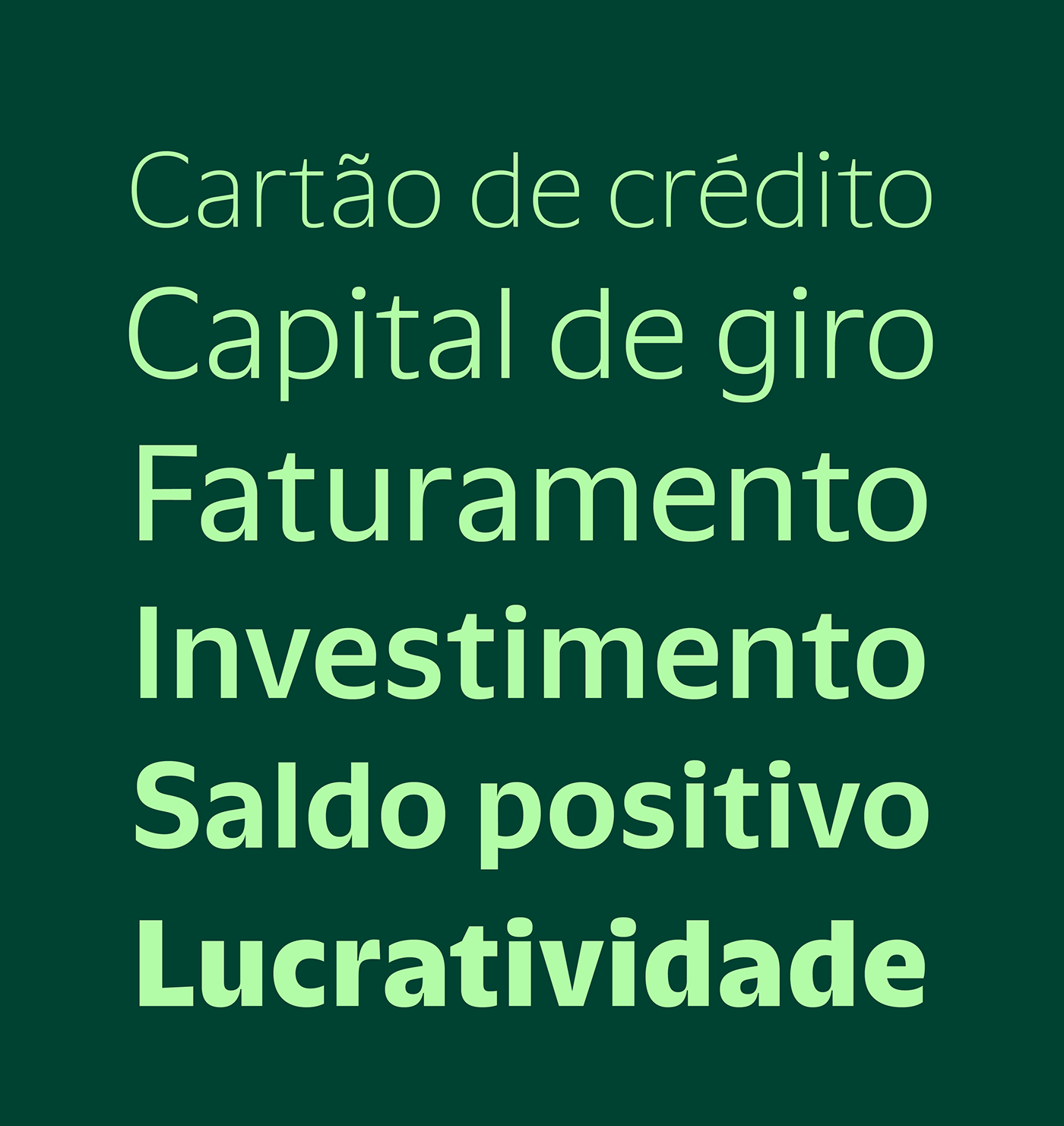
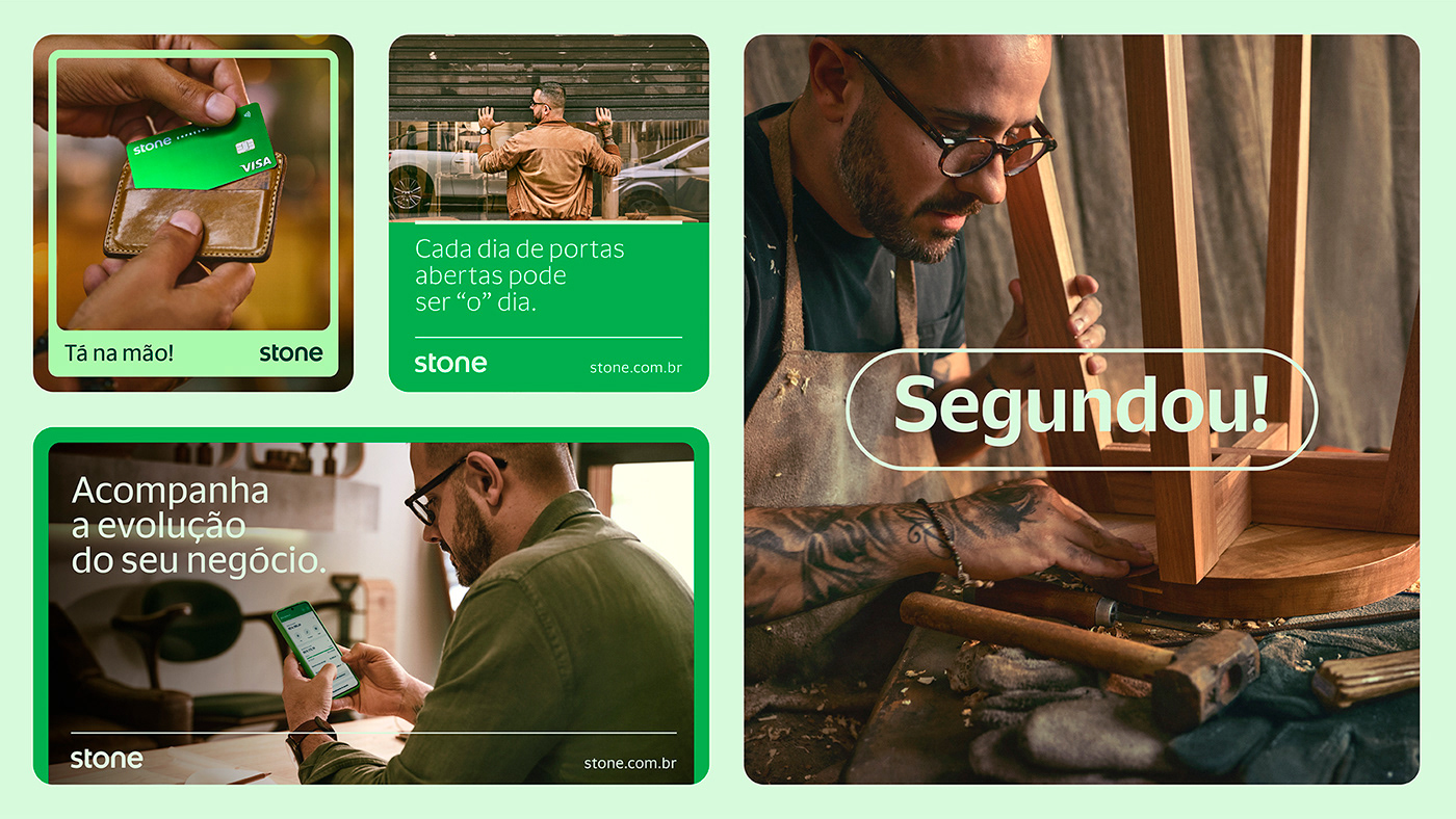
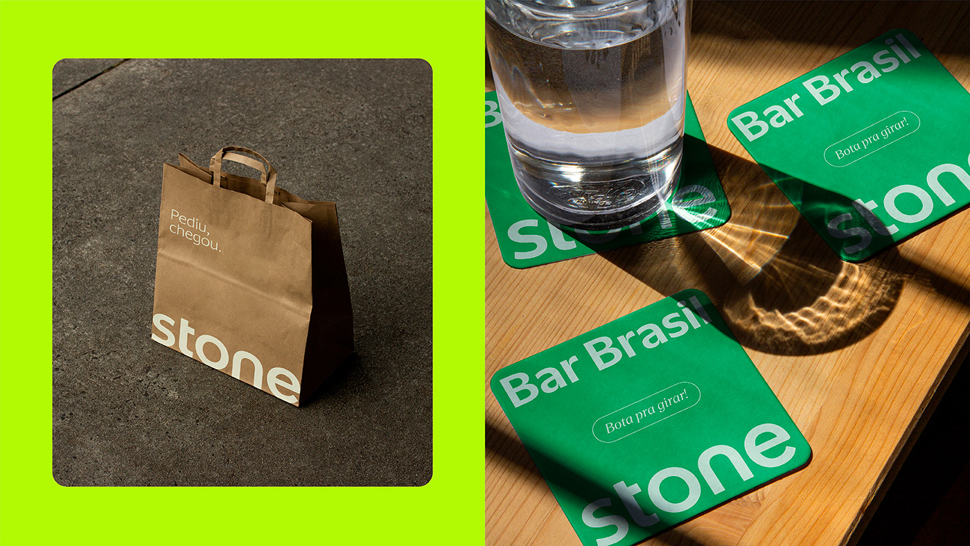
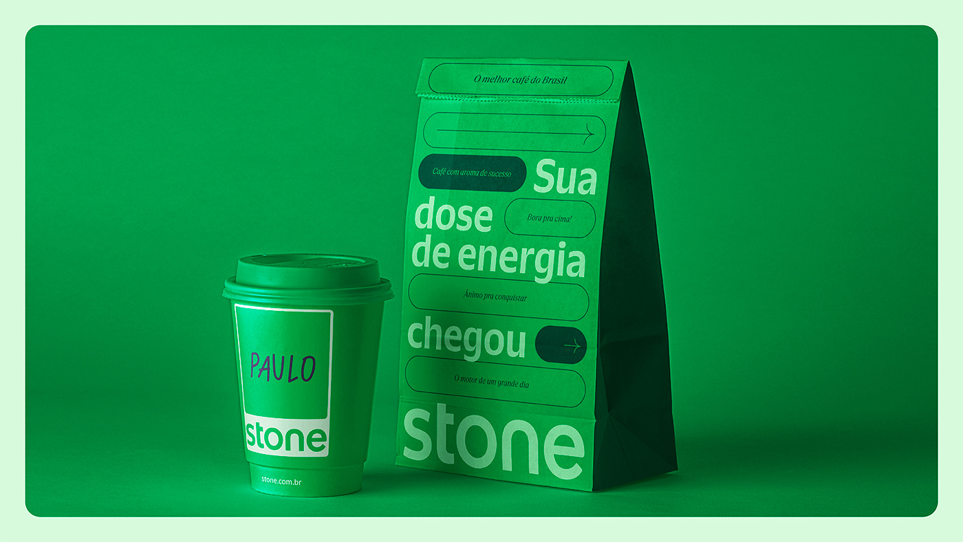
In 2019, we were called by Stone to create fonts that were the face of the brand. It was an incredibly fun challenge that resulted in a typographic project with no less than three complete families. The brand's new font palette was born, affectionately named Sharon (Stone), composed of a sans serif version, a monospaced version and a stylish serif font.

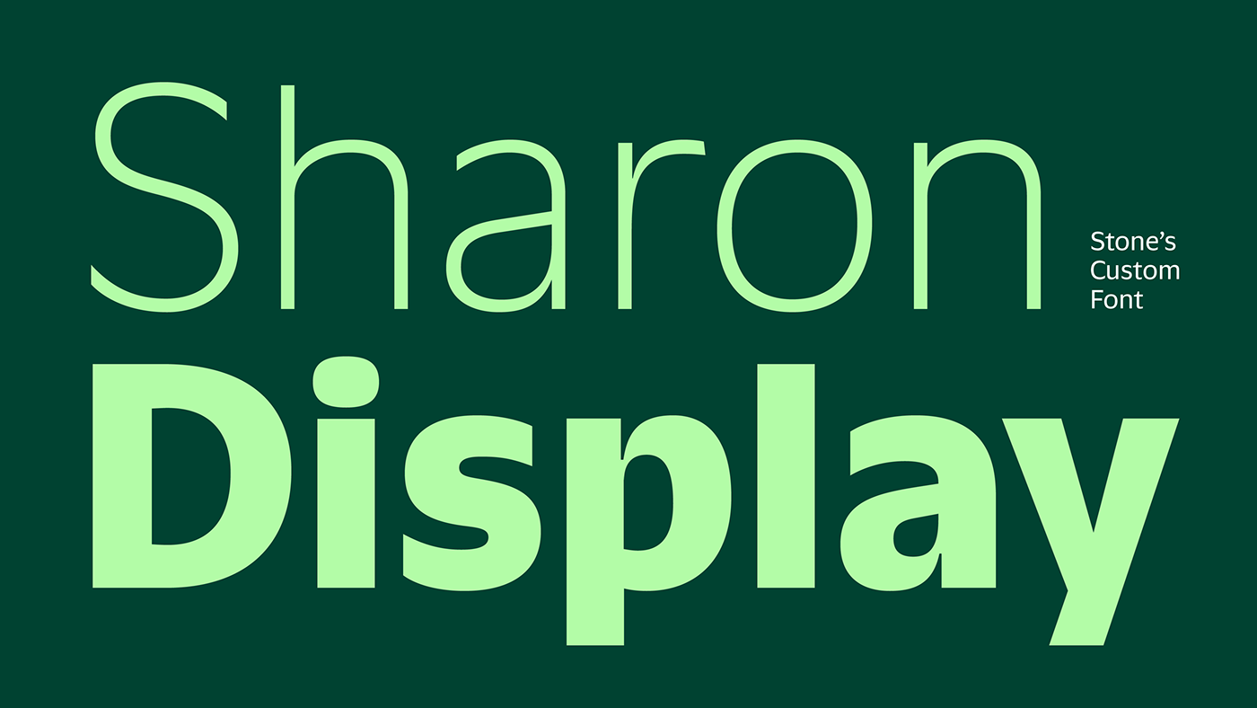
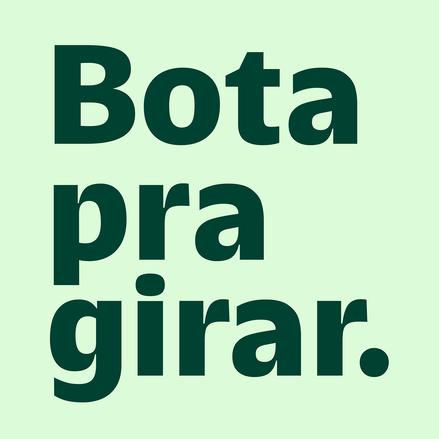
A few years later, in 2023, the brand matured in its purpose of “technological brazilianness” and identified the need to expand the font palette. A sans serif designed to be more simplified and compact than its “sisters” was the hit of the moment. Named Sharon Display, it can now be seen throughout Brazil, in the most diverse brand contexts.


Typedesign: Rodrigo Saiani e Carlos Mignot
===
===
Branding & Id Visual:
Head Marketing: Rodolfo Luz
Head Comunicação e Branding: Lucas Canto
Direção Criativa: Alexandre Rizzuti
Designers: Maiara Job, Marcelo Rodrigues da Cunha Filho, Joana Bertola
Head Marketing: Rodolfo Luz
Head Comunicação e Branding: Lucas Canto
Direção Criativa: Alexandre Rizzuti
Designers: Maiara Job, Marcelo Rodrigues da Cunha Filho, Joana Bertola
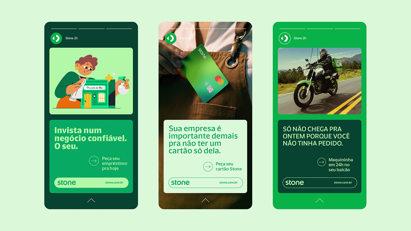
Redatores: Louis Vidovix, Leonardo Rachid
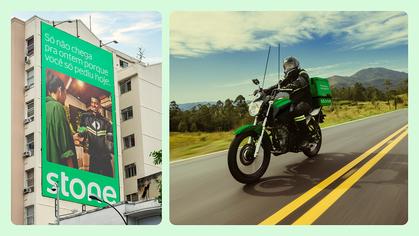
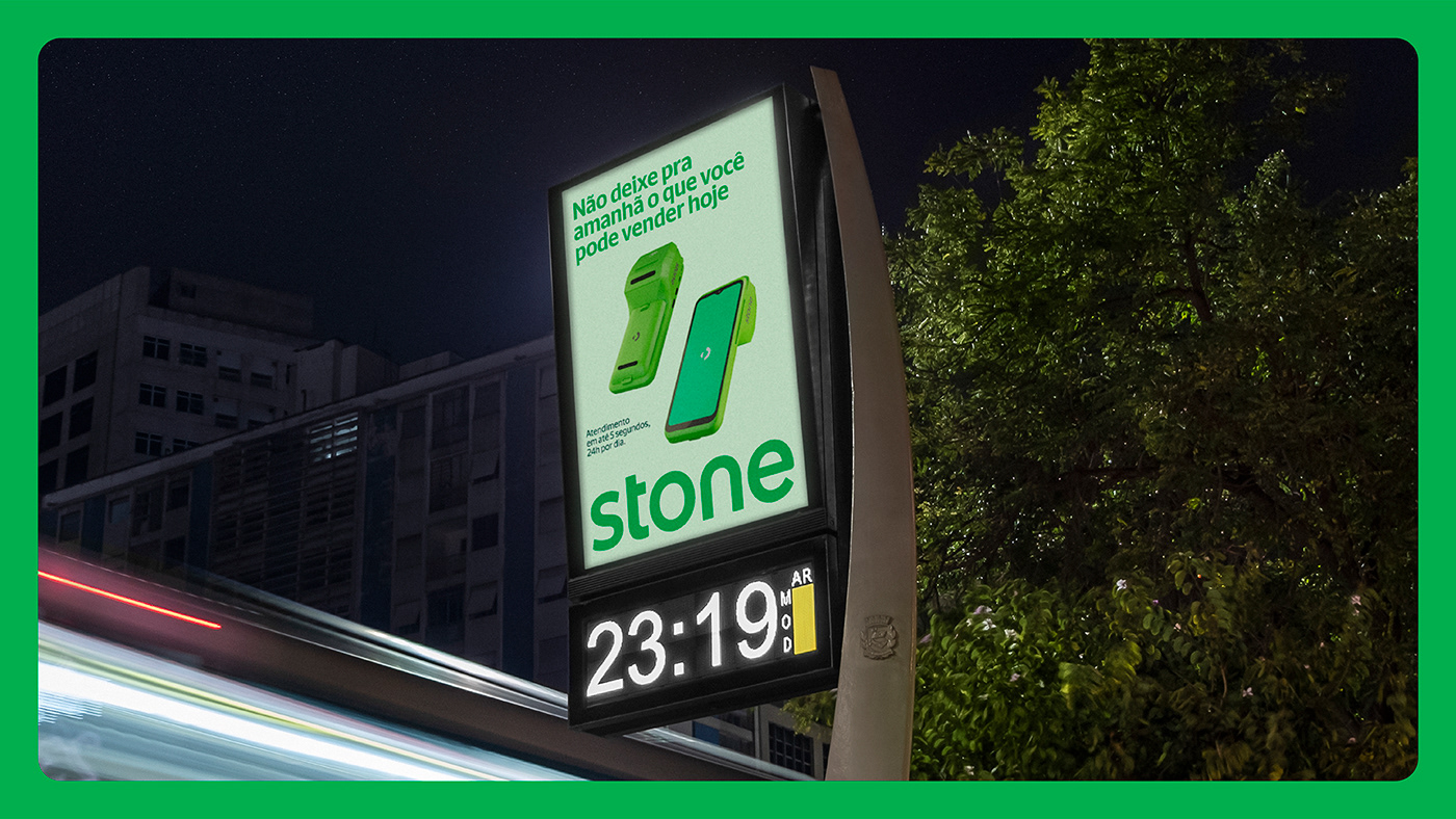
Fotografia: Gustavo Zylbersztajn
Motion: FutureBrand São Paulo
Fotografia: Gustavo Zylbersztajn
Motion: FutureBrand São Paulo


