Degustation
We developed a food court style restaurant concept.
This place would combine different cuisines in one location, with the area divided into stations where customers can go to and order the food they prefer. So, it would be a great spot to grab a quick and delicious bite for anyone who has a dynamic, high-tempo lifestyle.
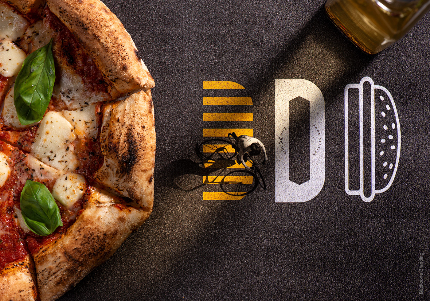
We started with the idea that stations, such as train stations, are an integral part of everyday life that enable people’s mobility in a city. So, we decided to call the new restaurant "Degustation," as it has different "food stations" offering various types of cuisine that customers can stop by and taste.
The brand identity emphasizes the urban lifestyle, portraying elements of fast-paced life, such as zebra crossings, bicycles, and people on the go. We aimed for customers to identify with the brand and feel empowered, seeing a reflection of their own lifestyles in the bold and relatable design.
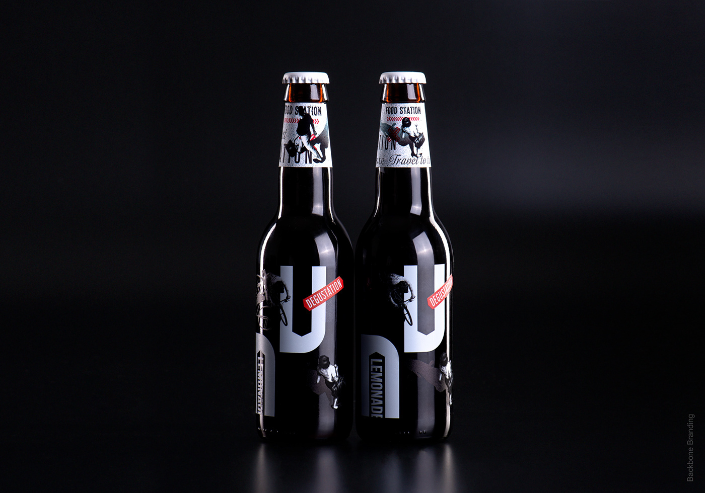
The brand identity has also been applied to Degustation's in-house lemonade line, which is also sold at the “food stations." The design emphasizes the refreshing qualities of the product and is more reminiscent of a beer bottle, which is quite unusual for a lemonade brand. In particular, the brown glass and bold elements on the label make the Degustation’s lemonade stand out from other conventional lemonade designs.
The design of the takeaway holder is aligned with the same identity and is inspired by urban architecture, resembling the shape of a house. With its help, customers can conveniently carry refreshing beverages to a picnic and share them with others.
Credits:
Brand Strategist: Stepan Avanesyan
Brand Strategy assistant: Lusie Grigoryan
Creative Director: Stepan Azaryan
Art Director & Illustrator: Mariam Stepanyan
Graphic Designer: Liana Mazmanyan