Gaga.team
Logo and corporate identity of a dating service

Client
Gaga.team is an online dating platform and an offline club that enables people from all around the globe to connect with like-minded individuals. Users' interests and professions can vary widely; gaga.team is welcoming to everyone, from entrepreneurs to bikers, gamers, and even fans of role-playing games.
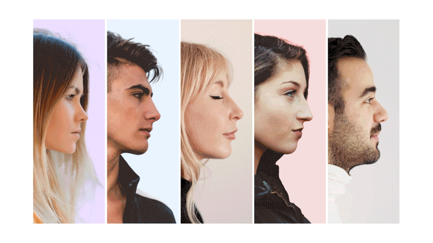
The project was initiated by founders who aimed to rectify the shortcomings of popular dating apps, where people typically take the process of selecting conversation partners too seriously and apply a myriad of filters, such as height, precise age, and weight. Consequently, users end up spending a considerable amount of time swiping through photos, most of which ironically echo the 'expectation versus reality' meme.
In contrast, real-life interactions usually don’t involve specific objectives; people often engage in conversations merely to alleviate boredom. The founders always felt the absence of a tool that could display individuals feeling bored in nearby locations or in a specific cafe or hotel.
Mere photos and identical tags never truly encapsulate a person's essence. However, a brief audio message attached to a location, or a 'gaga' as dubbed by the founders, serves as an effective introduction for acquaintances.
Task
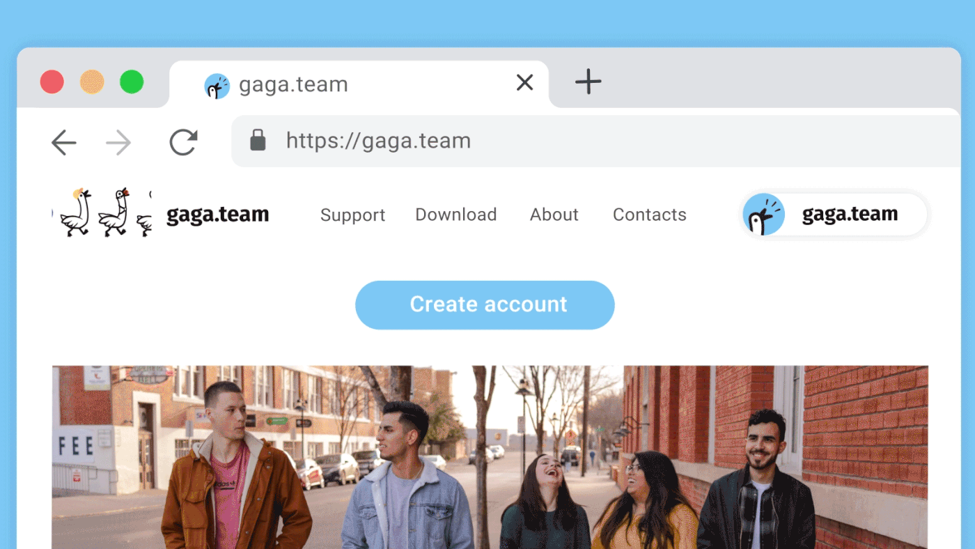
The application's founder approached Logomachine with a request for a logo that would elicit strong emotions from its clients.
Moreover, the prospective logo needed to be visually appealing on small-sized stickers, which could be affixed to a variety of surfaces, ranging from automobile windows to elevator mirrors.

Solution
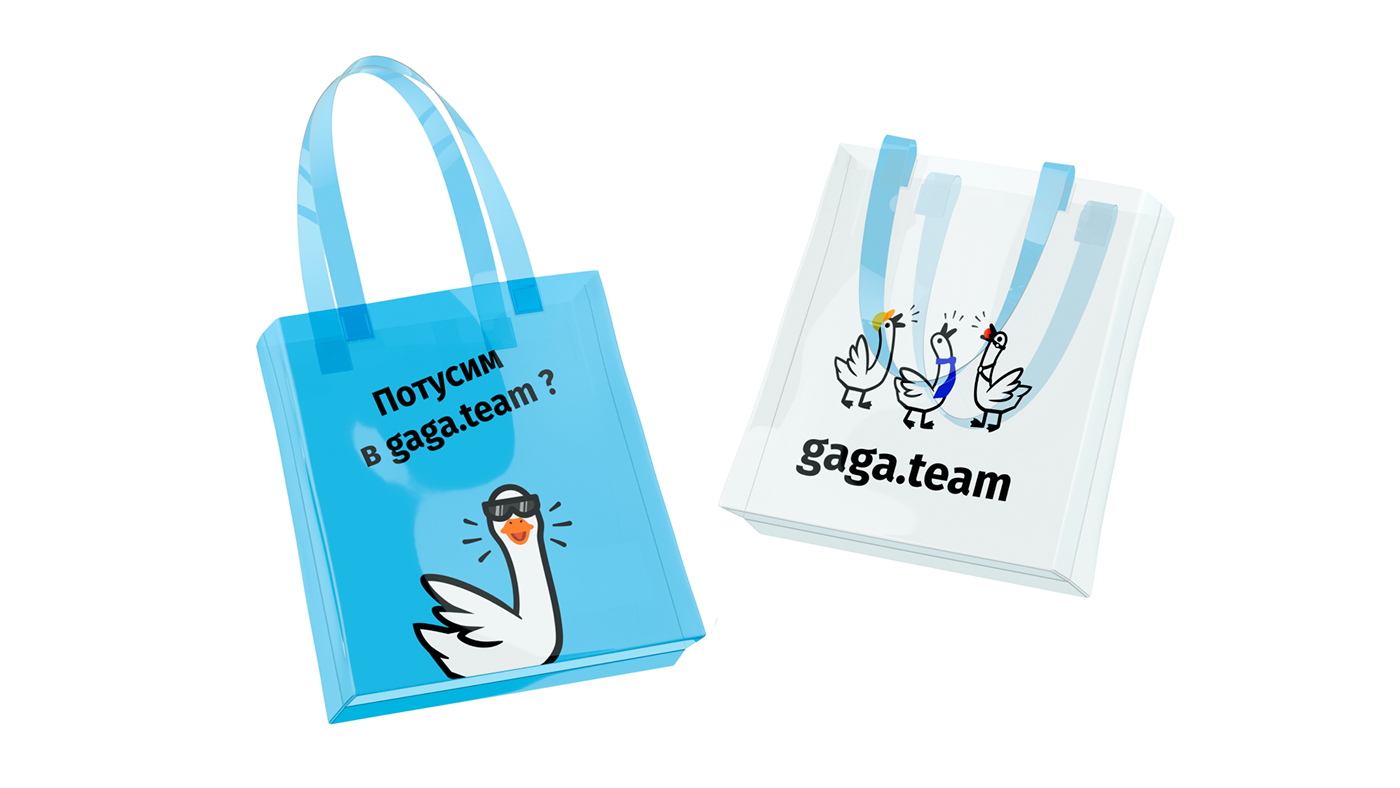
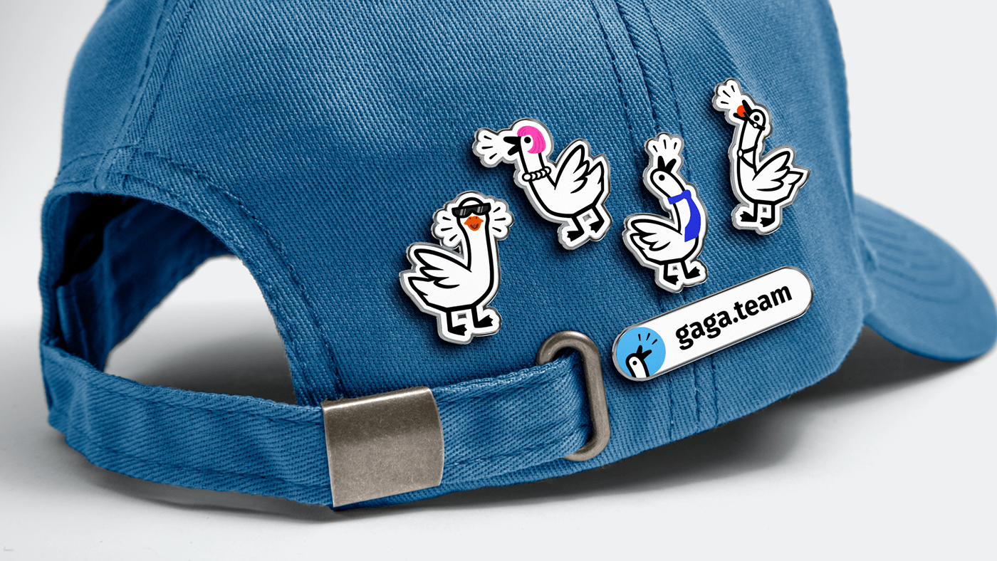
The logo is centered around a straightforward depiction of geese honking. To encapsulate the service's essence — that gaga.team attracts people with a wide array of interests — we incorporated several elements into the logo. For instance, one goose is adorned with a tie, embodying the image of an entrepreneur, while another is depicted with a gag in its mouth and a collar around its neck, representing a BDSM enthusiast.
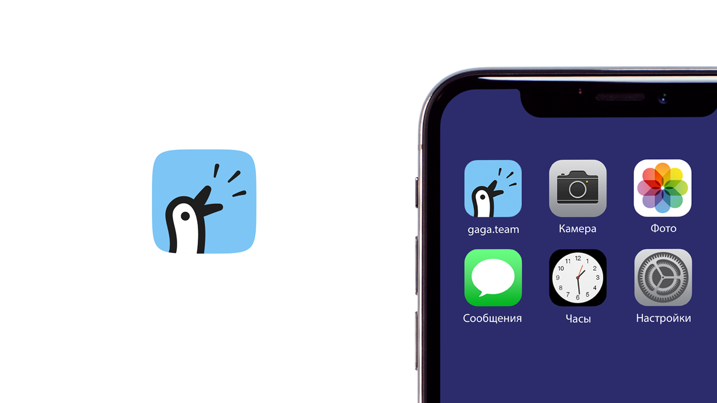
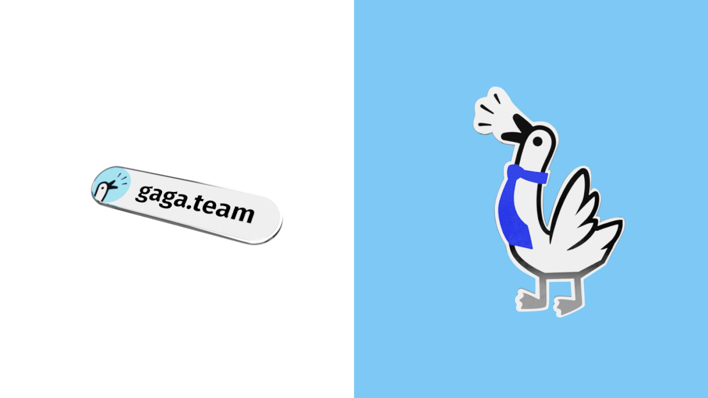
Beyond the primary logo, we crafted a streamlined version suitable for stickers, featuring just a single honking goose.
The project's primary font is Fira Sans, a simple and legible grotesque typeface. For the corporate colors, we opted for vibrant and straightforward hues reminiscent of comic books.
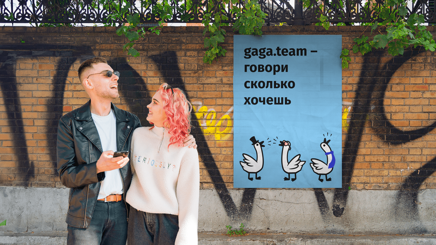
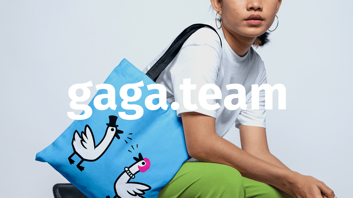
In addition to the geese, we included slogans on some media that mirror the service's philosophy, such as: "The most important thing in life is to find your tribe and find peace," "Find your flock," or "gaga.team — speak your mind."
As the founders intend to transform the gaga.team website into an app shortly, we devised several splash screen alternatives: upon app launch, the phone screen will either display geese accessorized with various items or photos of people enjoying each other's company.
Currently, the service is undergoing the final testing phase with a select group of users and will soon be accessible to everyone.