

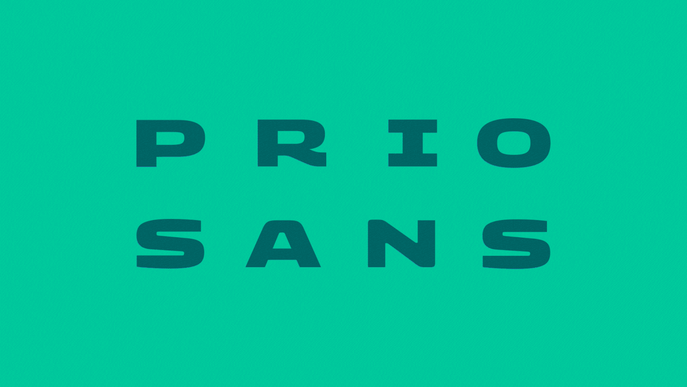
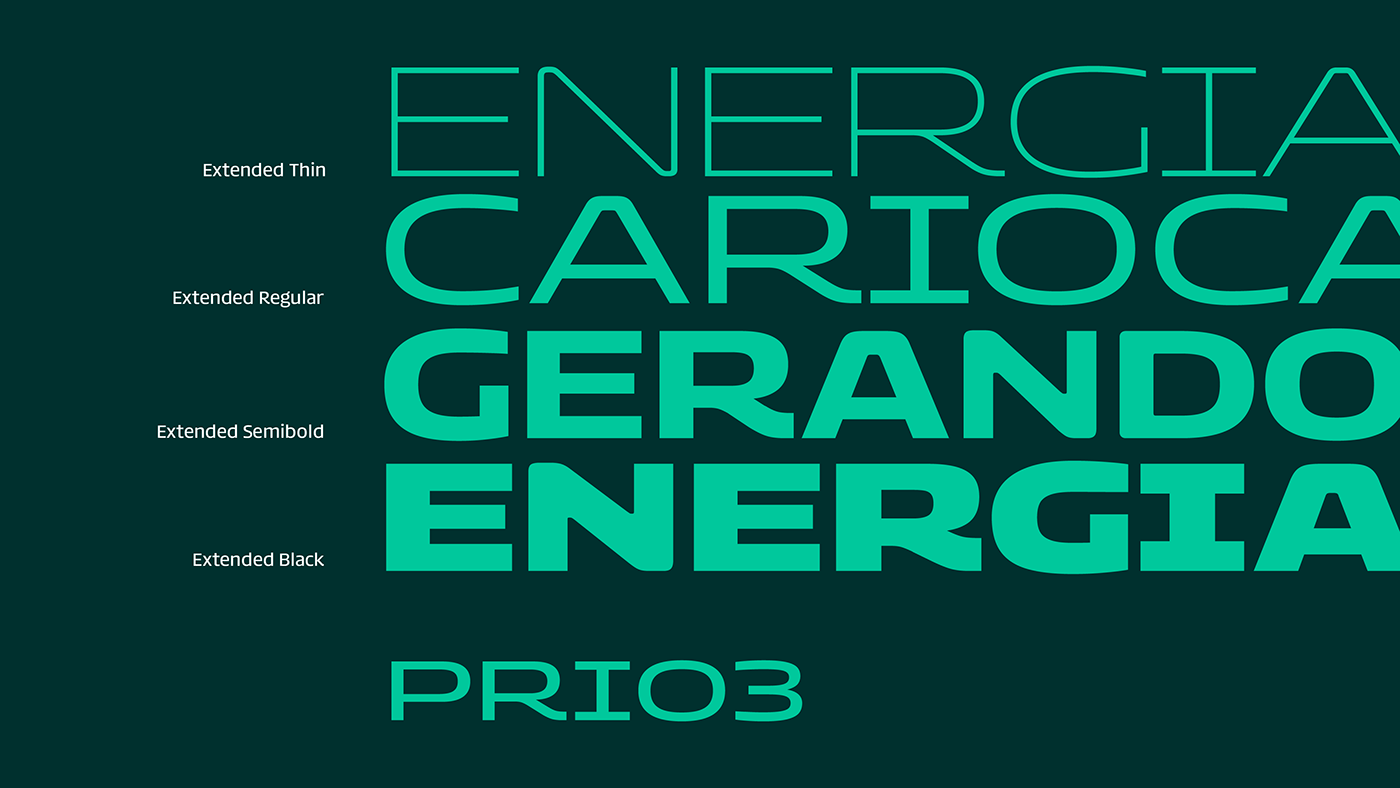
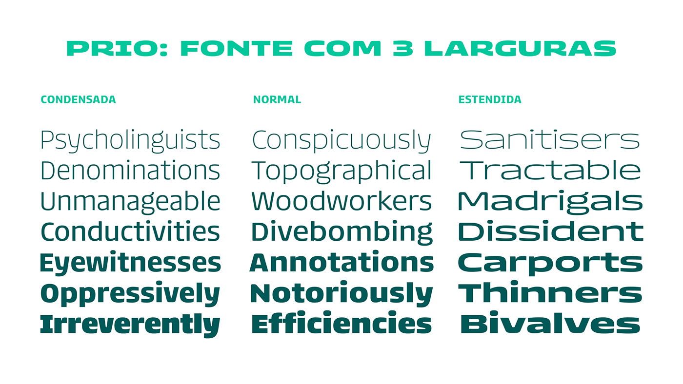
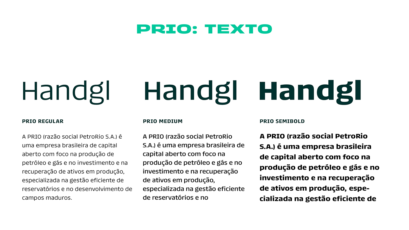
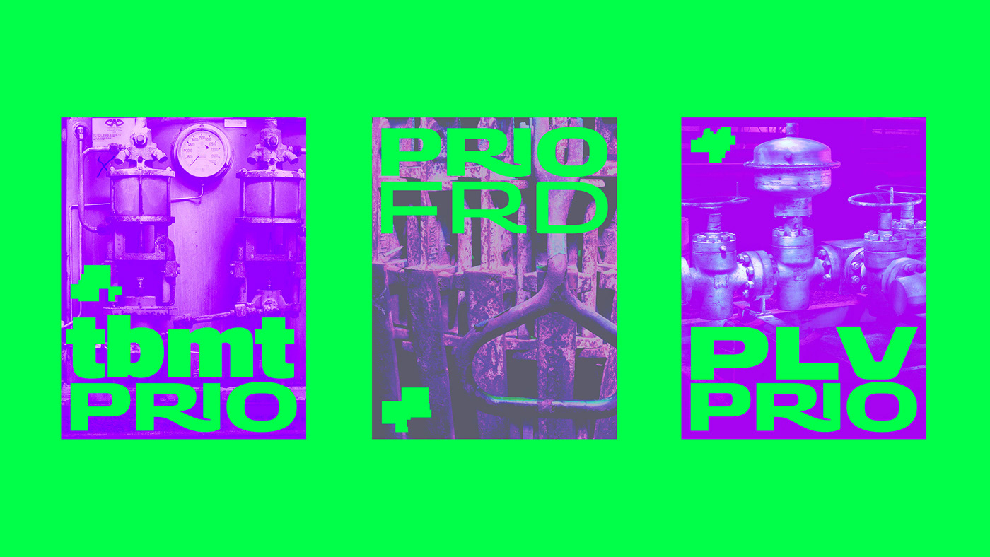
A name change is a good opportunity for a visual overhaul. With PRIO, we collaborated closely with the in-house team in designing a new company logo. Inspired by this new design, we expanded its communication capabilities by creating a typeface family with three width versions and seven styles for each (totaling 21 fonts).
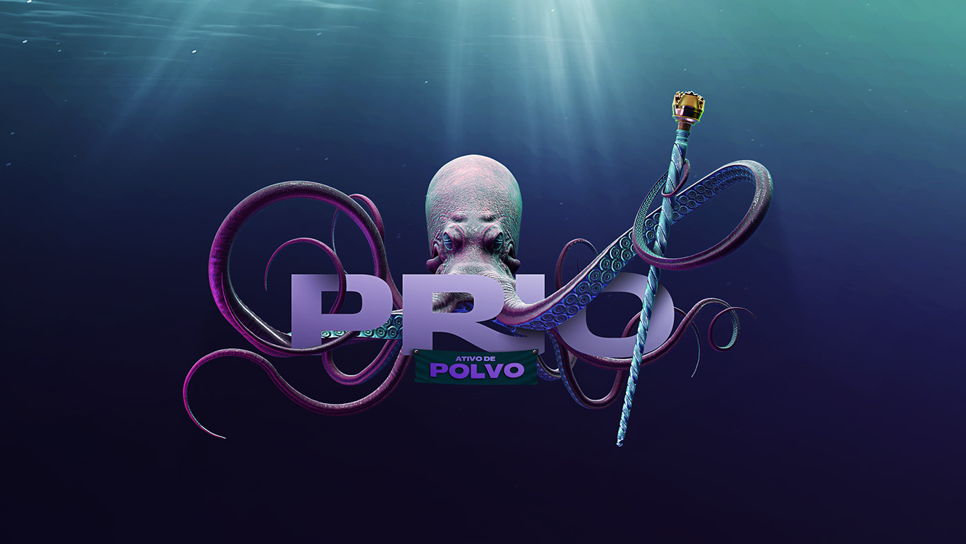
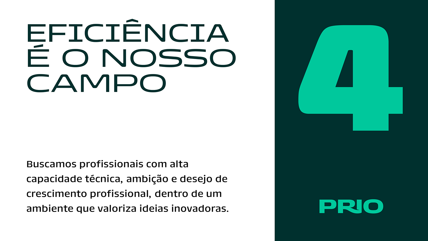
A company in the oil and gas sector, PRIO updated its communication to position itself as an "oiltech" and use the brand to point towards the future of oil production


PRIO decided to position itself in the market as both a technology brand and a global brand. The rebranding project was aimed at modernizing the brand and removing regional elements (such as the map of Brazil, which was present in the previous logo).
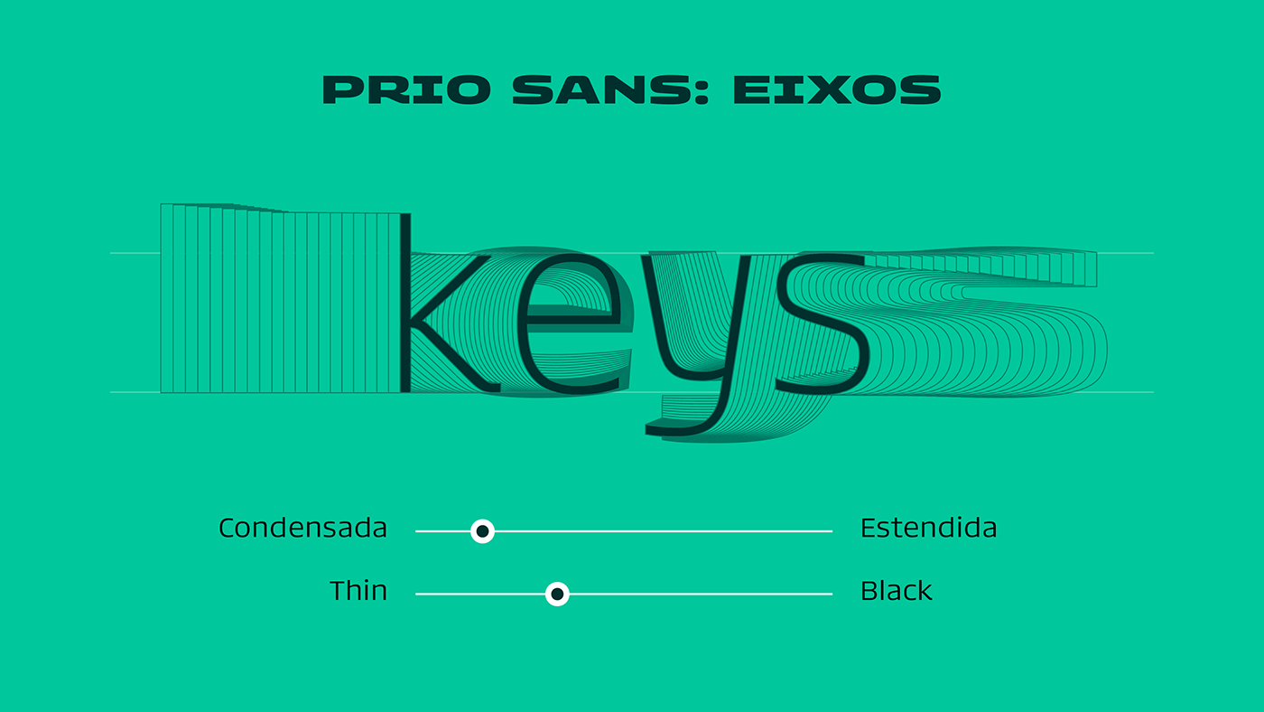
The PRIO typeface has a swift personality, and each width can express certain aspects of the brand's personality. Use the extended version on a race car to convey speed. The condensed version on a conference poster brings elegance and austerity. With the ability to vary in width, the fonts give the brand's communication the chance to gauge its impact, but always with a strong presence. The finishing touches on the letters spare no effort in delivering the technological tone that the brand seeks in its new phase.


Créditos
Logotipo: Plau
Type Design: Carlos Mignot, Rodrigo Saiani
Type Design: Carlos Mignot, Rodrigo Saiani
Comunicação: Monkey Land e Agência Rastro


