Creation of a Happy Meal
In this document I will take you through the process of my creation of a happy meal through Maya, Substance Suite, and Unreal. All materials made in this project were made using Substance Designer and applied in Substance Painter.
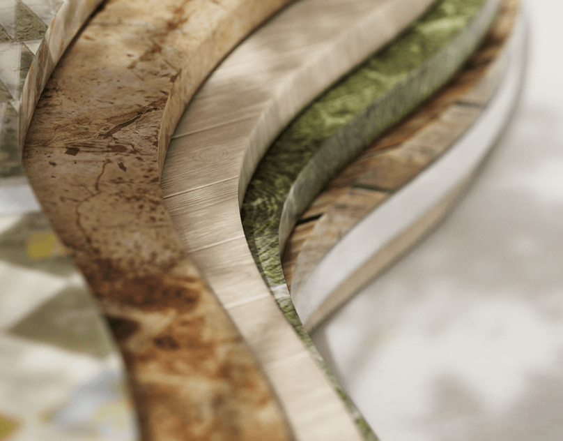
Happy Meal Project Rendered in Unreal
Reference Collection
As a starting point to all projects, I start by collecting reference for my materials, gathering reference images from Shutterstock, Reddit, as well as advertisements from companies such as McDonald's and Burger King. Utilizing actual advertisements allowed me to study the falsification of these objects when they're presented in this fresh new state. For example, the glossiness of a burger bun, the saturation of the ingredients, and the sheen a majority of these objects had, are all inconsistent with their actual product, but is what makes the item appealing. In contrast, I also was challenged to create a decayed version of this meal, causing me to gather additional reference for these materials. Studying how the materials lose their vibrance, begin to fold and discolor, as well as their overall lack of glossiness. I compile these references and pick out two with the most stark contrast, as move forward with them as a point of reference.


Assets
To expedite my process in working on the materials, I decided to acquire food and happy meal assets from various TurboSquid artists, as to not spend to much time modeling. I wanted to focus my time on my materials, so it was imperative that I found assets that contained clean geometry, and if possible, good UVs. Ultimately, I had to create new UV sets for a majority of the food ingredients, but the objects, such as the happy meal and burger box, already contained a nice set which would later help me in the branding process. I then set them up in a rough layout in Maya, to get the general idea of how I would like my composition to look.


Texturing
Bun
Typically when I begin my material creation in Substance Designer, I like to focus on the shape elements first before color, but seeing as how the bun has little to no shapes within the material and relies more on the separation of the toasted parts of the bun and the untoasted, I focused my attention on capturing the minuscule details. To start, I began with a gradient to allow myself control over how hard of a edge the bun would have. The color for the new version of the bun is pretty uniform, it was just dependent on its later application within Substance Painter. After getting the general gradation of the bun, I applied the colors using a blend node, making both colors editable in the case of over saturation or inconsistency.

To create the mold and dusting, I created a tile generator node with paraboloids, distorting the shape with a gradient map to increase the amount of rings within the mold. The edges on the gradated shape were too hard, so I blended it with the original shape to soften the edges a bit, and then warped it with its gradation to give it more rigid edges. To create some slight variation, I duplicated the mold shape and scaled it up a bit to encompass the smaller versions of the mold, then blending them together, created another blend to act as a switch between the new and old version.

To create the slight dusting on the old version, I took two dirt nodes, differed their levels for each and displaced one using a transform 2D node, then blended them together to create slight variation in sizing. I then warped these shapes with the original mold shape, blending them together to further that variation. I also applied a blur to both to give it that hazy look that dust creates.

Finally, I blended all these shapes together into one blend node to create an editable switch as mentioned before, thus completing my base color.
For the roughness and normal, I tend to work off similar nodes to create both, as deformations typically affect where light is reached on models. For the normal, I used a cells node to create the slight wrinkles in the bun, overlapped with a noise filter to create the grainy effect. Utilizing the mold from earlier, I plugged that into a blend with this base normal and set the blend to add sub to create exclusions in the normal. With similar application to the roughness, I added a blended a noise filter with the mold to create exclusions within the roughness for the old texture. I always blend my modified roughness with a uniform color roughness, to control the variation in its sheen.


Cheese
The cheese was one of the more simpler graphs to accomplish as it mainly relied on the color and sheen of the cheese. To create some slight variation in the shape of the cheese, I did apply a blurred clouds node to the normal to give the cheese slight wrinkles.

Throughout this project, I found myself utilizing the mold nodes from the bun a lot, as it was simpler to reuse that and alter its bases than create new mold from the beginning. As a collective too, when mold grows on food, it tends to be localized so the affected areas of moldy food spread to other similar regions, thus making the continuity of the mold relevant. I applied the mold similarly to that of the bun, plugging the mold nodes into a blend for the roughness and base color, to allow myself to easy switch between the new and old versions.


Fries
For the fries, to create the effect of a crispy edge, I created a paraboloid shape and scaled it so that just barely the edges of the fry would be darker. I then blended a lighter and darker brown/yellow to give the effect of a gradated fry, once again having those be editable in case correction would need to be applied in Painter. The mold node reappears once again in this instance, with an application of the dirt node as well to break the mold up within the fry. I then blended the two shapes together to give myself control over the deterioration.

Moving to the roughness of the fries, I wanted to emulate the effect the salt and fresh grease create on the fry with specs of highlights. to do this I broke up a uniform color node with dirt node that had its levels crunched. For the old version, I blended the mold dirt from the color nodes, as well as the mold shape with that speckled roughness to lessen the roughness in those areas with an editable node when I apply them in Painter.

For the normal, I simply blended a noise and cloud filter to give myself some variation in the fries, while lowering the intensity to not deform them too much.

Lettuce
Lettuce tends to follow a lot of the same principles of skin when it comes to application, from tonal variation, veins, and details. To break the normal detail up I created two variations of cracking, large cracks and smaller cracks. To create smaller cracks I blended two cell nodes and squished them on the X axis to create elongated veins. For the larger cracks I used a similar cells node, but enlarged it and warped the shape with a noise filter to create less uniformity within the large veins. I then applied them together with a blend node set to multiply to give myself larger and smaller details to work with in the material. This same cracking detail would be used in my roughness map to give a better sense of depth as the larger cracks would contain less roughness, and the raised areas would contain more.

For the base color, as mentioned before, I focused on the shape prior to the colors. To get the gradation, I used a stretched paraboloid as my alpha before applying a lighter and darker green all into a blend node, giving me my gradation from the center of the leaves. Both colors remaining editable, just in case I needed to retouch them in Painter.

Patty
For the patty I'll start with the base color. For the patty base, the colors applied are generated by crunching the levels on a fractal scrum node, duplicating it and blending it with two altered cloud nodes to create variation in the tonality of the patty. I created a levels node as well before applying the colors and shape in the alpha, to give myself more control over how much range the patty had.

For the burn marks, the same technique was used, but this time simply just using a higher contrast clouds filter to drive the lights and darks of the burn marks.

The normal on the other hand required me to apply the aforementioned alpha for the patty base underneath a generated burn mark. To create the burn mark I used a tile generator to create the base of the grill lines before blending them with a grunge leaks node. I then blended that with a fractal scrum node as well to give the background a bit more tonal variation. I then warped that with a crystal node to give my grill lines some breakage. Taking a B&W spots node, I warped the previous warp node to soften the edges of the grill marks, getting my closer to my goal. The burn marks were still to uniform so I blended the warp with itself and set it to multiply and then crunched the levels to give myself more variation in the shape. To finish up the base of the shape, I softened it with a blur node and used that as my alpha for the grill marks in the base color.

I took the blurred and unblurred version of the grill marks to create more depth in my normal map, and the blended them together with my patty base from earlier to create some nice depth in the material.

The roughness follows the application as the other materials, I scaled a liquid node, condensed the levels and then blended it with a B&W spots node, before blending this with a basic uniform color node to give myself control over the breaking of the roughness.

For the fungus, I created a simple paraboloid shape, and warped it with a liquid and fractal scrum base node to soften the edges of the warp. Applied a color to it with a blend node that had varying color in it due to a previously blended node. For its application, I wasn't too worried about placement, as I could solve that in Painter.

Tomato
The tomato was the most complicated of the bunch to accomplish, but I took the approach I normally do by focusing on the shape first, then followed by the colors. To construct the base of the tomato innards, I created 3 shape nodes consisting of lines, blended them together, and then inverted that blend, while adding a paraboloid to the center as well. to give myself inverted triangles. Once I had those inverted triangles, I duplicated this pattern and shrunk it down, inverting that to give myself a groove in the center.

For the color, I blended two reds together driven by a paraboloid alpha to give slight gradation to the shape. It wasn't sharp enough for me so I crunched the shape using levels and blended it one more time using a darker red. To apply the seeds, I created a random color tile node and used that to create the seed shape and background of the inner skin of the tomato. Then blending that with the higher contrast shape and the initial base color of the tomato, I set the blend mode to soft light to allow the seeds to show through only the hollow parts of the tomato.

For the mold, it was simply getting this white mold to be applied in the same areas as the seeds based off reference. Using a clouds node with increased levels, I was able to achieve the mold shape. and then just blending that shape with the initial tomato shape, I was able to control the location of the mold.

For the normal, I utilized the base shape for the seeds, as well as the tomato innards to create a hollowed out area, the only difference this time was converting the seeds node to grayscale and the intensity amount in the final normal.

When it came to the outer skin, I created a separate graph, as I had the outer and inner skin split in UVs making it easier to apply in Painter. The skin is fairly simple with a small amount of dirt generating the dispersing of color in the base skin, the main thing was getting the wrinkling of the older version, which was accomplished through using a liquid node with altered levels to give the skin slight wrinkles.

Application
For applying the materials in Painter, it was a matter of just making sure the materials were applied in appropriate placement, and that the scale of the textures fit the size of the objects . This required multiple maps, as well as altering blend modes as I noticed certain features could be edited in Painter, that I did not want to alter in Designer's base material. I utilized the new material files, saved them out as such, before altering them to their older versions and saving them out as such with renamed files.


Rendering
Materials
For material application within Unreal, I take a standard approach to all my materials to allow myself more control over roughness and saturation within the material. I attach all the maps necessary for the object, then expose roughness and desaturation nodes as parameters. This is a standard example of my material set up within Unreal.

I wanted to create dramatic lighting within my scene to emulate how fast food companies light their advertisements, while also allowing for the subsurface within my materials to be shown properly as well. My lighting is a three point lighting set up with two spotlights on the left and right of my subject with a spotlight backlighting the subject as well to allow light to pass through objects like the fries and bun.


Secondary Assets
As far as my secondary assets (Happy Meal, Burger Box, etc.) I took the approach to create all of my own base colors in Illustrator, incorporating my logo into the work, while remaining cohesive with an eclectic style that might be seen in a limited edition Happy Meal. This was done by exporting the UV maps for each object as pngs and then simply creating illustrations on new layers underneath them in Illustrator, to have all the objects remain cohesive with each other. I even decided to recreate and tweak the McDonald's logo, as to not infringe on any copyrighted properties.


Final Render
And finally, to complete my project, I established a shot that encompassed all my work, while showcasing off the material creation primarily and utilized the High Resolution Screenshots in Unreal to capture images of my work. To create PNGs of separate objects, I made sure "custom depth mask" was enabled for each object, so that I could enable it in the High Resolution Screenshot settings, as to not worry about masking out objects later. With a little camera tweaks to focal distances and lengths, I was able to capture some pretty nice detail in my work.