Want to boost your business with memorable design?
Get it with 10% OFF via promo code «BeEnhanced»

Coffrontera
Naming, logo and corporate identity for the coffee manufacturer
Kaliningrad, Russia
Client
Recently a Kaliningrad manufacturer of instant coffee from Brazilian and Colombian coffee beans contacted our agency. The company is just entering the market, but it plans to add ground and grain coffee, amaretto, and tea to its existing product line in the future.
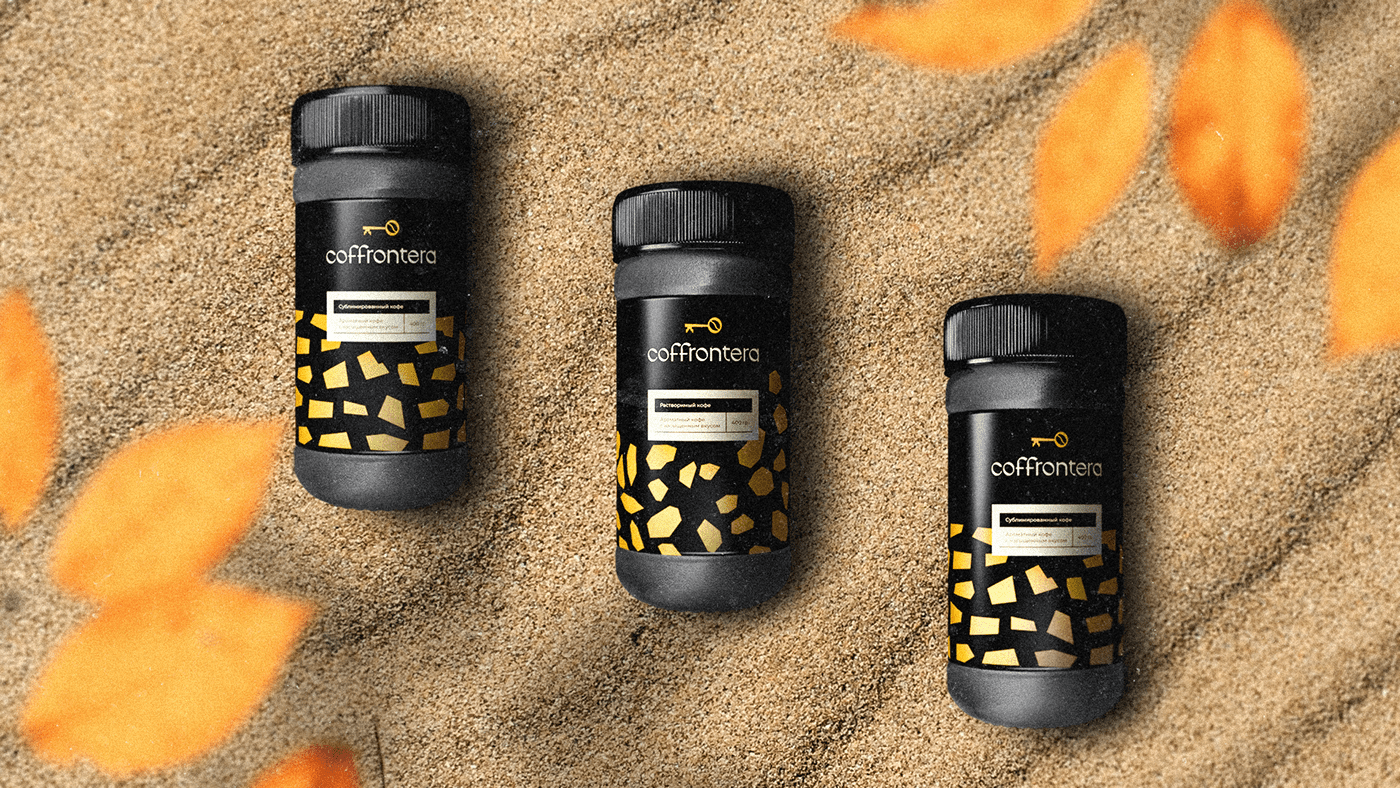
Usually, instant coffee is sold in tin cans or bags with an outdated design that doesn't look pleasing: you don't want to present it as a gift. The client decided to create glass packaging with the idea that customers could buy it as a present.

Task
To develop a name associated with Kaliningrad, the city where the brand originated, as well as to create a logo and corporate identity that emphasises the premium quality of coffee beans.
Naming
A manufacturer's name would be placed on coffee jars, so it should be short and succinct. The main goal is to create naming that would not only be associated with coffee, but also help the brand stand out among dozens of other competitors.
Three names made the shortlist:
Coffeesberg, a sonorous name made up of two words: coffee and Koenigsberg, the old name for Kaliningrad.
Amberabica is both a coffee variety, arabica, and a symbol of Kaliningrad — amber.
Our client liked the Coffrontera variant the most. The name consists of two words: coffee, the main product, and frontera which translates from Spanish as "border."
Kaliningrad is an exclave, the westernmost border of Russia so the name can be translated as "coffee on the border." We chose the Spanish language not by chance: it is spoken in Colombia, where the coffee beans come from.

The logo
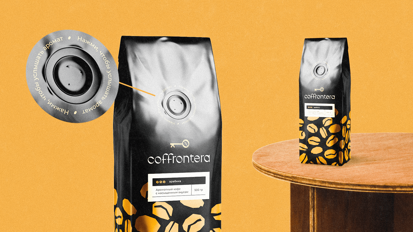
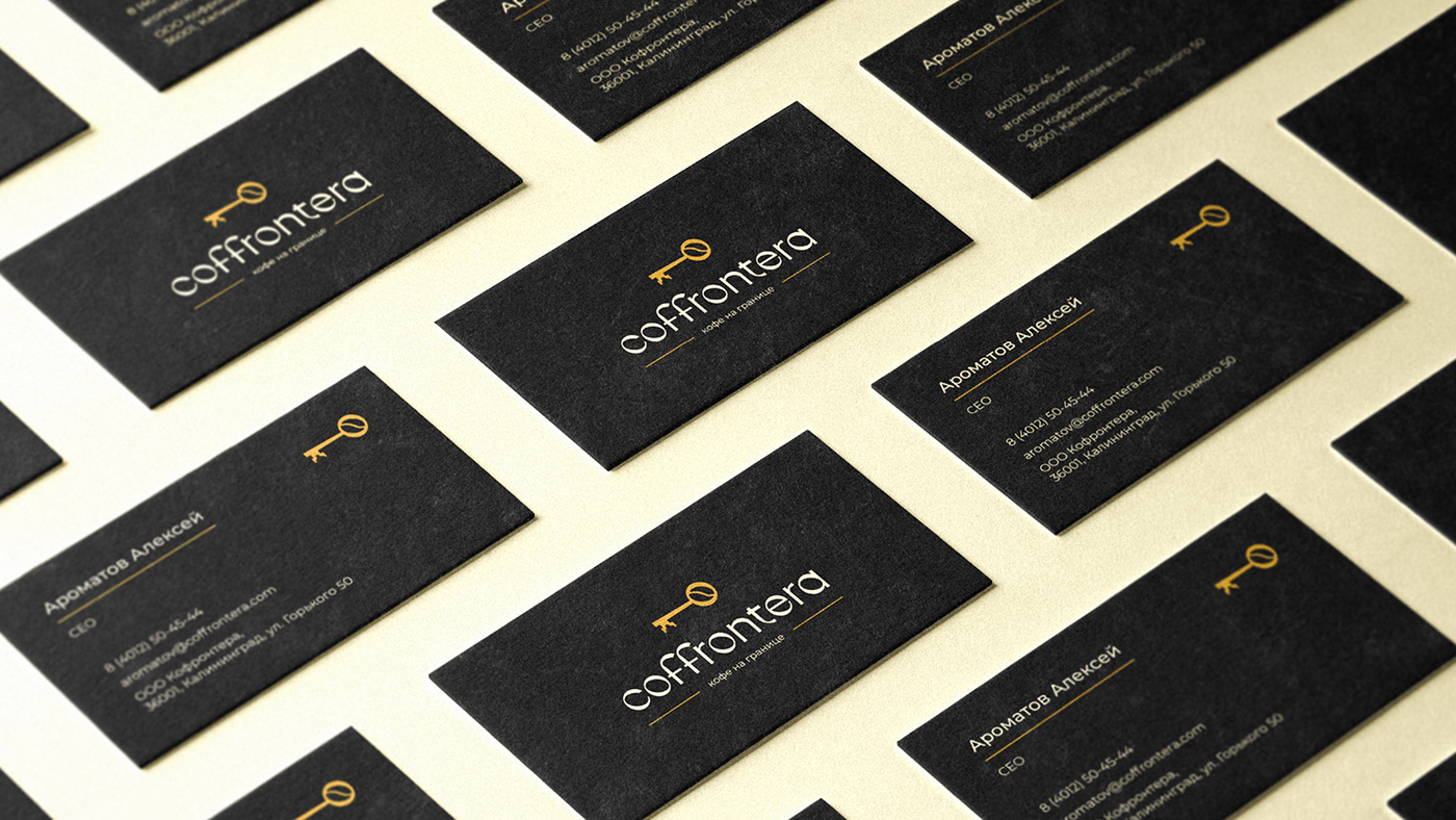
The logo consists of a logotype and a symbol. We chose a key as the image for the logo, so coffee becomes the key to a good mood and vigor. The tip of the symbol resembles the top of the Kaliningrad Cathedral conical roof — the main landmark of the city. We added the image of a coffee bean to the key ring to emphasize the manufacturer's specialization.
In the logo, we used the Nurer font. Its rounded letters resemble the shape of coffee beans, and the letters O and C repeat the outline of the coffee bean in the sign.
Corporate style
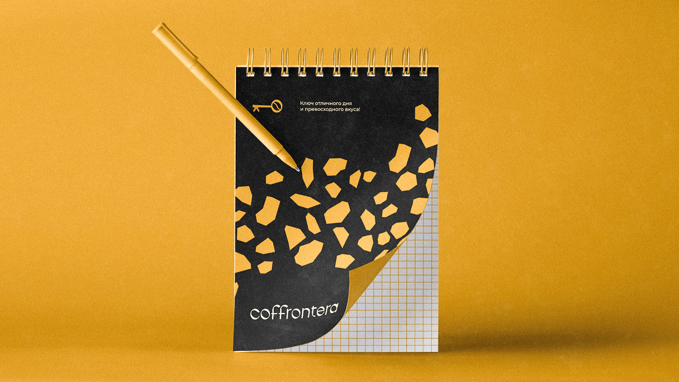
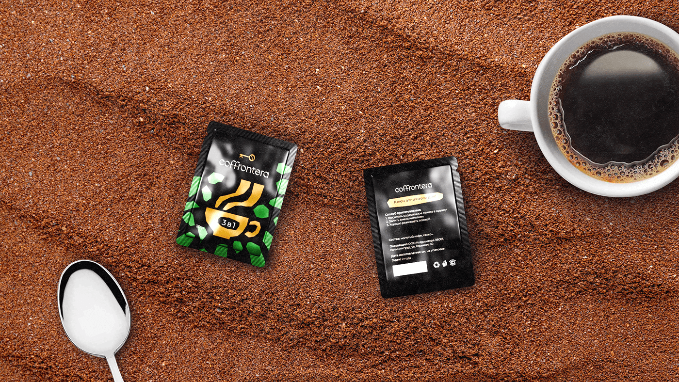
Coffrontera coffee helps people to distract themselves from their usual worries. To convey this feeling of relaxation, we chose calm coffee tones. For contrast we added green and red: the first is associated with the coffee trees, and the second with the beans before roasting. Black background makes the design look clean cut.
Montserrat font is used on the brand identity carriers — on the packaging, banners and merchandise. It's smooth and legible, so it's easy to use.
For every type of coffee — ground, instant, and granular — we developed their own pattern, which is associated with a specific product and helps distinguish them from one another.





Want a design just as cool? Logomachine will create a perfect logo for your project.
Interested? Contact us!

