Want to boost your business with memorable design?
Get it with 10% OFF via promo code «BeEnhanced»
FITMOST
Logo and corporate identity for a sports service
About the Client
FITMOST is a unique Russian service with 1,700 businesses connected to it: yoga and cycling studios, swimming pools, gyms, spa, and beauty salons.
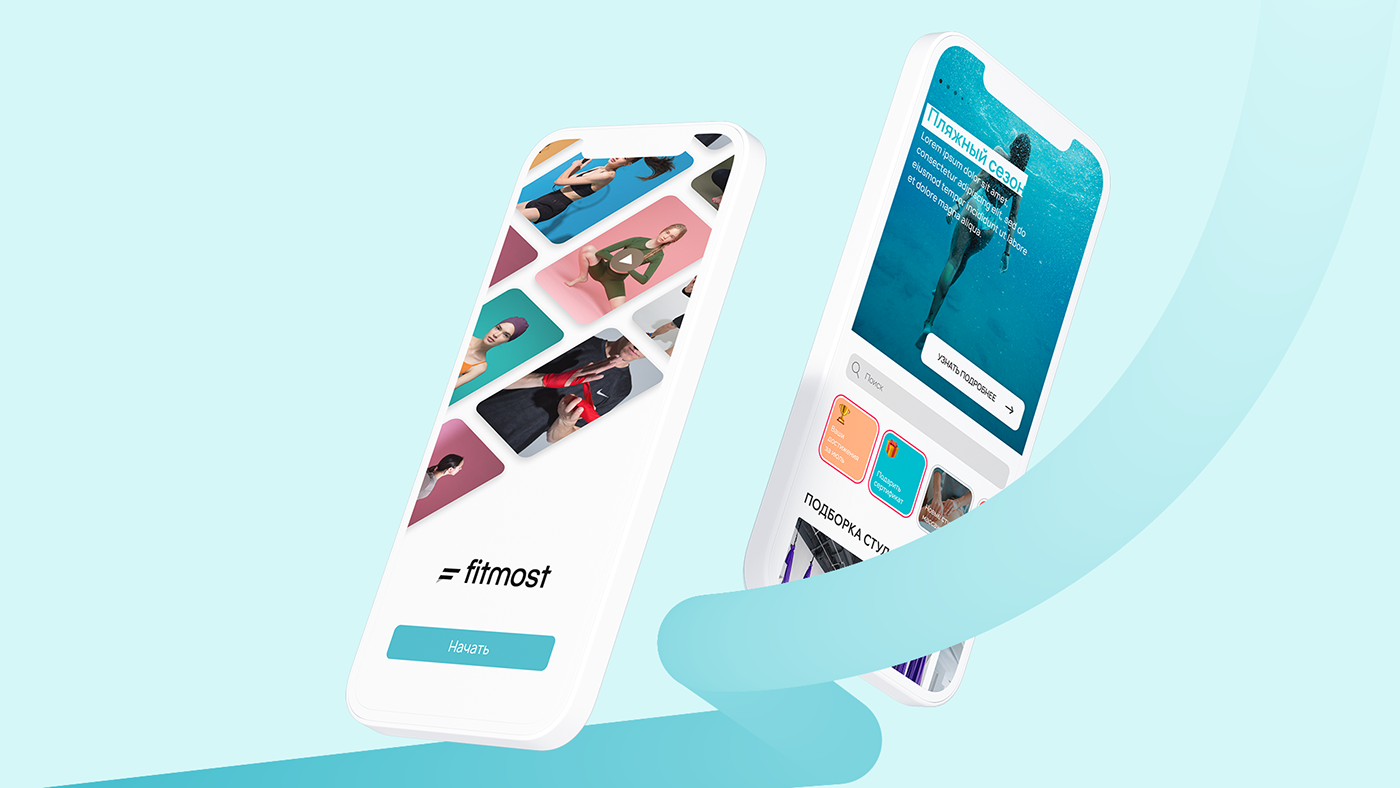
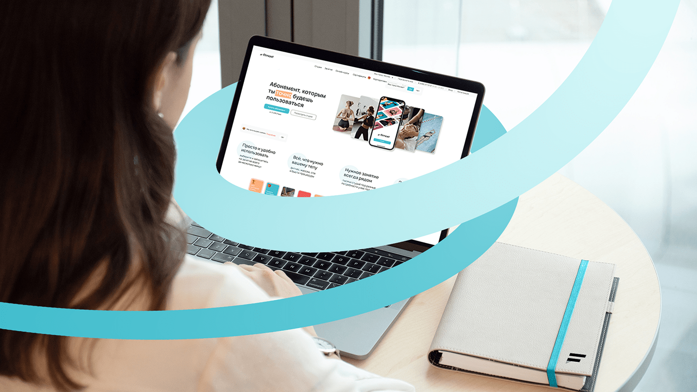
You can buy points in the mobile app or on the FITMOST website, which can be spent on a variety of services. For example, users can go to yoga and massage today and to boxing and swimming tomorrow. Customers have already made one million bookings through the FITMOST app.
The mission of the service is to make sports and self-care a regular thing — you can find and sign up for any physical and recreational activity through the
Task
At a meeting with us, the FITMOST team formulated the task as follows: the service needed a new logo and corporate identity that would look good in real life — on a T-shirt or a bag, and at the same time stand out among other services.
The existing logo had one major problem — thin lettering, which made it difficult to see, especially on the printed layout.
The corporate identity had a similar issue. Company colors were suitable for use in the digital format but were hard to read on real-life objects.
Logo
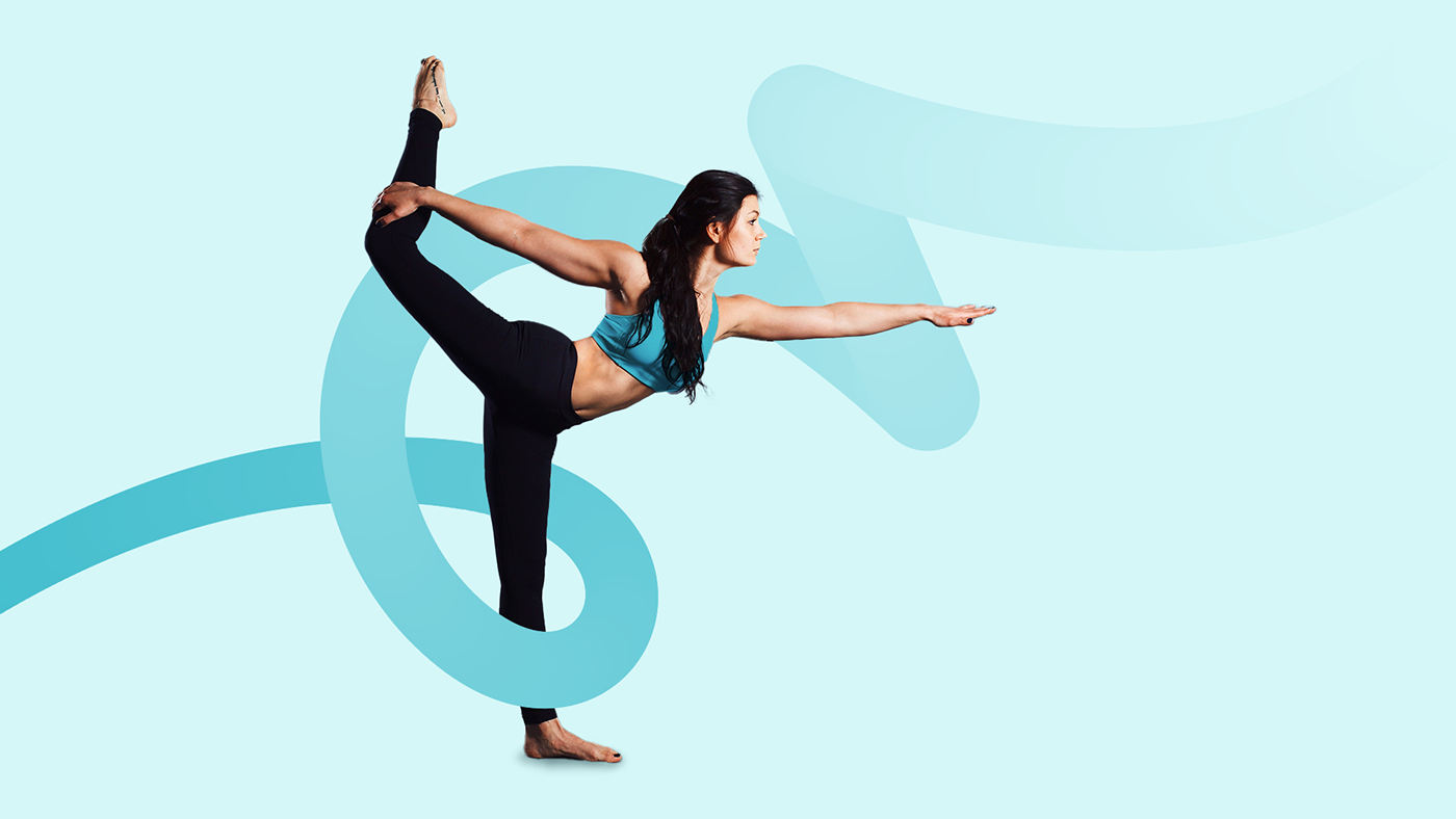
Before we started developing the design, we created a mind map with the activities that the clients of the service have an opportunity to go to. It is a handy tool for finding the right image that will reflect the client's business idea.
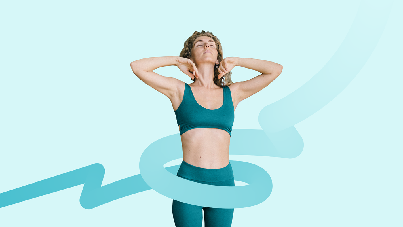
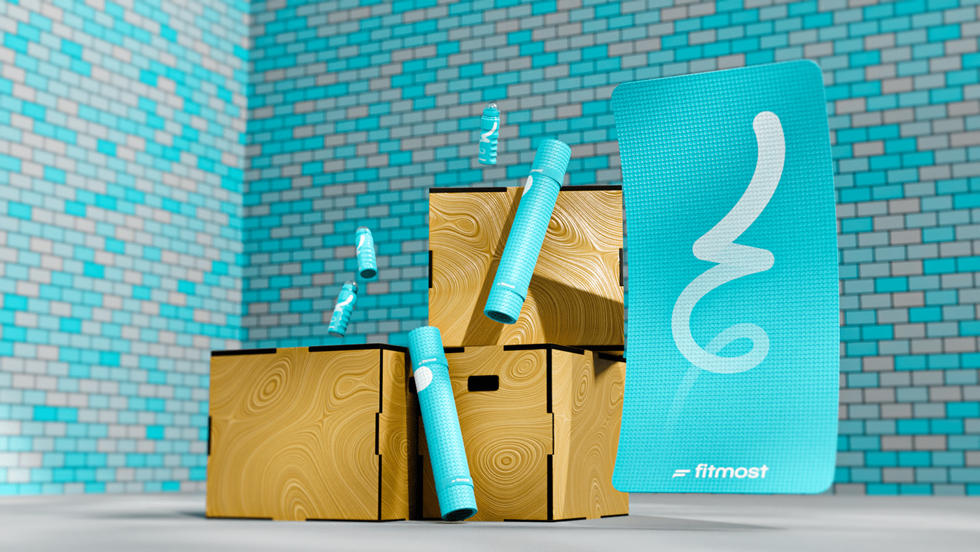
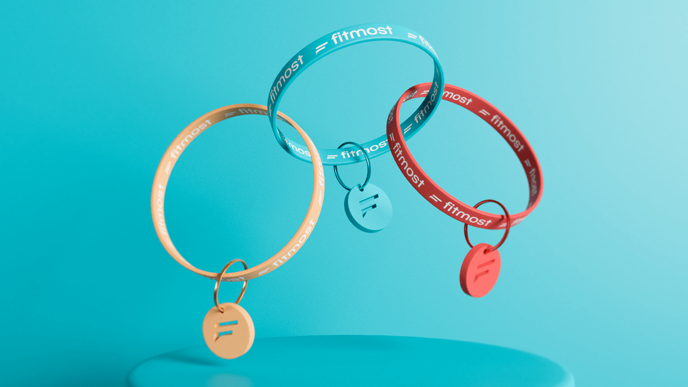
After several brainstorming sessions, we settled on a gymnastic ribbon image. Like the service itself, the ribbon is flexible and easy to use.
FITMOST was offered to choose from several variants of the logo in different color palettes and with different levels of ribbon realism.
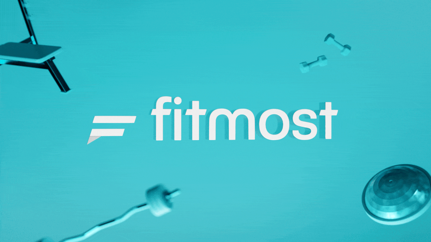
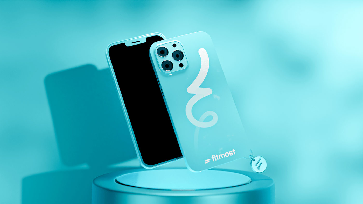
Alexandra Gerasimova, the founder of the service, even held a vote on her social media for the best version of the logo. In the end, both the subscribers and the service team settled on the logo in which the sign consists of two lines forming the letter F.
The font for the logo was created using BC Novatica font. It is rounded and easy to read, which will allow the logo to stand out.

Corporate identity
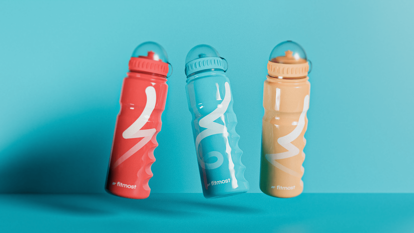
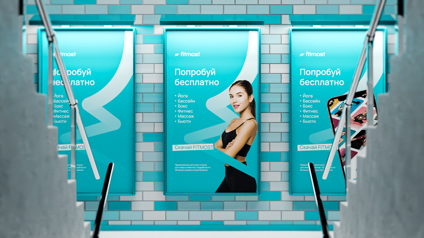
FITMOST's corporate colors used to be dim shades of gray, beige, and soft pink. They were not easy to work with, especially when it came to advertising. Banners and branding were pale and hard to notice.
We needed to maintain continuity, so we kept the existing colors but made them brighter.
We added turquoise to the refreshed old colors, as it is contrasting and gender neutral. Such qualities are important for the positioning of the service in the future: a turquoise-colored app helps us fight the stereotype that FITMOST is meant only for female audiences.
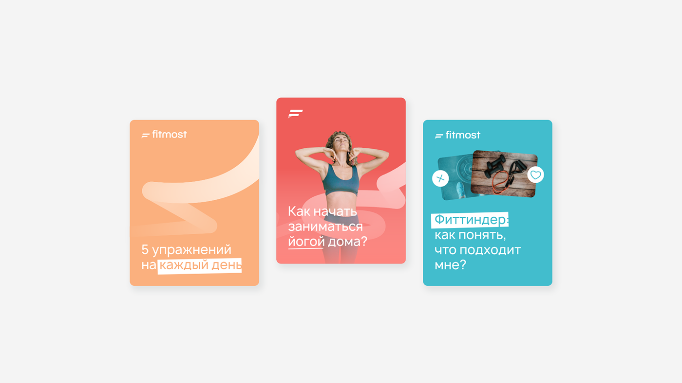
The very same gymnastic ribbon became an identity-forming element. Patterns that would be used as a background for posters and posts on social media are based on the images of ribbons.
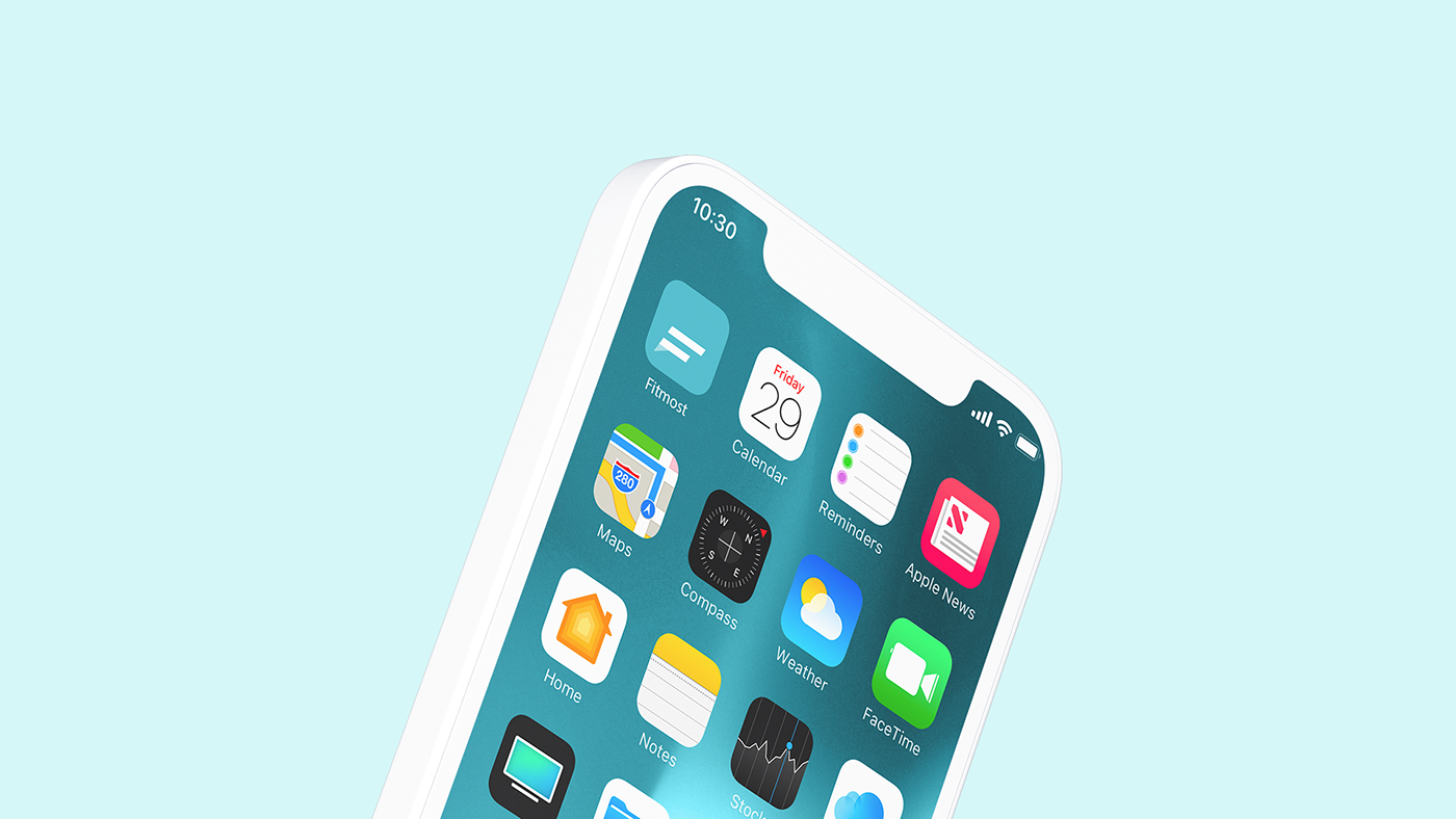
As an icon, we used the sign of the letter F. It would not overload the composition and users can quickly find the app on the phone screen.


Want a design just as cool? Logomachine will create a perfect logo for your project.
Interested? Contact us!