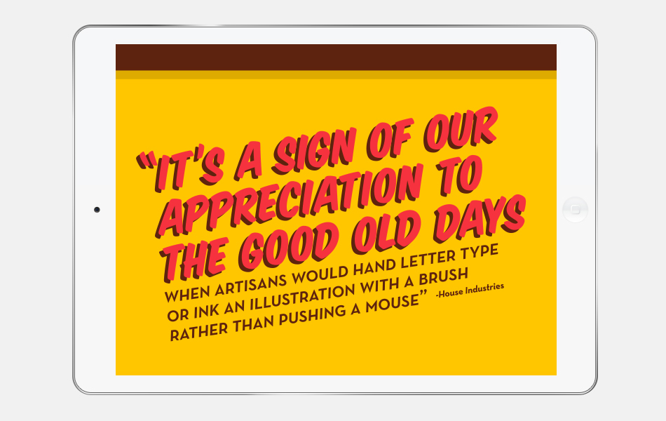
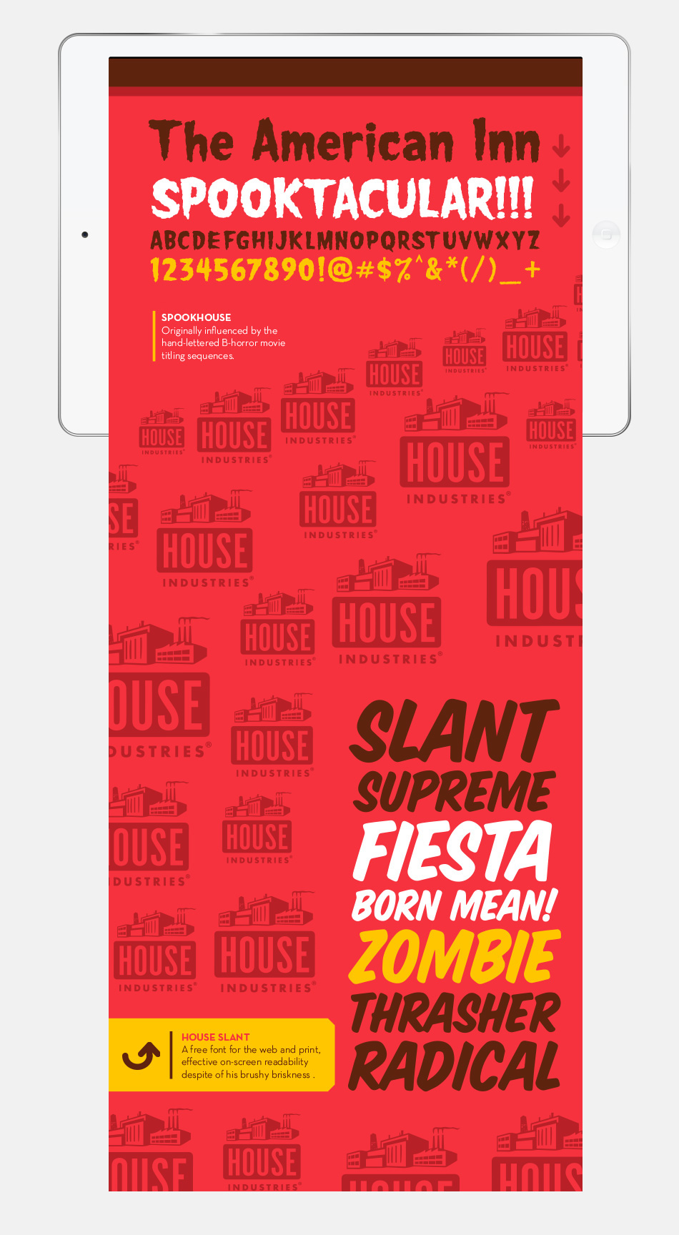
This publication was a project I did in school for my junior year. I had to write about two typographers that I could compare and contrast, I chose Josh Buivenga, famous for his typeface Museo, and the people from House Industries, famous for many of their display faces; but also for typefaces such as Neutra. I designed the print publication, and the digital version, having two prominent color, the red and the yellow, I chose these color to suggest the playfulness and youthfulness of some of these typorgraphers work. They shougt to satisfy a desire for good design and challenge themselves in a way their client work could not.


In my paper I am make emphasis in the similar approach these two foundires had in their beginings.
In a beginning for this two foundries designing typefaces was and experimental process, and the same time it was a creatively challenging process.
Digital publication

Navigation icons at opening page