


PT - BR
Viajelo é uma startup nova, que surge com o propósito de ajudar as pessoas a serem mais felizes, viajando. Há muitos destinos para visitar no mundo e pode ser difícil decidir para onde ir. A Viajelo pretende tornar esta decisão mais simples, disponibilizando as últimas ofertas e promoções. A missão da Viajelo é garantir que você saiba para onde ir, quando ir e como chegar!
EN - US
Viajelo is a new startup, created with the purpose of helping people to be happier, traveling. There are many destinations to visit in the world and it can be difficult to decide where to go. Viajelo intends to make this decision simpler, providing the latest offers and promotions. Viajelo's mission is to make sure you know where to go, when to go and how to get there!


PT - BR
O projeto possui dois pilares de construção:
1 - Sorriso / Conexões:
O projeto possui dois pilares de construção:
1 - Sorriso / Conexões:
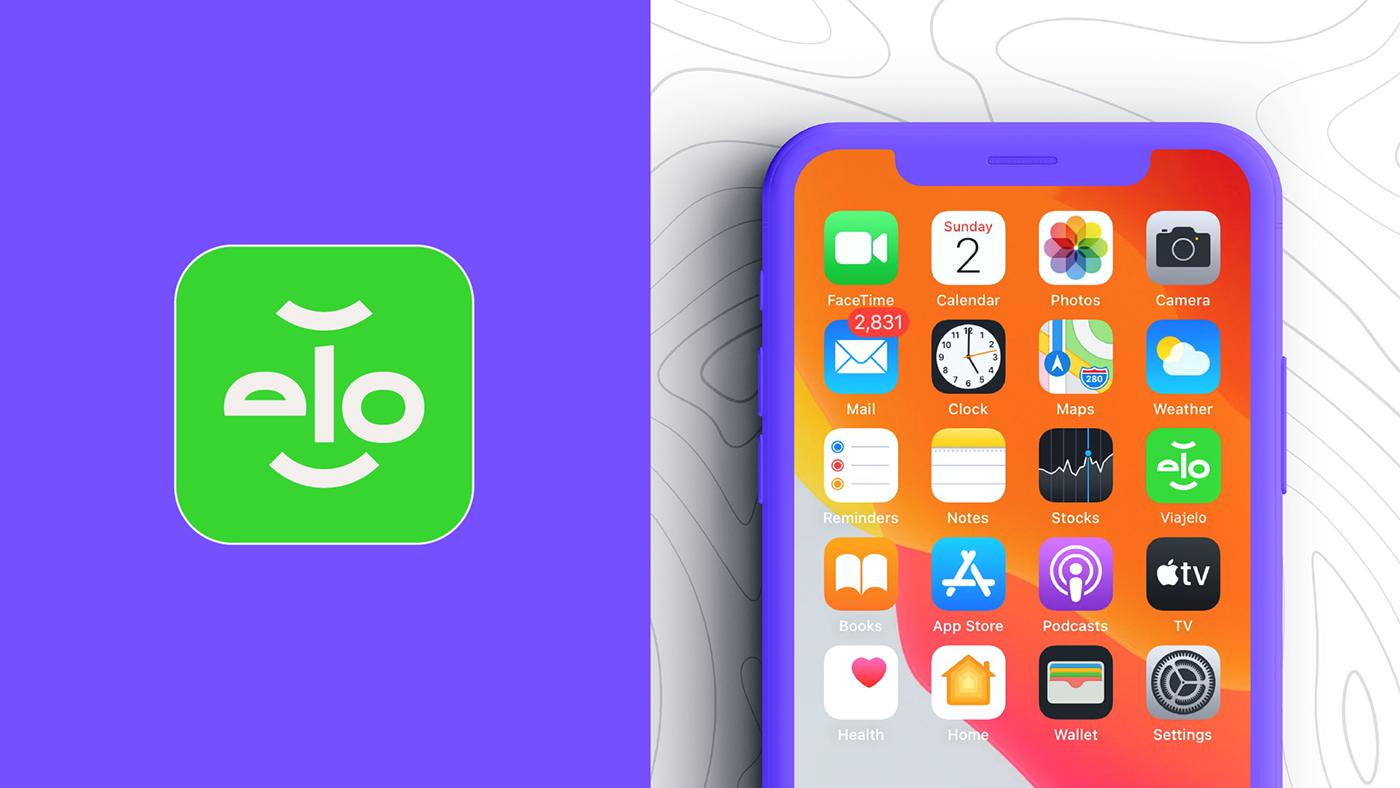
A forma do sorriso é universal, e carrega consigo inúmeros atributos que são diretamente ligado a marca. A alegria de um novo destino, o sorriso do planejamento da viagem. Mas essa forma também traduz conexões, ponto A para ponto B, saída e chegada são atributos que ampliam o universo da marca. Afinal Viajar é alegria.
2 - Irreverência / Amigável:
2 - Irreverência / Amigável:
A tipografia da marca da vida a um rosto amigável e que transmite irreverência em seu olhar. Um ícone forte e que pode funcionar muito bem isoladamente dado o seu contexto e originalidade da forma. Sua construção abre um leque de aplicações, que além de criar conexões com o público alvo traduz uma irreverência nas peças gráficas onde for aplicada.
EN - US
The project has two construction pillars:
1 - Smile / Connections:
The smile shape is universal, and carries with it countless attributes that are directly linked to the brand. The joy of a new destination, the smile of planning the trip. But this shape also translates connections, point A to point B, departure and arrival are attributes that expand the brand's universe. After all, traveling is joy.
2 - Irreverence / Friendly:
The typography that marks life to a friendly face that conveys irreverence in its look. A strong icon that can work very well in isolation given its context and originality of form. Its construction opens up a range of applications, which, in addition to creating connections with the target audience, translates an irreverence in the graphic pieces where it is applied.


