FPDB is a food creative studio, in that order.


The stylized “F” represents the brand's Food First approach, the starting point of every FPDB photography project. Its freeform contrasts with geometric letters, implying creativity and professionalism. And a subtle nod to sauce plating.
The intentional staggered composition breaks up similar-sounding letters and helps with comprehension.
In other words, FPDB ≠ FBDP.


We created a series of food emojis and embedded them into the brand font system as glyphs so every employee of FPDB—even creatively-challenged ones—can express the brand's love of food.

IRL and IG stickers from our custom food glyphs.


Audible branding. Checked. Edible branding? Of course.
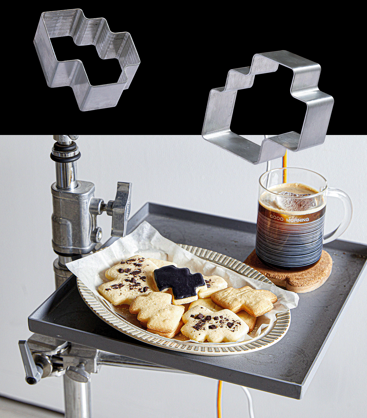

(This is a mock-up, we didn't produce it in time.)
Creative Director: Tuan Le
Sr Graphic Designer: Tuan Ha
Jr Graphic Designer: Khe Nguyen
Photographer: FPDB Creative
Sr Graphic Designer: Tuan Ha
Jr Graphic Designer: Khe Nguyen
Photographer: FPDB Creative
Accounts: Huyen Vo, Anh Nguyen, Duy Lam
Motion Designers: Tuan Le, Tuan Ha
Documentation: Tuan Ha


