🔗 Try it for free Exclusively at Pangram Pangram®
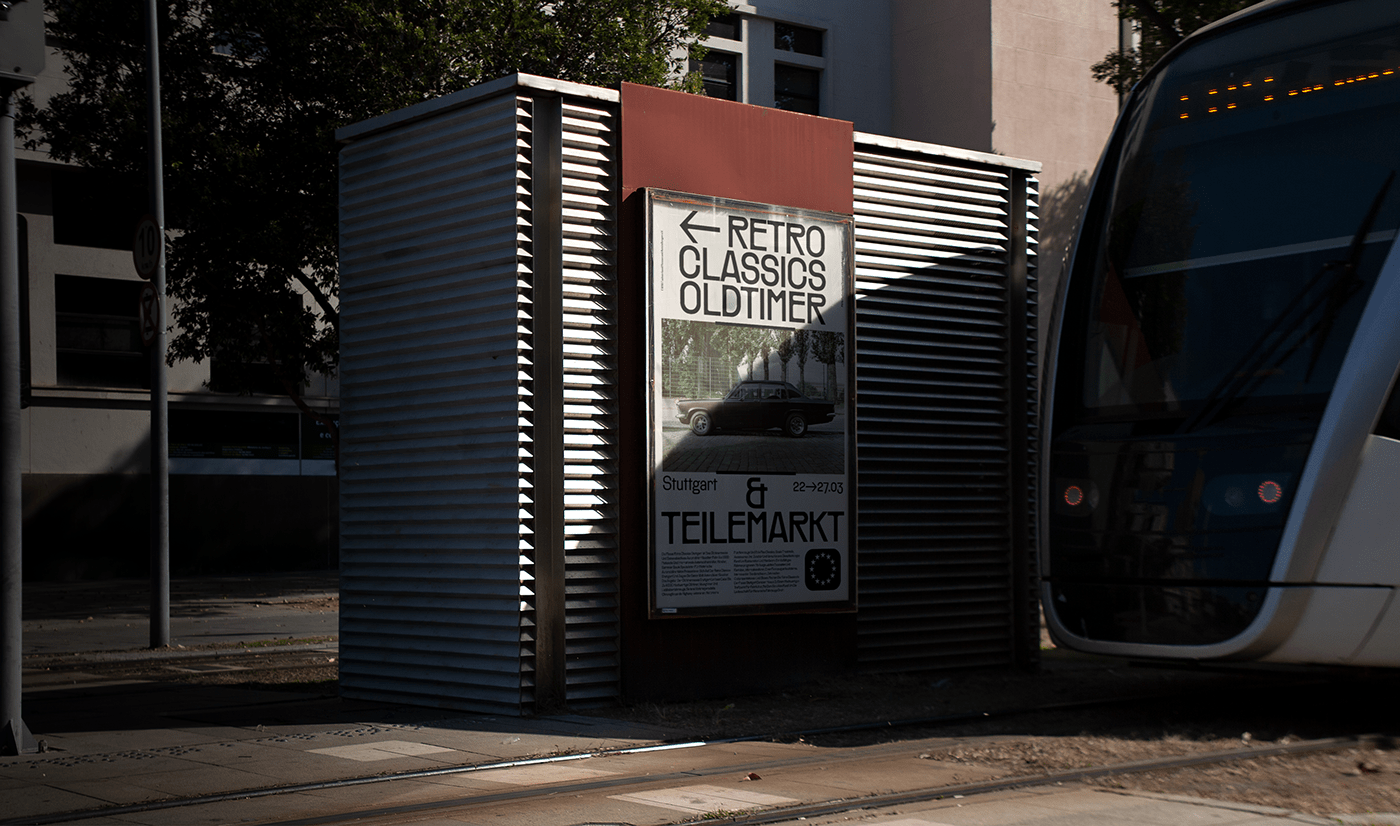
▲ The first 54 characters of Räder were designed by 🔗 Morula Type in a single day, following a simple concept: what would happen if we were to infuse the Art Nouveau spirit in a a font like DIN? While many typefaces made for wayfinding and road signage follow the readability-first approach, Räder takes an unexpected detour, acting as an eye-catcher rather than a seamless infographic tool.
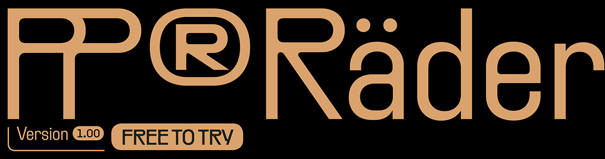
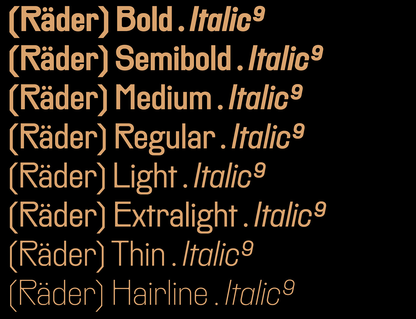
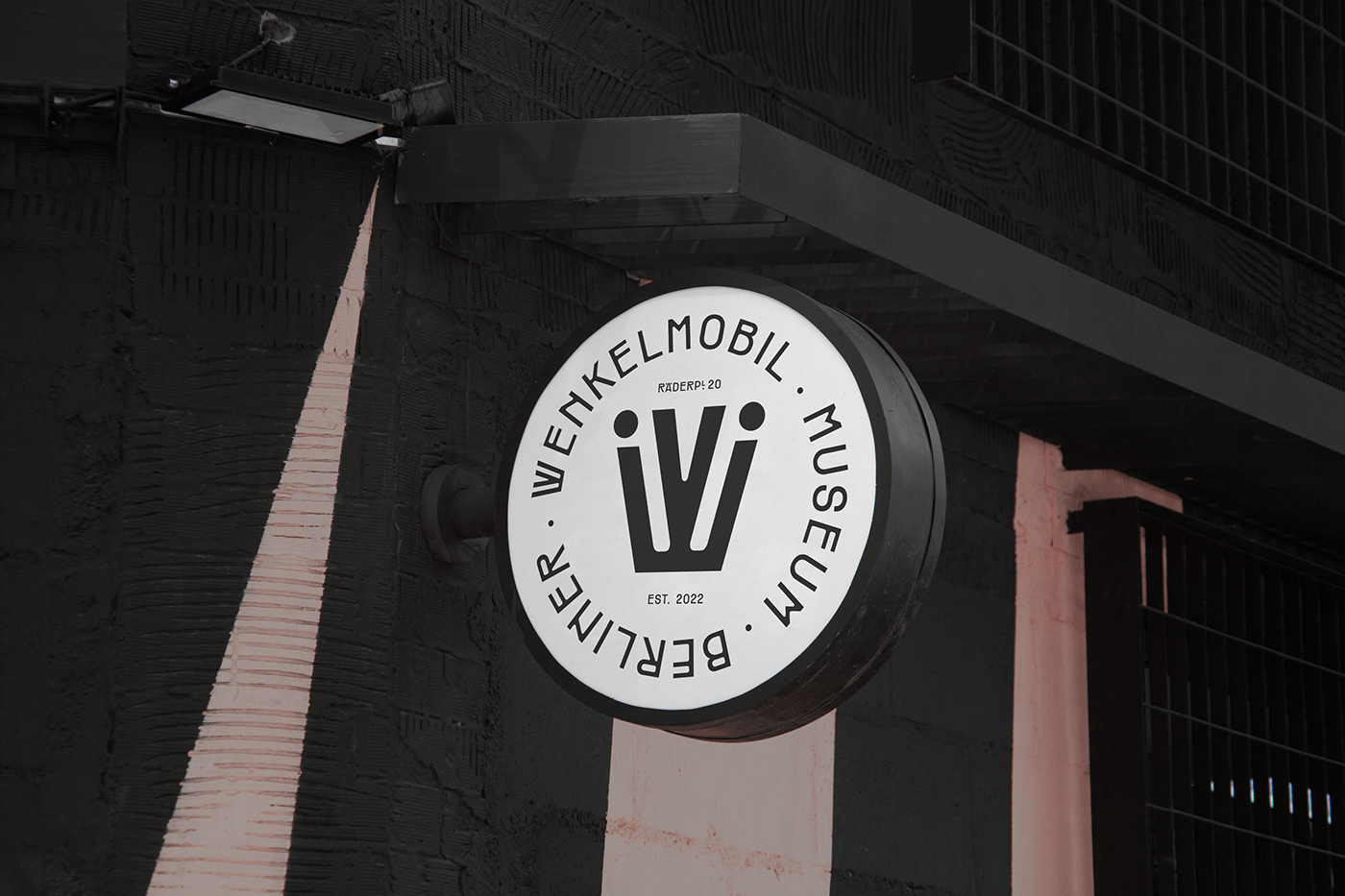
▲ Räder is nevertheless packed with a multitude of typographical gimmicks: hundreds of arrows, ligatures and symbols turn this typeface into a highly versatile tool with which crafting both contemporary and retro solutions. Designed to work both as an expressive display typeface and as a readable editorial tool, Räder's range spans across 16 carefully crafted weights: from a stripped down hairline cut to the more exhuberant and decorative bold.
▲ Road signage is something of which we've learned to assume the neutrality: it's ubiquitous, simple and sends an arguably unmistakable message to the viewer. Has it always be like that, though? Vintage signage systems were in fact the result of a graphic compromise between clarity of message and beauty of appearance, as designers understood the importance of wayfinding in the urban identity: Räder is an attempt to bring the craft back to such times. On one hand immediately recognisable, on the other oddly familiar, it draws from a debut-de-siecle aesthetic to spice up the hyperpopular genre of industrial grotesques.
▲ Räder's inner round counters give the feeling of a printed typeface, without compromising its modern look, so you can have the best of both worlds... or should we say the best of both ages?
🔗 Try it for free Exclusively at Pangram Pangram®
▲ The first 54 characters of Räder were designed by 🔗 Morula Type in a single day, following a simple concept: what would happen if we were to infuse the Art Nouveau spirit in a a font like DIN? While many typefaces made for wayfinding and road signage follow the readability-first approach, Räder takes an unexpected detour, acting as an eye-catcher rather than a seamless infographic tool.
▲ Räder is nevertheless packed with a multitude of typographical gimmicks: hundreds of arrows, ligatures and symbols turn this typeface into a highly versatile tool with which crafting both contemporary and retro solutions. Designed to work both as an expressive display typeface and as a readable editorial tool, Räder's range spans across 16 carefully crafted weights: from a stripped down hairline cut to the more exhuberant and decorative bold.
▲ Road signage is something of which we've learned to assume the neutrality: it's ubiquitous, simple and sends an arguably unmistakable message to the viewer. Has it always be like that, though? Vintage signage systems were in fact the result of a graphic compromise between clarity of message and beauty of appearance, as designers understood the importance of wayfinding in the urban identity: Räder is an attempt to bring the craft back to such times. On one hand immediately recognisable, on the other oddly familiar, it draws from a debut-de-siecle aesthetic to spice up the hyperpopular genre of industrial grotesques.
▲ Räder's inner round counters give the feeling of a printed typeface, without compromising its modern look, so you can have the best of both worlds... or should we say the best of both ages?


Try PP®Räder for free at 🔗 Pangram Pangram
Type design and specimen by 🔗 Morula Type
Mockups by 🔗 Art Directed
Thanks for watching!

