優選Uselect 品牌改造設計案
Uselect Rebranding
✦
製作 Production:突形蟲 otherworm
類別 Category:品牌形象 Branding
客戶 Client:優選 Uselect
年份 Years:2020
設計統籌 Creative & Art Director:陳品丞 Chen Ping-Chen
企劃 & 設計 Planning & Design:陳品丞 Chen Ping-Chen、邱子堯 Chiu Tzu-Yao
客戶 Client:優選 Uselect
年份 Years:2020
設計統籌 Creative & Art Director:陳品丞 Chen Ping-Chen
企劃 & 設計 Planning & Design:陳品丞 Chen Ping-Chen、邱子堯 Chiu Tzu-Yao
選物 Select:邱子堯 Chiu Tzu-Yao
空間設計 Interior Design:劉元琦 Liu Yuan-Ci(Fopia Design Studio)
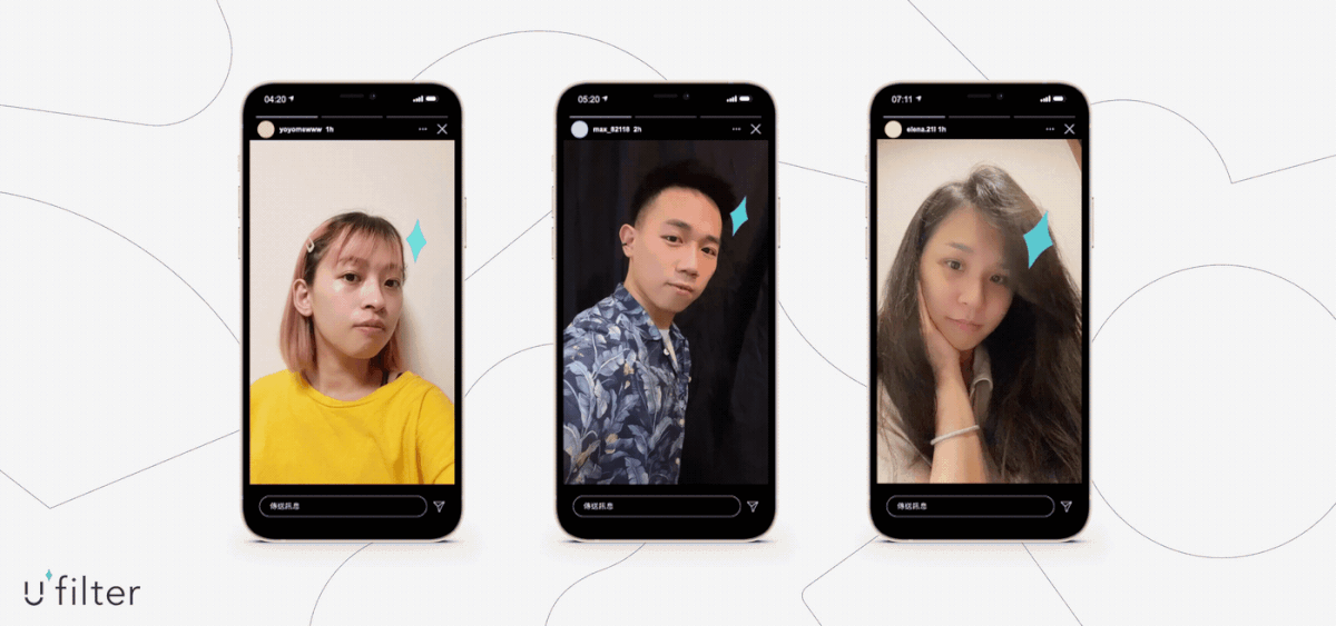
動畫&濾鏡 Animation & IG Filter:閻青攸 Yoyo Yan
攝影 Photographer:黃覺深 Jason Huang
印刷經理 Print Manager:陳宏泰 Chen Hung-Tai
行銷 Marketing:陳郁翰 Henry Chen、張承維 Chang Cheng-Wei
印刷經理 Print Manager:陳宏泰 Chen Hung-Tai
行銷 Marketing:陳郁翰 Henry Chen、張承維 Chang Cheng-Wei
特別感謝 Special Thanks:徐可馨 Kirsty、簡郁穎 Jian,Yu-Ying、張以風 Spencer Chang
✦
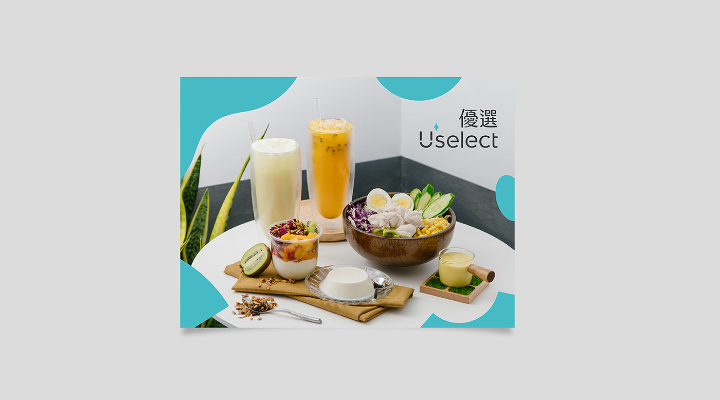
位於台中大業路的15坪店面,作為優格飲食品牌「優選」重新出發、推廣手作優格之路的起站,除了明亮、乾淨、專業感的基礎氣氛定調以外,考量地區風俗民情與店主外向的性格,團隊決定以「親切感」作為形象設計的核心,呼應優選產品本身兼顧「健康與美味」,我們希望視覺形象能夠兼顧「俐落感與人情味」。
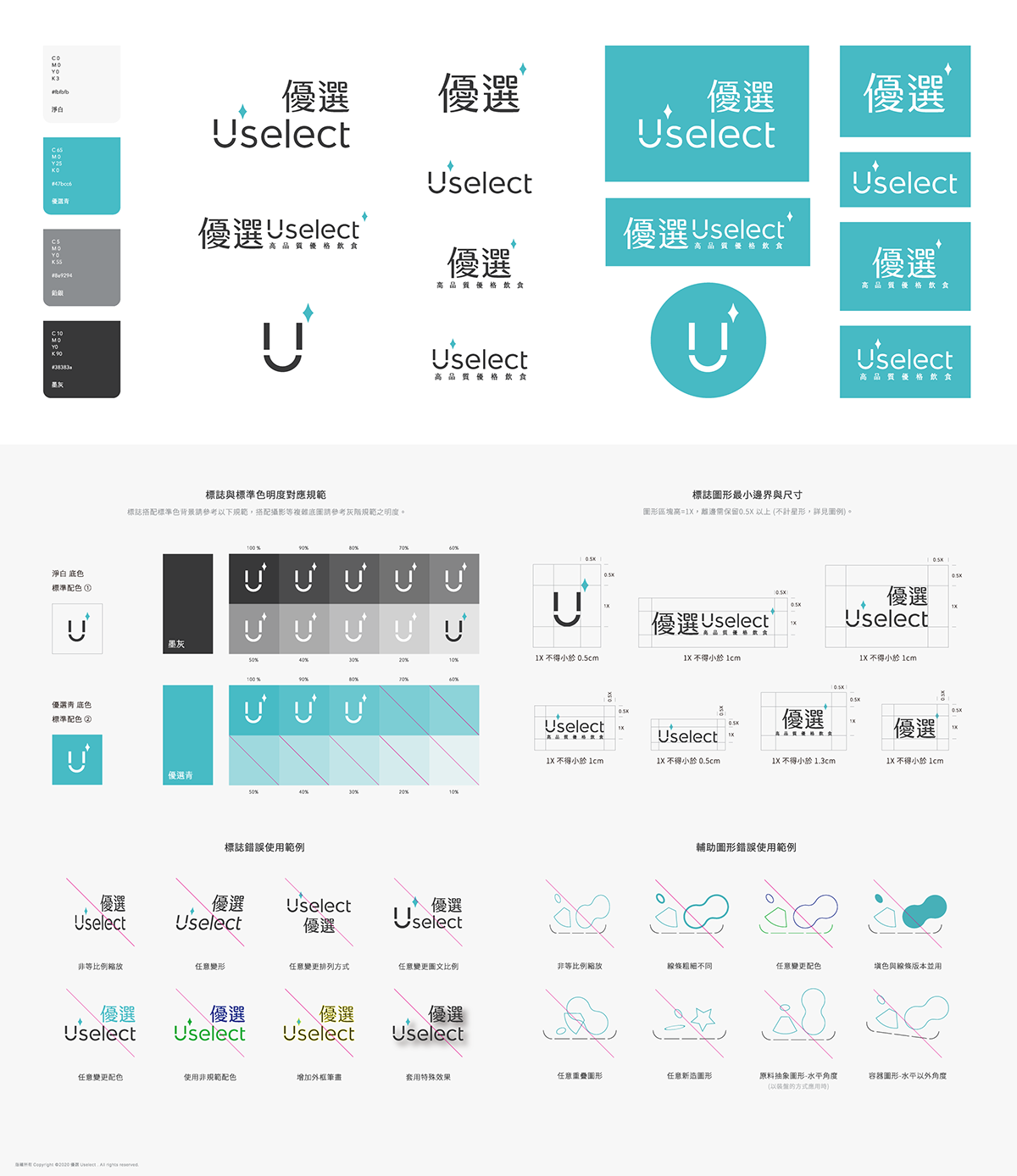
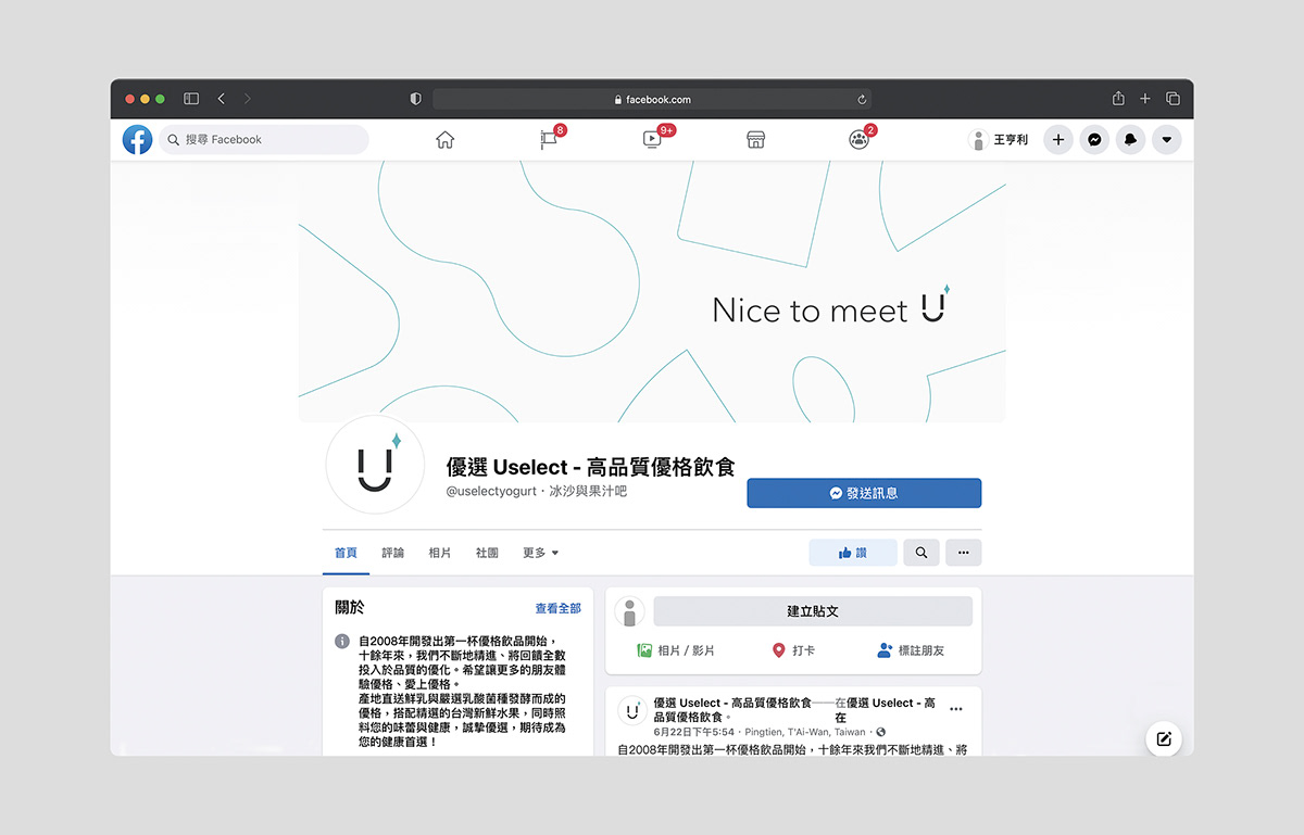
Logo的圖形像是一個親切又自信的笑臉符號,以微笑的視覺語言作為開啟與不同性別年齡層顧客溝通的契機。同時在延伸應用上,「Uselect」的「U」可視為容器,因此Logo圖形也像是一個亮晶晶的杯子,容納各種健康食材,以此開展高可塑性的形象設計的規劃,期待在高度強調豐富性的台灣飲品市場,不僅能與品牌一起經過時間的考驗,也能開展更豐富的視覺可能。
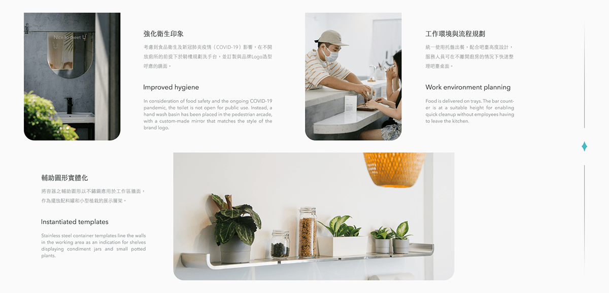
整體室內規劃以簡潔、實用性為主,適當在細節的空間語言上配合視覺形象的設定。例如手持食材時方便進出後廚房的布簾、水果顆粒意象延伸的磨石紋理吧台、像是一層優格覆蓋在桌面上的吧台桌板、從視覺形象造形延伸的置物層架與鏡子等。在提供輕快、舒適的用餐體驗之餘,也讓來店的客人對品牌符號留下連貫的整體印象。
✦
50 ㎡ store on the Daye Road, Taichung which is the site for our client "Uselect", Brand of homemade yogurt, to start anew. Other than good illumination, cleanness, and a sense of professionalism, friendliness is also selected as one of the store’s core images, both to reflect the character of local population and the shop owner’s easygoing personality, and to accentuate the healthiness and deliciousness of products. Furthermore, we hope that the store will exhibit a graceful simplicity with a human touch.
The logo of the shop is in the shape of a friendly and self-confident smile, which signifies unobstructed communication across all age groups and different genders. Visually, the U in "Uselect" can be likened to a shiny glass that may hold various types of healthy food, thus giving inspiration to a highly adaptable image design. We expect that the logo and the brand will not only endure the test of time in Taiwan’s beverage market, which values diversity, but also visually give a hint to rich possibilities.
The interior design shall be governed by simplicity and practicality, with details that embody the shop image in their spatial vocabularies. For example, the cloth curtain that enables easy passage in and out of the kitchen when holding food in both hands; the terrazzo bar counter with a decorative pattern that evokes images of fruit granules; the table tops that look like a layer of yogurt; and the shelves and mirrors befitting the visual image of the shop. All in all, we aim to create a light-hearted and pleasant dining experience and impress our customers with a well-integrated shop image.
✦


✦
因應品牌轉型重新定位店面內裝,並同時增設內用座位區。為求在既有的狹長型空間上將座位數最大化,將隔間木板層移向後方、釋放更多用餐空間,並改採L型吧臺形式提供內用服務。
以親切簡淨的品牌調性為主,未來展店的需求為輔,整體空間色彩以簡潔且容易延伸運用的白色系、灰(銀)色系和木料的大地色系規範。裝潢選物以「符合視覺調性」、「具實用機能性」、「經濟實用的材料」為目標準則。
✦
With regard to brand transition, the interior of the shop has been redesigned and a seating area has been added. To maximize the number of seats, the wooden partition wall has been moved back, and the seats have been arranged around an L-shaped bar for dine-in services.
The brand image emphasizes warmth and simplicity, and the possibility of future expansion has also been taken into consideration. The color scheme is characterized by white, which is simple and expansive as well as gray, silver, and several earth tones such as wood brown. The design follows three principles: visual identity, practical functionality, and the use of economical and practical materials.
✦