In the light of controversial BMW 2020 rebranding mixed with COVID‑19 pandemic a quarantined designer have re-imagined BMW logo without the text inside the circle.
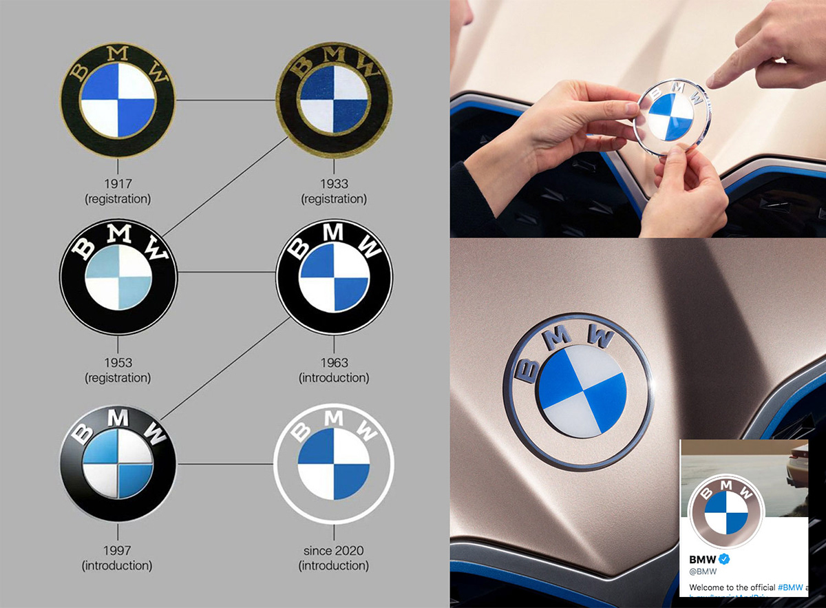
Back in March 2020 BMW introduced a new official logo where apart from another application of flat design trend, the black circle was replaced with transparency. The project was designed in collaboration with an advertisement agency called BECC. Nevertheless not everyone saw the official redesign as an improvement, some reviewers felt that the simplified version of BMW symbol can be confused with a generic crash test dummy sticker. That thought have fuelled the need for an alternative version with a better contrast on white, silver or blue backgrounds.

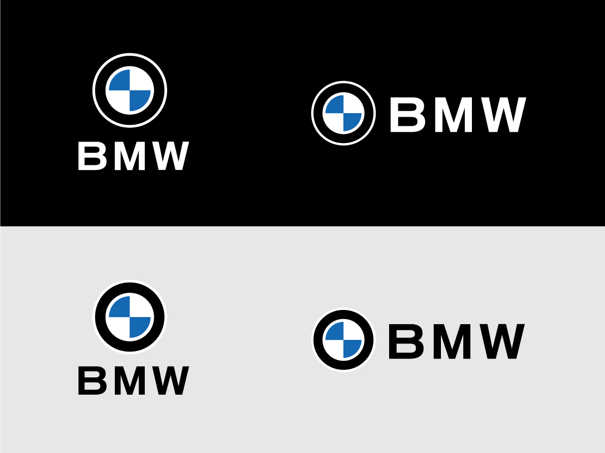
BMW logo was redesigned by Dim Newman, creative director of Copenhagen based branding agency Brand Lane. The proportions of the logo were changed by adding some white space to separate the logo elements. BMW lettering was removed to achieve the level of balance never seen in BMW logo before. The historical continuity was preserved by keeping the iconic black circle.
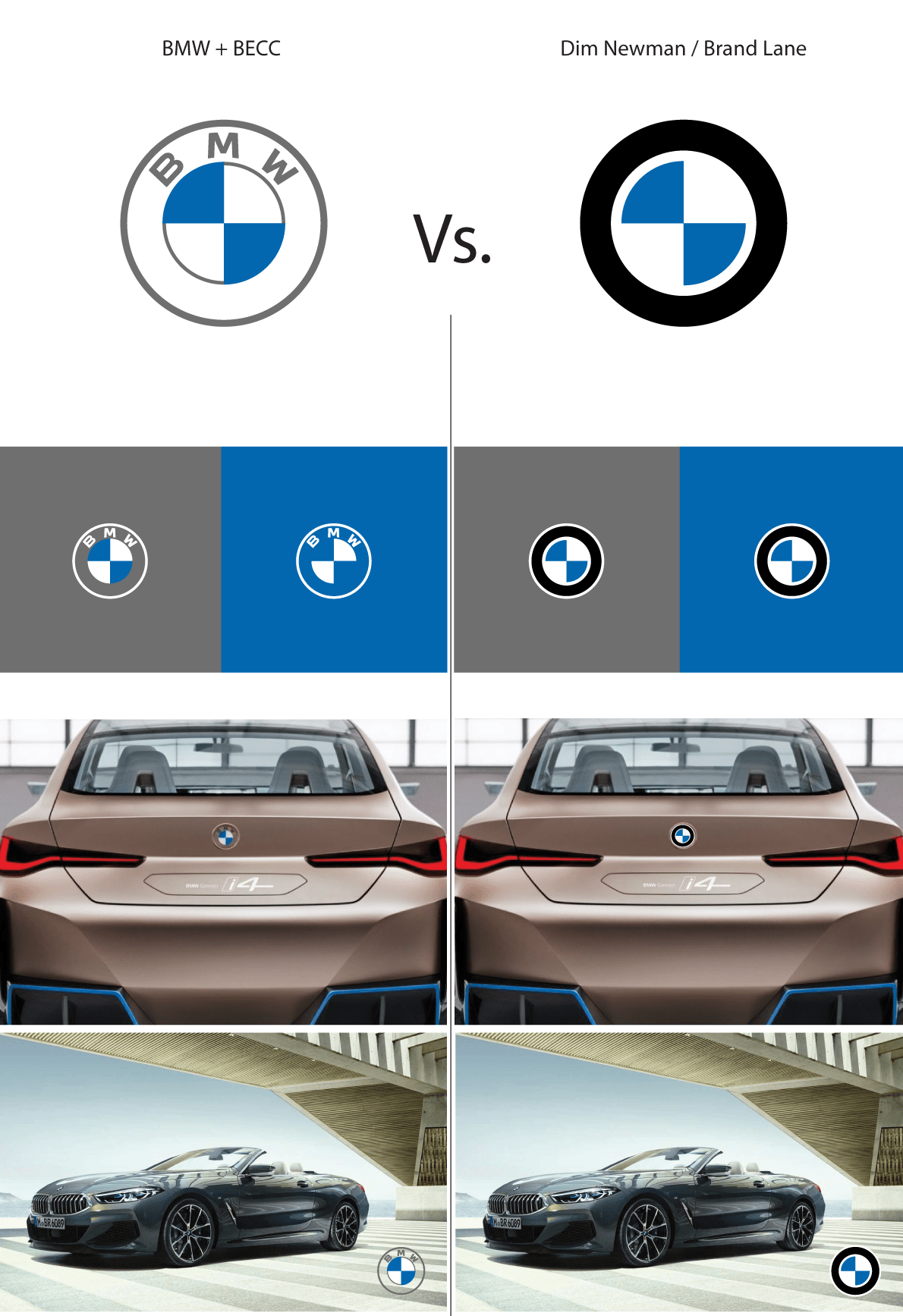
To cover both light and dark backgrounds BECC have ended up making two versions of BMW logo, the alternative design can stand out on any background with just a single version.

Visualisation of the conceptual BMW logo on a car

Conceptual BMW logo in a car interior
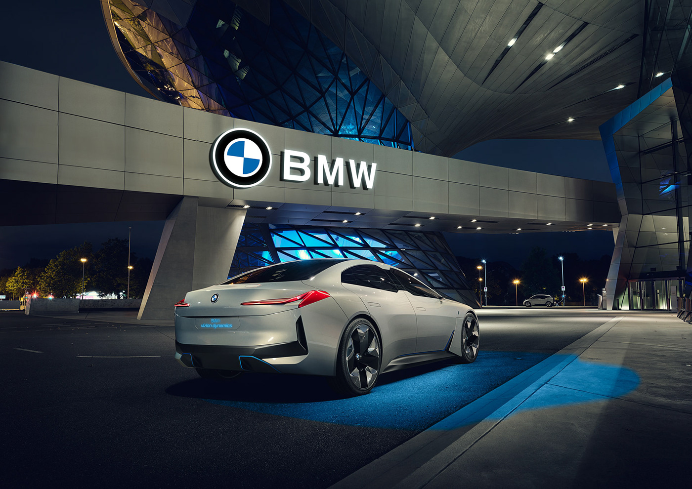
BMW logo on a dealership signage can be accompanied with the unsqueezed letters to be placed outside of the roundel. Should there be designed a better new BMW-typeface then?
Conceptual BMW logo on a car advertisement can be just as well accompanied with the BMW letters in digital or printed representations (here on the drawing by Nicolas Guille).
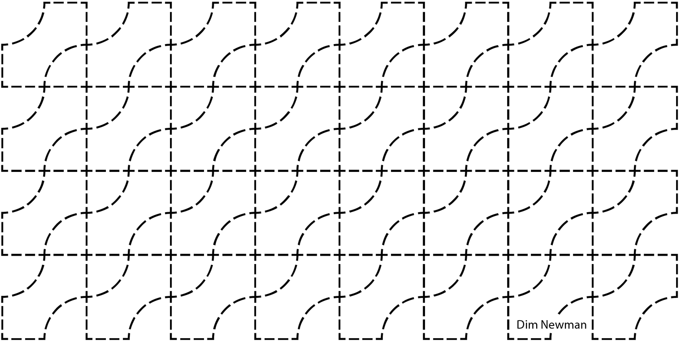
The stitching pattern designed by Dim Newman can set the attention to detail onto entirely new level. Every line intersects at 90-degree angle. This infinite continuous pattern was inspired by BMW quadrants and can boost the brand recognisability trough a subtle touches in the interior.

BMW logo-pattern by Dim Newman. It was inspired by Wallmark.dk 3D-panels and the design language of fashion brands like Louis Vuitton, Gucci or Fendi. In combination with the matching stitching pattern for the car interior it could drive BMW info Bentley territory without the increase in the car production cost.

BMW pattern used for radiator grill decoration. Can be produced with a chromed frontal quadrants, and made of blue plastic gradually deepening towards the black openings.
Remarkably that after seeing the public reaction on the 2020 transparent logo on i4 concept car, BMW have announced that they will continue to use the 1997 version of their logo on cars for now. The application of BMW logo designed by BECC got limited to marketing materials only.
A sociological survey among the car enthusiasts have demonstrated that 86,4% out of 425 respondents voted for Dim Newman's version of BMW logo, against the official BMW redesign. Sample size: 2K respondents, 21% response rate.
Read the full story about the BMW rebranding project here:
Photos and graphics are courtesy of BMW and Dim Newman. This is not an official BMW logo redesign.
The project is a non-commercial design research exercise.
The project is a non-commercial design research exercise.


